// src/components/Navbar/Navbar.tsx
"use client";

import { useState, useRef, useEffect } from "react";
import { ChevronDown, ChevronUp, Menu, X } from "lucide-react";
import { PulseContactButton } from "../ui/Button";

const navLinks = [
  { name: "Home", href: "/", children: [] },
  { name: "About", href: "/about", children: [] },
  {
    name: "Services",
    href: "/services",
    children: [
      { name: "Web Development", href: "/services/web-development" },
      {
        name: "Mobile App Development",
        href: "/services/mobile-app-development",
      },
      { name: "UI/UX Design", href: "/services/ui-ux-design" },
      { name: "Digital Marketing", href: "/services/digital-marketing" },
      { name: "SEO Optimization", href: "/services/seo-optimization" },
    ],
  },
  { name: "Teams", href: "/teams", children: [] },
  { name: "Blogs", href: "/blogs", children: [] },
];

function Navbar() {
  const [mobileOpen, setMobileOpen] = useState(false);
  const [servicesOpen, setServicesOpen] = useState(false);
  const mobileMenuRef = useRef<HTMLDivElement>(null);

  // Close mobile menu on outside click
  useEffect(() => {
    function handleClickOutside(e: MouseEvent) {
      if (
        mobileMenuRef.current &&
        !mobileMenuRef.current.contains(e.target as Node)
      ) {
        setMobileOpen(false);
      }
    }
    document.addEventListener("mousedown", handleClickOutside);
    return () => document.removeEventListener("mousedown", handleClickOutside);
  }, []);

  // Lock body scroll when mobile menu is open
  useEffect(() => {
    document.body.style.overflow = mobileOpen ? "hidden" : "";
    return () => {
      document.body.style.overflow = "";
    };
  }, [mobileOpen]);

  return (
    <>
      <header className="fixed top-3 left-1/2 z-50 flex w-[calc(100%-2rem)] max-w-6xl -translate-x-1/2 items-center justify-between rounded-full border bg-white px-4 sm:px-6 py-2 shadow-sm">
        {/* Logo */}
        <a href="/" className="shrink-0 w-28">
          <img
            src="https://www.codekk.dev/_next/image?url=%2Flogo-icon-dark.png&w=1920&q=75"
            alt="CodeKK Logo"
            className="h-8 w-auto object-contain"
          />
        </a>

        {/* Desktop Navigation */}
        <nav className="hidden md:block">
          <ul className="flex items-center">
            {navLinks.map((link) => (
              <li key={link.href} className="group relative px-3 py-2.5">
                <a
                  href={link.href}
                  className="flex items-center gap-1 text-gray-700 transition-colors duration-200 group-hover:text-[#0068a3]"
                >
                  <span>{link.name}</span>
                  {link.children.length > 0 && (
                    <span className="relative h-4 w-4">
                      <ChevronDown className="absolute inset-0 h-4 w-4 transition-all duration-200 group-hover:translate-y-0.5 group-hover:opacity-0" />
                      <ChevronUp className="absolute inset-0 h-4 w-4 translate-y-0.5 opacity-0 transition-all duration-200 group-hover:translate-y-0 group-hover:opacity-100" />
                    </span>
                  )}
                </a>

                {link.children.length > 0 && (
                  <ul className="pointer-events-none absolute top-8 left-0 z-20 w-64 translate-y-3 rounded-xl border bg-white p-2 opacity-0 shadow-xl transition-all duration-200 group-hover:pointer-events-auto group-hover:translate-y-2 group-hover:opacity-100">
                    {link.children.map((child) => (
                      <li key={child.href}>
                        <a
                          href={child.href}
                          className="block rounded-lg px-4 py-3 text-sm text-gray-700 transition-all duration-200 hover:bg-gray-100 hover:text-[#0068a3]"
                        >
                          {child.name}
                        </a>
                      </li>
                    ))}
                  </ul>
                )}
              </li>
            ))}
          </ul>
        </nav>

        {/* Desktop CTA */}
        <div className="hidden md:block">
          <PulseContactButton />
        </div>

        {/* Mobile hamburger */}
        <button
          className="flex md:hidden items-center justify-center rounded-full p-2 text-gray-700 hover:bg-gray-100 transition-colors"
          onClick={() => setMobileOpen((v) => !v)}
          aria-label={mobileOpen ? "Close menu" : "Open menu"}
        >
          {mobileOpen ? (
            <X className="h-5 w-5" />
          ) : (
            <Menu className="h-5 w-5" />
          )}
        </button>
      </header>

      {/* Mobile Menu Overlay */}
      {mobileOpen && (
        <div className="fixed inset-0 z-40 bg-black/30 backdrop-blur-sm md:hidden" />
      )}

      {/* Mobile Menu Drawer */}
      <div
        ref={mobileMenuRef}
        className={`fixed top-0 right-0 z-50 h-full w-72 max-w-[85vw] bg-white shadow-2xl transition-transform duration-300 ease-in-out md:hidden ${
          mobileOpen ? "translate-x-0" : "translate-x-full"
        }`}
      >
        {/* Drawer header */}
        <div className="flex items-center justify-between border-b px-5 py-4">
          <a href="/" onClick={() => setMobileOpen(false)}>
            <img
              src="https://www.codekk.dev/_next/image?url=%2Flogo-icon-dark.png&w=1920&q=75"
              alt="CodeKK Logo"
              className="h-7 w-auto object-contain"
            />
          </a>
          <button
            className="rounded-full p-2 text-gray-500 hover:bg-gray-100 transition-colors"
            onClick={() => setMobileOpen(false)}
            aria-label="Close menu"
          >
            <X className="h-5 w-5" />
          </button>
        </div>

        {/* Drawer links */}
        <nav className="overflow-y-auto px-3 py-4">
          <ul className="space-y-1">
            {navLinks.map((link) =>
              link.children.length > 0 ? (
                <li key={link.href}>
                  {/* Accordion toggle for Services */}
                  <button
                    onClick={() => setServicesOpen((v) => !v)}
                    className="flex w-full items-center justify-between rounded-xl px-4 py-3 text-left text-gray-700 hover:bg-gray-50 hover:text-[#0068a3] transition-colors"
                  >
                    <span className="font-medium">{link.name}</span>
                    <ChevronDown
                      className={`h-4 w-4 text-gray-400 transition-transform duration-200 ${
                        servicesOpen ? "rotate-180" : ""
                      }`}
                    />
                  </button>

                  {/* Sub-links */}
                  <div
                    className={`overflow-hidden transition-all duration-200 ${
                      servicesOpen
                        ? "max-h-96 opacity-100"
                        : "max-h-0 opacity-0"
                    }`}
                  >
                    <ul className="ml-2 mt-1 space-y-1 border-l-2 border-gray-100 pl-3">
                      {link.children.map((child) => (
                        <li key={child.href}>
                          <a
                            href={child.href}
                            onClick={() => setMobileOpen(false)}
                            className="block rounded-lg px-3 py-2.5 text-sm text-gray-600 hover:bg-gray-50 hover:text-[#0068a3] transition-colors"
                          >
                            {child.name}
                          </a>
                        </li>
                      ))}
                    </ul>
                  </div>
                </li>
              ) : (
                <li key={link.href}>
                  <a
                    href={link.href}
                    onClick={() => setMobileOpen(false)}
                    className="block rounded-xl px-4 py-3 font-medium text-gray-700 hover:bg-gray-50 hover:text-[#0068a3] transition-colors"
                  >
                    {link.name}
                  </a>
                </li>
              ),
            )}
          </ul>

          {/* CTA at bottom of drawer */}
          <div className="mt-6 px-1">
            <PulseContactButton className="w-full justify-center rounded-full" />
          </div>
        </nav>
      </div>
    </>
  );
}

export default Navbar;Component details
Overview, install command, dependencies, and project links.
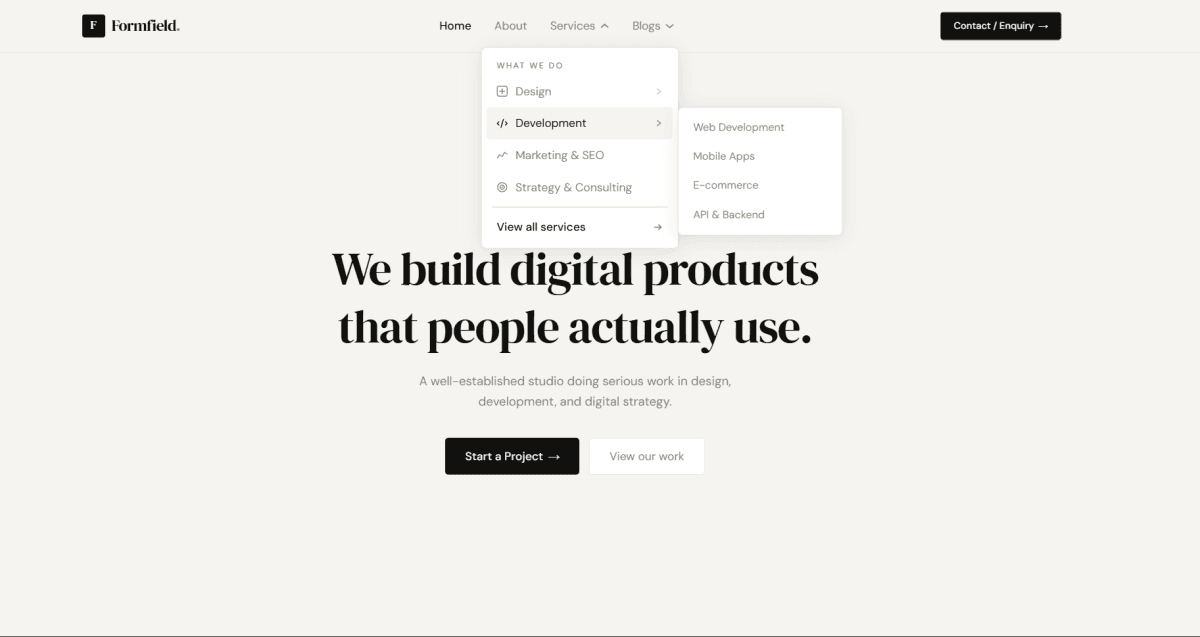
A floating pill-shaped navbar built with React, Tailwind CSS, and TypeScript - fixed at the top center of the viewport with a soft border and shadow. Navigation links are defined as a data array so adding or removing items is just editing one object, no JSX changes needed. The Services link has a multi-item dropdown that appears on hover using pure CSS group utilities - group-hover:opacity-100, group-hover:pointer-events-auto, group-hover:translate-y-2 - no JavaScript state required for the open/close logic. The dropdown chevron icon does a clean swap between ChevronDown and ChevronUp using layered absolute positioning and opacity transitions. The contact button is a separate PulseContactButton component with an animated pulse ring behind it using Tailwind's built-in animate-pulse on an absolutely positioned background span. Fully typed in TypeScript with prop types for the button component and clean separation between the navbar data, layout, and the reusable button.
Install
npm install tailwindcss @tailwindcss/vite lucide-reactDependencies
Discussion
Feedback, implementation tips, and usage notes.
Comments
Sign in to join the conversation
Similar Components
More from the same category