

Featured Work
Top components by engagement


Color Palettes
1 public palette
sadie-sink
#3b82f6All Components
44 published components
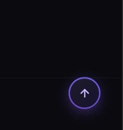
Scroll to Top Button with Progress Ring
A smooth animated scroll-to-top FAB button with circular SVG progress ring, live scroll percentage, ripple effect, and pulse glow. Pure HTML, CSS & JavaScript.
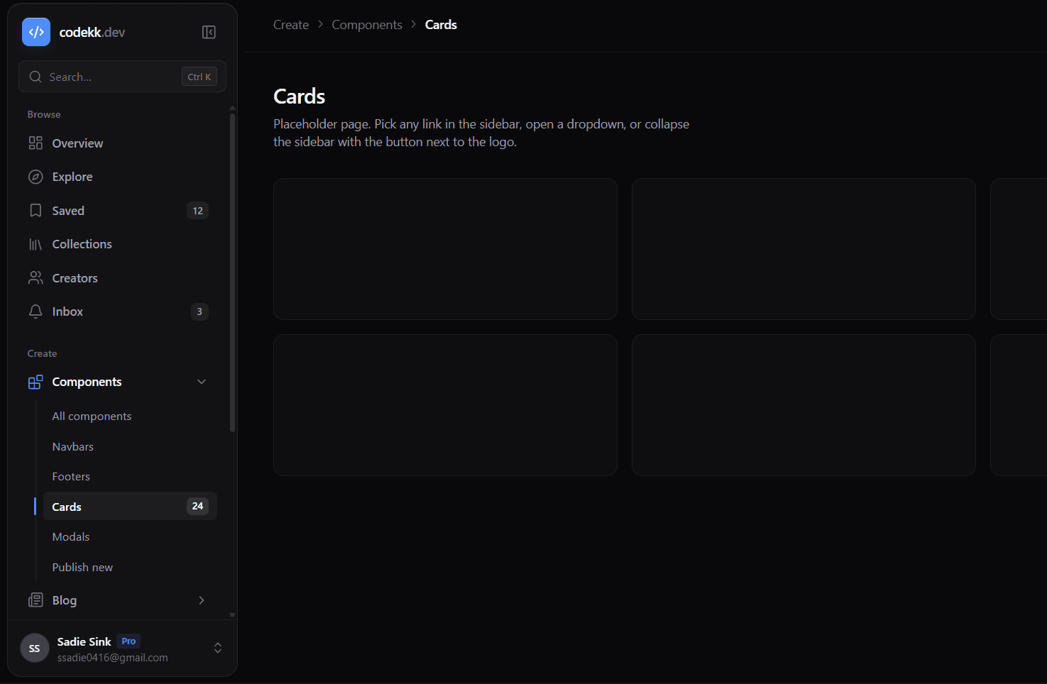
Sidebar - React Admin Dashboard Sidebar
A free React admin dashboard sidebar built with TypeScript, Tailwind CSS, and Lucide icons. It works as the main navigation for admin panels, SaaS dashboards, and internal tools. Links are grouped into titled sections, and any link can become a dropdown with nested sub-links. Open groups expand with a smooth height animation, and the active sub-link is marked with an accent line on the guide rail. If the active link is inside a group, that group opens automatically. Badges show either a counter (like unread messages) or a text pill like "New" or "Soon", and any link can be disabled. On desktop, the sidebar collapses into a slim icon rail with the button next to the logo. In the rail, hovering a link shows a tooltip, and clicking a dropdown group opens a flyout menu beside it. Hovering the logo turns it into an expand button. On mobile, the sidebar becomes a slide-in drawer with a dimmed backdrop that locks page scroll and closes with Escape, a backdrop tap, or after picking a link. The search button supports a Ctrl K / ⌘K shortcut and shows the right key for the user's OS. The user menu at the bottom shows the name, email, and role, with Profile, Settings, and Log out actions. It falls back to initials when there is no avatar image. A single accentColor prop takes any hex color and themes the active states, focus rings, badges, and logo. Collapsed state and the active link can be controlled or left to the component. The onNavigate callback lets you plug in React Router or Next.js routing, and a findSidebarLink helper builds breadcrumbs from the same data. All links live in one data file, so you can edit the menu without touching the component. Animations are turned off when prefers-reduced-motion is enabled. It works in Vite, Create React App, and Next.js.
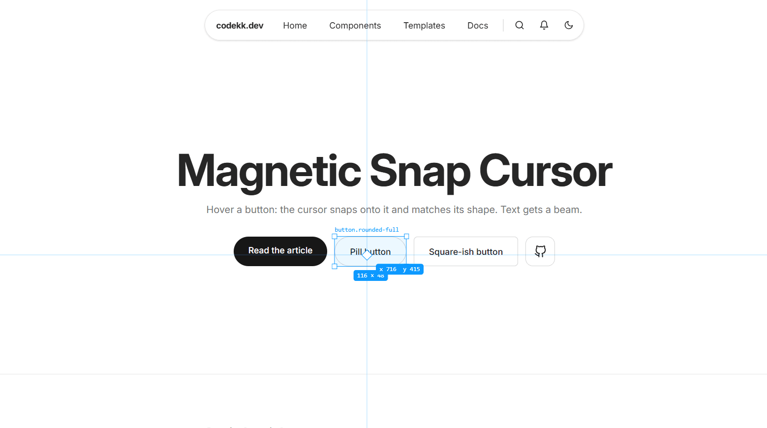
Blueprint Inspector Cursor - React Figma-Style Cursor
A design-tool cursor for React built with TypeScript, Motion, and Tailwind CSS v4. It makes your site feel like inspecting a layer in Figma, a great fit for developer portfolios, design system docs, and dev tool landing pages. Thin crosshair lines follow the pointer across the whole screen, and a small chip beside it shows your exact x and y position. When you hover a button, link, image, or input, a selection box springs onto it with corner handles. The element's name sits on top, like button or a.rounded-full, and its exact size sits underneath, like 148 × 44. Moving between elements makes the box glide from one to the next, and clicking pinches the diamond at the pointer. Props set the accent color, toggle the crosshair lines and coordinates, and add padding around the box. The inspectAll option makes the box follow everything you hover, including text and layout containers, while skipping page-sized wrappers. Data attributes let you set custom labels, inspect non-interactive elements, or hide the cursor in a section. The cursor never moves your elements, so it works alongside other animated components. It only turns on for a mouse or trackpad, so touch devices are unchanged. With prefers-reduced-motion enabled, the box jumps to each element instead of gliding. All cursor layers are hidden from screen readers and ignore pointer events. It works in Vite, Create React App, and Next.js.
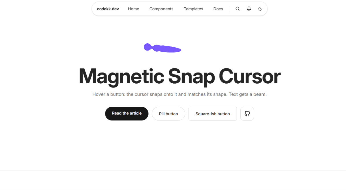
Liquid Trail Cursor - React Gooey Metaball Cursor
A gooey, metaball-style custom cursor for React built with TypeScript and Tailwind CSS v4, with no animation library needed. A chain of blobs trails behind the pointer and melts together like liquid, using an SVG goo filter that blurs the blobs and then sharpens their edges so they fuse into one shape. When you move fast, it stretches into a long, wobbly tail, and when you stop, it pulls back into a single drop. Over links and buttons, the head swells into a big drop and the tail tucks in, so it reads as one rounded bead. The drop also turns see-through, so button text and icons stay readable underneath it. Pressing the mouse squishes the drop, and clicking splashes out droplets that fly apart and fade away. Props control the color, size, tail length, how tightly the blobs follow each other, how much the drop swells, and how see-through it gets over buttons. An invert option swaps the color for a difference blend that inverts whatever is underneath, so the cursor stays visible on any background. Data attributes let you force the swell on any element, hide the cursor in a section, or stop it from swelling in specific areas. Everything runs in a single requestAnimationFrame loop that moves the blobs directly, so moving the mouse never causes React to re-render. It only turns on for devices with a mouse or trackpad. On phones and tablets it doesn't render at all, and touch behavior stays normal. When prefers-reduced-motion is enabled, the tail and splash are switched off and it becomes a single blob that follows the pointer. All cursor layers are hidden from screen readers and ignore pointer events, so clicks and keyboard navigation work exactly as before. It works in Vite, Create React App, and Next.js.
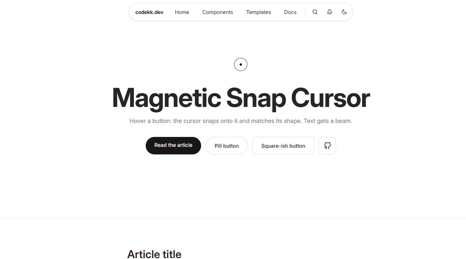
Snap Cursor - React Context-Aware Animated Cursor
A context-aware snap cursor for React built with TypeScript, Motion, and Tailwind CSS v4. It checks what's under the pointer and snaps into a matching shape. By default, it's a small dot with a ring that trails slightly behind on a spring. Over links and buttons, the ring swells into a solid disc that inverts the colors beneath it with a difference blend mode, so it stays visible on light, dark, and image backgrounds. Over paragraphs, headings, and text inputs, it morphs into a thin caret that matches the line height of the text, so it grows over a large hero heading and shrinks over body text. Any element with data-cursor-label gets a large disc with a word inside, like "View" or "Open," which works well for project cards, galleries, and image links. Clicking squeezes the cursor slightly, like a button press. Data attributes give you control over any part of the page: hide the cursor in a section, force the disc on a non-link element, or turn off the caret on specific text. The nearest element with an attribute wins, so a label on a card overrides the caret for the text inside it. The cursor also updates while scrolling, so it changes shape when content moves under a still pointer. It only turns on for devices with a mouse or trackpad. On phones and tablets it doesn't render at all, and touch behavior stays normal. When prefers-reduced-motion is enabled, the ring follows the pointer directly instead of trailing, while shape changes stay. All cursor layers are hidden from screen readers and ignore pointer events, so clicks and keyboard navigation work exactly as before. It works in Vite, Create React App, and Next.js.
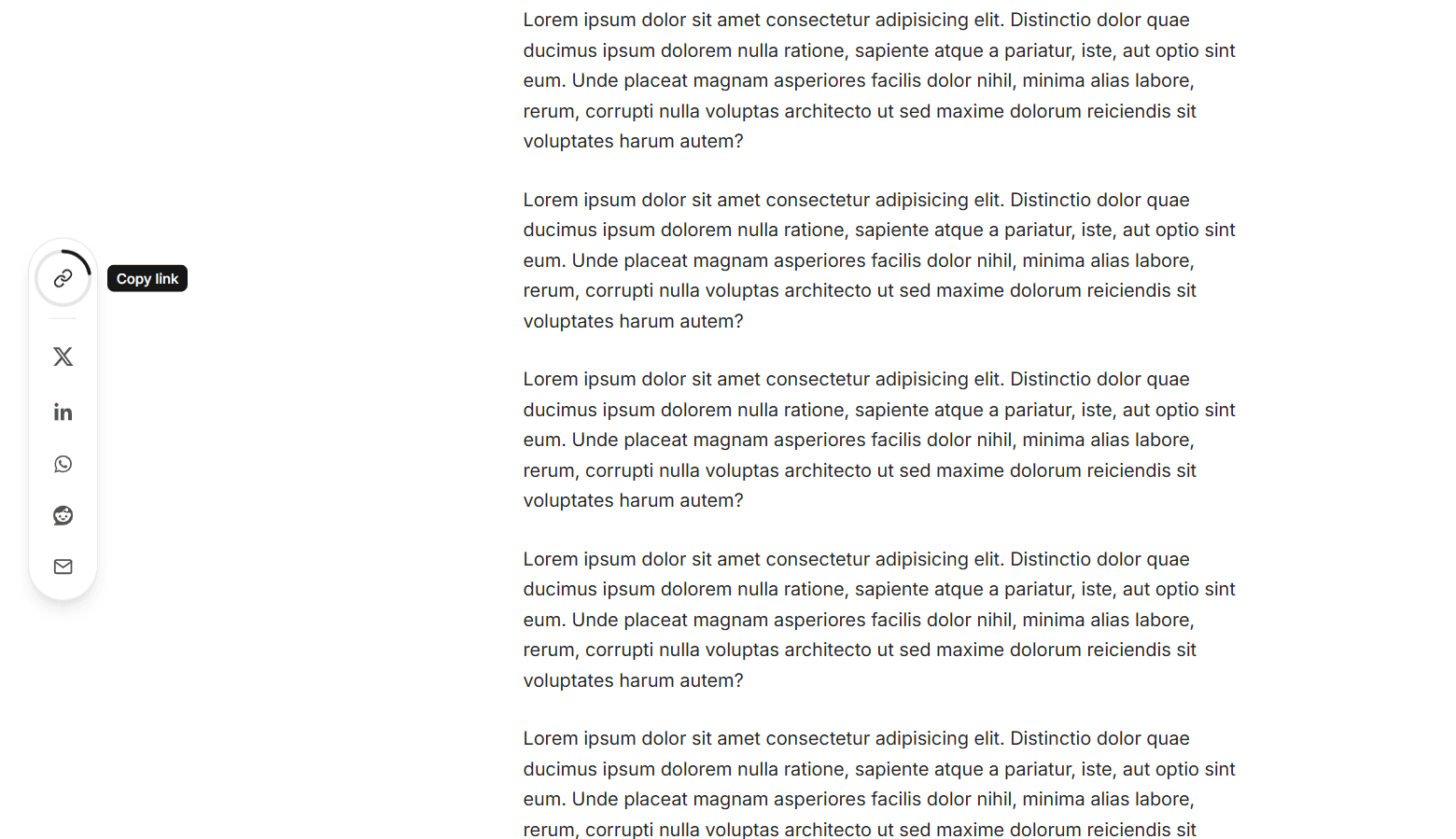
Share Dock - React Sticky Share Sidebar with Reading Progress
A sticky vertical share rail for React, built with TypeScript, Motion, React Icons, and Tailwind CSS v4. It's made for blog posts, articles, and documentation pages. The dock stays hidden at first and slides in from the screen edge with a spring animation once the reader scrolls past a set point. It slides back out when they scroll back up. The top button is a reading progress ring that fills as the reader moves through the page and shows a live percentage in the center. On hover, the percentage fades into a link icon, and clicking it copies the page URL. The icon then turns into a green check mark and the ring turns green. Pass a target ref to track progress through a specific article instead of the whole page, so the ring reaches 100% at the end of the content rather than at the footer. The share icons have macOS-dock-style magnification: as the cursor moves along the rail, the nearest icon grows and its neighbors grow a little less, all driven by smooth springs. Each icon fills with its brand color on hover or focus, and a label pill slides out beside it. It supports X, LinkedIn, Facebook, WhatsApp, Telegram, Reddit, and email. The networks prop sets which icons appear and in what order, and the side prop places the dock on the left or right edge. The label pills automatically open toward the content. The page URL and title are read when the dock first appears rather than on render, so it is safe to server-render in Next.js. Copying falls back to a hidden textarea on non-secure http:// pages. The rail is a labeled nav landmark, every button has an accessible label, and a polite live region announces "Link copied" to screen readers. Dark mode styles and a frosted glass background are included. When prefers-reduced-motion is enabled, magnification is turned off and the dock fades in instead of sliding. The dock is hidden below the md breakpoint by default to keep mobile reading clean. It works in Vite, Create React App, and Next.js.
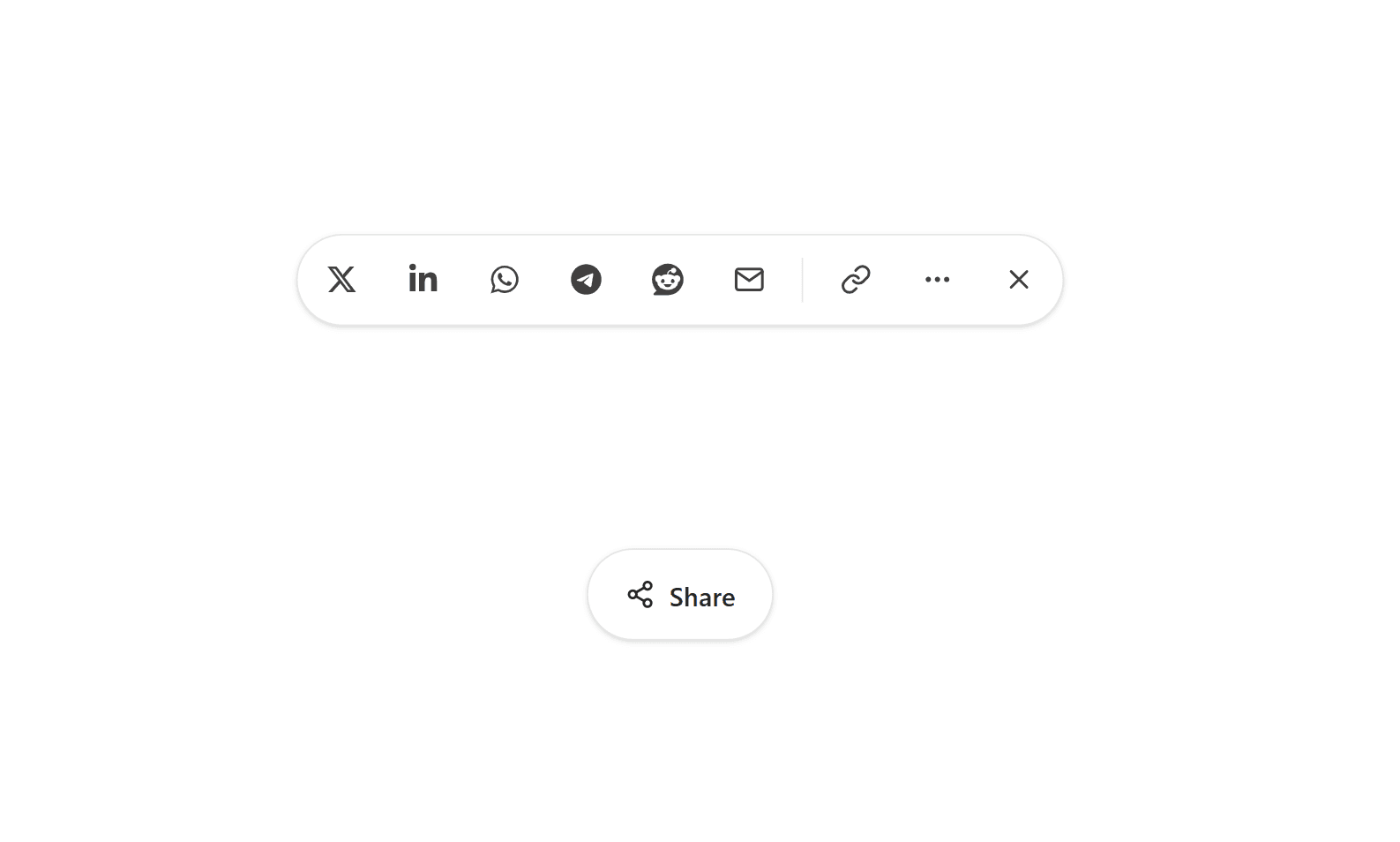
Share Button - React Animated Social Share Menu
An animated share button for React built with TypeScript, Motion, React Icons, and Tailwind CSS v4. It starts as a compact "Share" pill. On click, it stretches open with a spring layout animation and the share targets pop in one after another. Each target lifts slightly on hover and fills with its own brand color, using a CSS variable per button so one class handles every network. It supports X, LinkedIn, Facebook, WhatsApp, Telegram, Reddit, and email, and the networks prop lets you choose which ones appear and in what order. The copy link button copies the URL to the clipboard and swaps its link icon for a green check mark with a quick rotate animation. It falls back to a hidden textarea copy on non-secure http:// pages where the Clipboard API is blocked. A "More" button opens the device's native share sheet, and it only appears on browsers that support navigator.share, so desktop users never see a button that does nothing. The close button spins a quarter turn on hover. The page URL and title are read when the button is clicked rather than on render, so the component is safe to server-render in Next.js. When the menu opens, focus moves to the first share target. Pressing Escape or the close button returns focus to the trigger, and clicking outside closes the menu. A polite live region announces "Link copied" to screen readers, and every icon button has an accessible label. Dark mode styles are included, and when prefers-reduced-motion is enabled, the morph, lift, and spin animations are turned off. It works in Vite, Create React App, and Next.js.
Share Sheet - React Morphing Share Panel
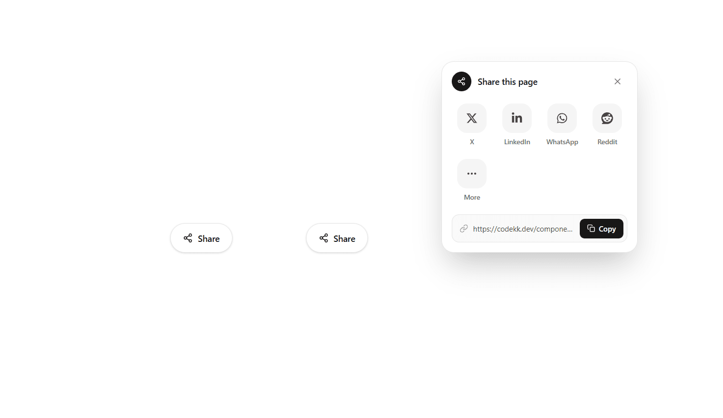
A share button for React that morphs into a full share panel, built with TypeScript, Motion, Tailwind CSS v4, and React Icons. When clicked, the pill-shaped button stretches into a rounded panel using a shared layout animation, and the share icon flies from the button into the panel's header. The heading slides in, the close button spins into place, and the share targets rise in one after another on a stagger. It supports X, LinkedIn, Facebook, WhatsApp, Telegram, Reddit, and Email, laid out in a tidy four-column grid, and the networks prop picks which ones appear and in what order. Hovering or focusing a tile lifts it, fills it with the platform's brand color, and adds a soft glow in the same color. Below the grid, a read-only link field selects the whole URL on focus, and its Copy button springs into a green "Copied" state with a check mark and announces "Link copied" to screen readers. It uses the Clipboard API with a fallback for older browsers. On devices that support the Web Share API, an extra "More" tile opens the device's native share sheet. The placement prop opens the panel above or below the button, and align pins it to the button's left or right edge, so it fits in a footer, a header, or a corner of the page. An invisible placeholder keeps the button's space while the panel is open, so nearby content never jumps. The shared URL and title default to the current page and document.title, and are read at the moment the panel opens, so they stay correct in single-page apps. The panel closes on Escape, on a click outside, or with the close button, and morphs back into the button. Focus moves to the first target when it opens and returns to the button when closed with the keyboard. Dark mode is built in through Tailwind's dark: variants. When prefers-reduced-motion is enabled, the movement and morphing are turned off and elements simply fade. It works in Vite, Create React App, and Next.js.
Radial Share Button - React Animated Share Menu
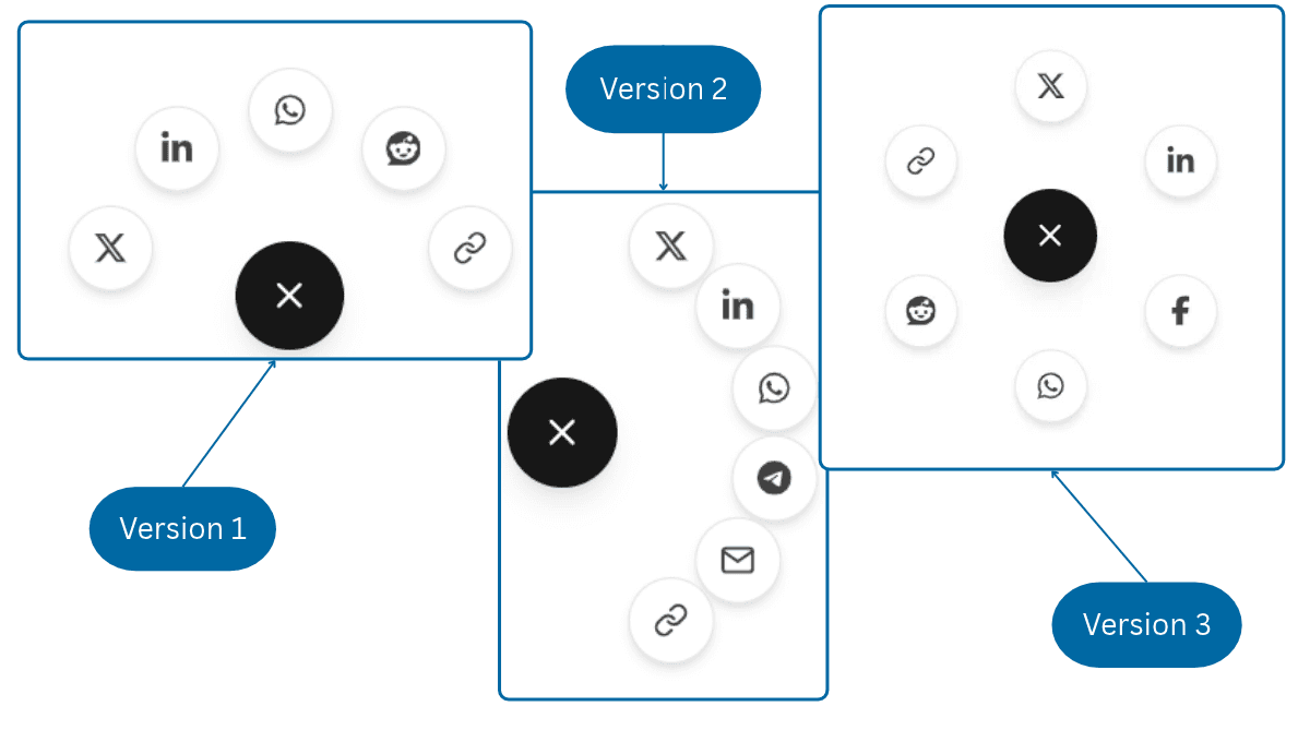
A round share button for React built with TypeScript, Motion, Tailwind CSS v4, and React Icons. When clicked, the share icon spins into an X, a ripple ring pulses outward, and the share targets burst out along an arc on springy, staggered animations. When it closes, they fly back into the center in reverse order. The arc is fully configurable. direction sets which way it opens (up, down, left, or right), radius sets how far the targets travel, and spread sets the arc width, so it can be a tight fan, a wide semicircle, or a full 360° ring with evenly spaced targets. It supports X, LinkedIn, Facebook, WhatsApp, Telegram, Reddit, Email, and Copy link, and the targets prop picks which ones appear and in what order. Hovering or focusing a target makes it grow, fill with the platform's brand color, and show a tooltip label. The Copy link target uses the Clipboard API with a fallback for older browsers, flips to a green check mark, and announces "Link copied" to screen readers. The shared URL and title default to the current page and document.title, and are read at the moment the menu opens, so they stay correct in single-page apps. Share links open in a new tab with noopener noreferrer. The menu closes on Escape or on a click outside. Focus moves to the first target when it opens and returns to the button when it closes. The button uses aria-expanded and aria-controls, and every target has an accessible label. Dark mode is built in through Tailwind's dark: variants. When prefers-reduced-motion is enabled, the springs, spin, and ripple are replaced with a simple fade. It works in Vite, Create React App, and Next.js.
Magnetic Social Links - React Animated Footer Social Icons
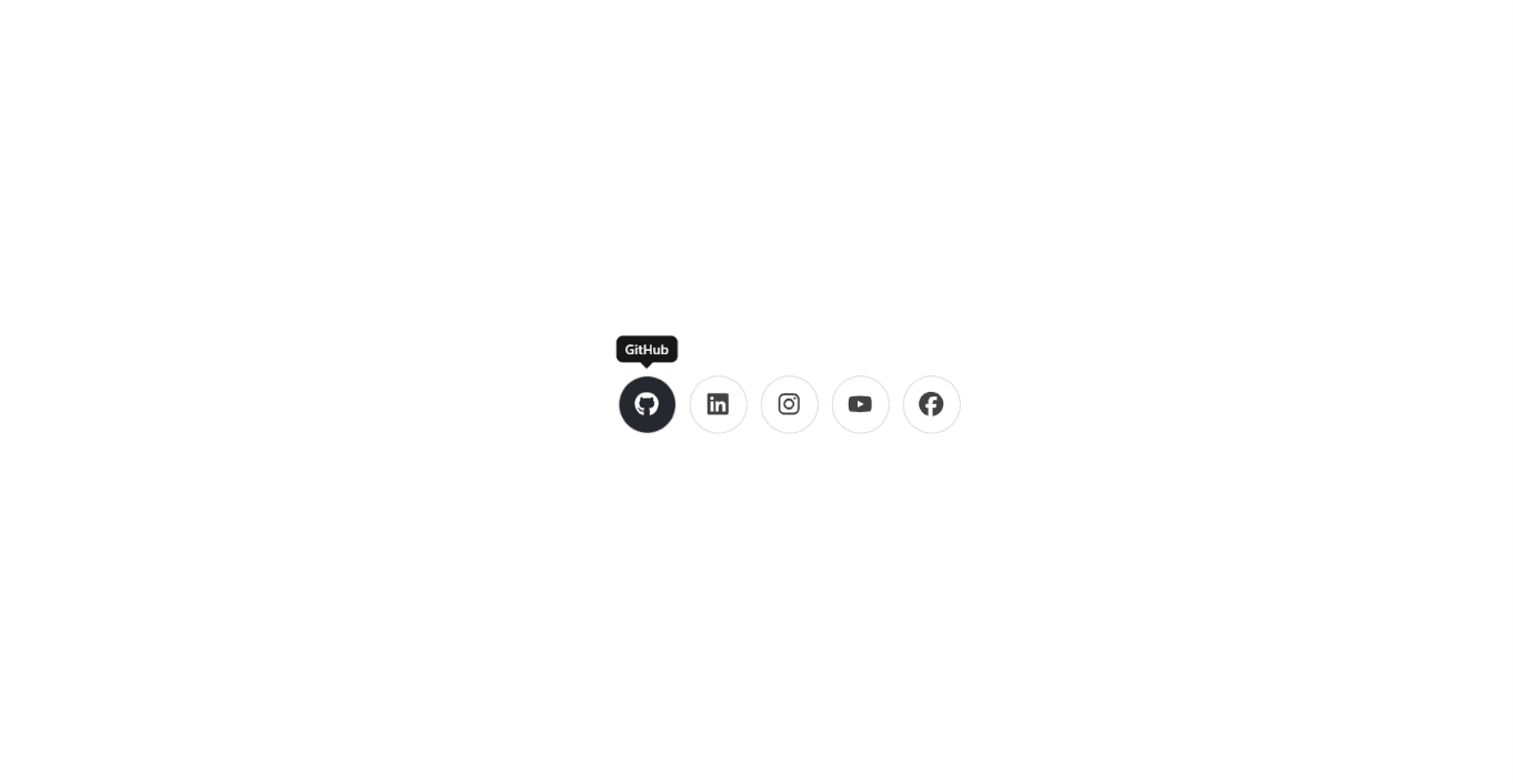
A set of animated social media icons for React built with TypeScript, Framer Motion, React Icons, and Tailwind CSS. It works well for portfolio footers, landing pages, personal sites, link-in-bio pages, and contact sections. Each icon sits in a round outlined button, and hovering or focusing it with the keyboard starts four effects together. The button leans toward the cursor with a springy magnetic pull. The brand color rises inside the circle like liquid, from a tilted, rounded blob that straightens as it fills. The icon rolls up and out while a white copy rolls in from below. A small tooltip with the platform name pops up above the button. The icons also fade and slide up one after another the first time the list scrolls into view, and each button shrinks slightly when tapped. The color for each link accepts any CSS background value, so you can use a solid brand hex or a gradient such as Instagram's. Pass your own links array with any icon from React Icons, or use the built-in defaults for GitHub, X, LinkedIn, Instagram, YouTube, and Discord. The size prop sets the button diameter, and the icon scales with it. The borders and tooltip adapt to light and dark mode through Tailwind's dark: classes. Every link has an accessible label, opens in a new tab with rel="noopener noreferrer", and shows a visible focus ring for keyboard users. When prefers-reduced-motion is enabled, the magnetic pull and rolling motion are turned off and the hover falls back to a simple color fade. It works in Vite, Create React App, and Next.js.
Service Company Navbar - Bootstrap 5 Mega Menu with Top Bar
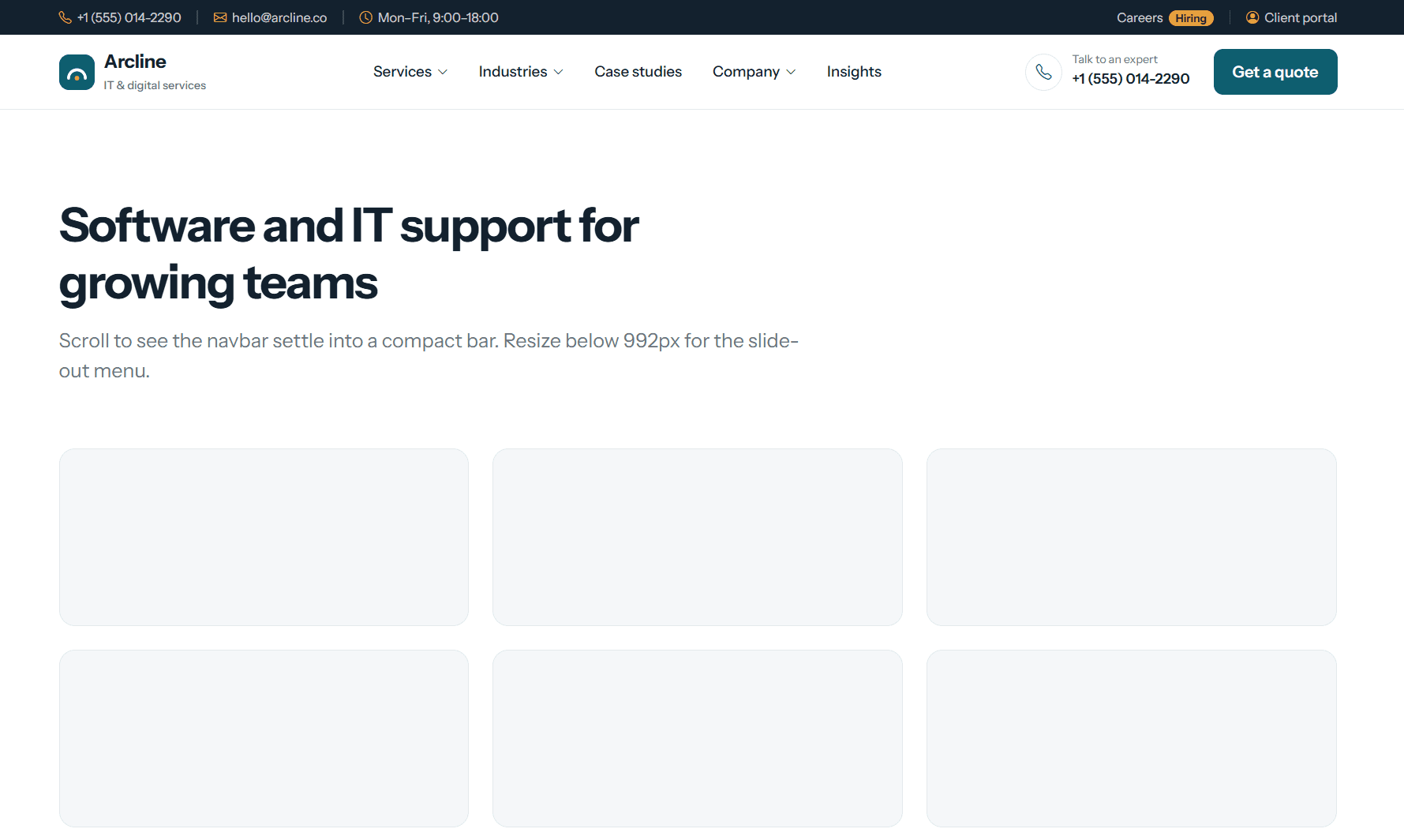
A professional, conversion-focused navbar for service-based businesses, built with Bootstrap 5.3, Bootstrap Icons, HTML, CSS, and vanilla JavaScript, with no build step. It fits IT agencies, consultancies, marketing agencies, law and accounting firms, clinics, and any company that wants visitors to call or request a quote. A dark top bar shows the phone, email, and office hours, plus Careers (with a "Hiring" tag) and a Client portal link. It scrolls away while the main navbar stays pinned. The Services link opens a full-width mega menu with six services in two columns, each with an icon, title, and short description, next to a highlighted panel for booking a free consultation. Industries and Company dropdowns, plus Case studies and Insights links, complete the menu. On the right, a "Talk to an expert" phone number sits beside a "Get a quote" button. Only one dropdown stays open at a time, and the navbar becomes compact with a soft shadow once it reaches the top of the screen. Below 992px, the navbar shows the logo, a tap-to-call button, and a menu button. The menu slides out from the right with every section, a contact card, and a full-width "Get a quote" button. It closes when a link is chosen or the window is resized to desktop. All colors are CSS variables, so the navbar can be rebranded in seconds. Accessibility includes arrow-key dropdown navigation, ARIA labels, aria-current on the active link, visible focus rings, and reduced-motion support. It works in plain HTML sites, WordPress themes, PHP templates, and any backend that renders HTML.
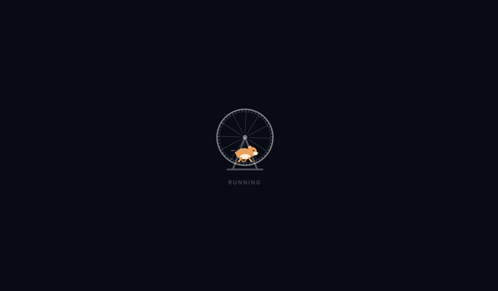
Running Wheel Loader - React Hamster Loading Animation
A playful hamster wheel loader for React built with TypeScript, Framer Motion, SVG, and Tailwind CSS. A little hamster runs in an exercise wheel while the wheel turns under its feet, a friendly loading state for pet stores, fitness apps, kids' products, playful brands, and "working on it" moments. The wheel's spokes and tread rungs rotate clockwise, the direction the hamster's steps would actually push it, while the rim, hub, and stand stay still like on a real wheel. Each leg swings back and forth from the hip along a smooth arc, with diagonal legs moving together like a real trot. The far-side legs are slightly faded and drawn behind the body for a sense of depth. Leg motion is animated through each line's endpoint rather than CSS rotation, which avoids transform-origin issues and stays consistent across browsers. The body bobs slightly with every step, and speed streaks trail behind the hamster. The stride is tied to the wheel speed, so a single `speed` prop makes the hamster sprint or jog in sync with the wheel. The hamster is drawn entirely in SVG, with a rounded body and belly, an ear with a pink inner ear, a glinting eye, a snout with a pink nose, a blush, and a little tail. The `color` prop sets the fur color, so the hamster can be golden, grey, white, or a brand-colored mascot. The wheel and stand use `currentColor`, so they adapt to light or dark themes automatically. The wrapper uses `role="status"` with an accessible label, and the visuals are hidden from screen readers. When `prefers-reduced-motion` is enabled, the hamster stands still in the wheel and the wheel stops turning. It works in Vite, Create React App, and Next.js.
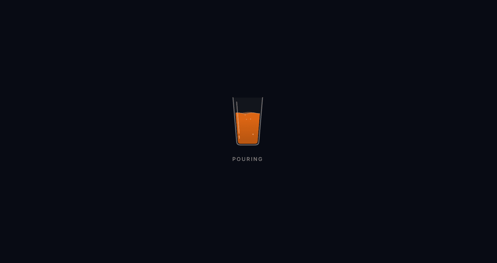
Pour Loader - React Liquid Fill Animation for Drink Brands
A liquid fill loader for React built with TypeScript, Framer Motion, SVG, and Tailwind CSS, designed for beverage brands, juice bars, coffee shops, breweries, and soda websites. A glass fills with a fizzy drink, holds for a moment, then drains and refills in a smooth loop. The surface is made of two wave layers that slide in opposite directions at different speeds, so the liquid looks like it's really moving rather than rising as a flat block. Each wave is wider than the glass and shifts by exactly one wavelength per loop, so the motion never jumps or resets. The front wave has a thin bright surface line, and a subtle gradient darkens the drink toward the bottom for depth. Fizz bubbles wobble their way up and disappear at the surface. They're clipped to the liquid itself, so they never float in the empty part of the glass, and the clip animates an SVG attribute rather than a CSS transform for reliable cross-browser rendering. A glass shine completes the look. The color prop sets the drink to any brand or flavor color, and bubbles={false} turns the fizz off for still drinks like juice, coffee, or smoothies. The optional progress prop turns the loader into a real progress indicator: the glass fills smoothly to the given level with spring motion and stays there, the label shows the percentage, and the wrapper switches to role="progressbar" with proper ARIA values. The glass outline uses currentColor, so it adapts to light or dark themes. Clip and gradient IDs come from React's useId, so multiple loaders can share a page without conflicts. When prefers-reduced-motion is enabled, the drink sits still at 65% full, or at the progress level if one is set. It works in Vite, Create React App, and Next.js.
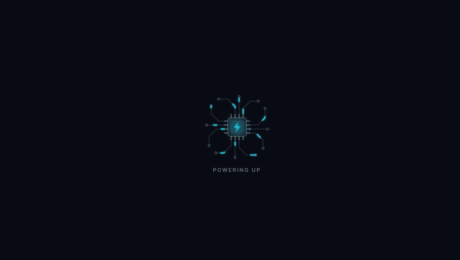
Circuit Board Loader - React Electronics Loading Animation
A circuit board loader for React built with TypeScript, Framer Motion, SVG, and Tailwind CSS, designed for electronics stores, tech brands, EV charging, and smart home websites. A microchip sits at the center of a small circuit board, and bursts of electric current race along copper traces from all four sides into it. When the current arrives, a lightning bolt on the chip flickers like a live connection, and a soft halo around the chip breathes with the flow of power. The board has realistic detail: 12 traces with angled bends, ring-shaped vias where each trace starts, four pins on every side of the chip, an inner die outline, and a pin-1 orientation dot in the corner. The traces for one side are defined once and rotated for the other three, so the board stays perfectly symmetrical. Each pulse is a short glowing dash animated along its trace with pathLength and strokeDashoffset, and the gap after it is longer than the trace, so each trace carries exactly one pulse at a time. The 12 pulses fire in a shuffled order but stay evenly spaced in time, so the board always looks active without everything flashing at once. The bolt flickers on an irregular rhythm for a more electric feel. A single color prop sets the pulses, bolt, and halo, so the loader matches any brand color. The board lines use currentColor at low opacity, so they adapt to light or dark themes automatically. SVG filters add a tight glow to the pulses and a wide halo behind the chip, with IDs from React's useId, so multiple loaders can share a page without conflicts. The wrapper uses role="status" with an accessible label, and the visuals are hidden from screen readers. When prefers-reduced-motion is enabled, the pulses are hidden and the chip and bolt stay steadily lit. It works in Vite, Create React App, and Next.js.
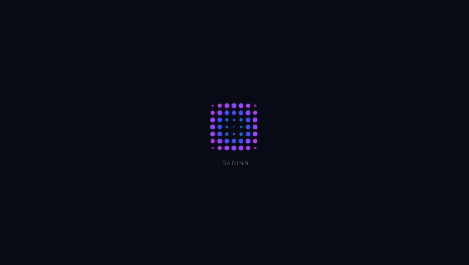
Ripple Grid Loader - React Dot Spinner
A ripple grid loader for React built with TypeScript, Framer Motion, SVG, and Tailwind CSS. A square grid of glowing dots, 7 × 7 by default, pulses with a wave that keeps rippling outward, like a stone dropped into still water. Each dot's start time is based on its distance from the ripple's origin, so the wave spreads in a smooth circle rather than row by row. In each cycle, a dot swells and brightens quickly, settles back, then rests until the next wave arrives, which gives the motion a clear rhythm instead of a constant shimmer. The wave takes 40% of the cycle to cross the grid, so a new ripple always starts cleanly after the last one fades. Dot colors follow the ripple too, blending from cyan at the origin through blue to magenta at the farthest dots. The origin prop switches the effect: "center" ripples outward from the middle, and "corner" sweeps a diagonal wave from the top-left, so one component gives you two distinct loaders. Grid size is adjustable with the grid prop, and dot sizes scale with the spacing, so a 3 × 3 grid and an 11 × 11 grid both keep the same proportions. Dot positions, colors, and timing are calculated once with useMemo, and each dot animates its radius and opacity on a native SVG circle. An SVG blur filter adds a soft neon glow, and the filter ID comes from React's useId, so multiple loaders can share a page without conflicts. The wrapper uses role="status" with an accessible label, and the visuals are hidden from screen readers. When prefers-reduced-motion is enabled, the grid stays still, brightest at the origin and fading toward the edges. It works in Vite, Create React App, and Next.js.
DNA Helix Loader - React Loader Spinner
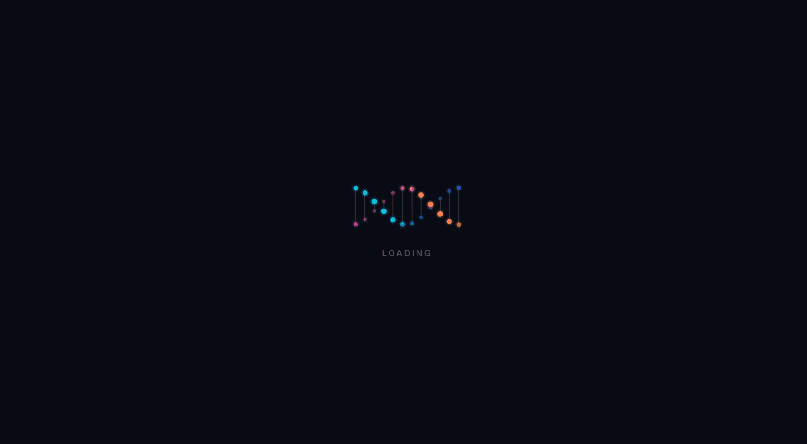
A DNA helix loader for React built with TypeScript, Framer Motion, SVG, and Tailwind CSS. Two strands of glowing dots twist around each other, joined by thin rungs, like a rotating strand of DNA. The 3D effect needs no 3D library or canvas. Each dot moves up and down on a sine wave, and a matching cosine controls its depth. Dots swinging toward the viewer grow to full size and brightness, while dots at the back shrink to about half size and fade, so the flat SVG reads as a helix turning in space. Each column starts slightly further along its turn than its neighbor, which creates the twist, and the second strand runs half a turn behind the first so the strands always cross. All motion is precomputed into smooth keyframe loops with useMemo, and each dot animates its position, radius, and opacity through Framer Motion on native SVG circles. The rungs stretch and shrink as the dots move, and they use currentColor at low opacity so they adapt to light or dark themes. The top strand blends cyan to blue from left to right and the other blends magenta to orange, with every dot's color calculated from its position. An SVG blur filter adds a soft neon glow. The number of dot pairs is adjustable with the dots prop, and spacing recalculates automatically. Filter IDs come from React's useId, so multiple loaders can share a page without conflicts. The wrapper uses role="status" with an accessible label, and the visuals are hidden from screen readers. When prefers-reduced-motion is enabled, the helix freezes in a twisted pose instead of disappearing. It works in Vite, Create React App, and Next.js.
Orbit Frame Loader - React Loading Animation
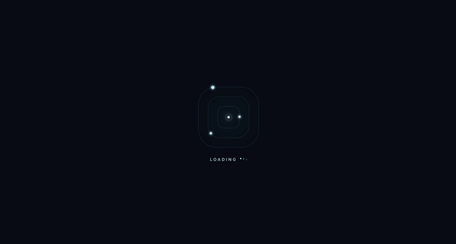
An orbit frame loader for React built with TypeScript, Motion, SVG, and Tailwind CSS. Three nested rounded-square tracks surround a softly pulsing core, and a glowing dot travels along each track. Each dot follows its track's exact SVG path using <animateMotion> with <mpath>, so it stays on the line the whole way around, including through the rounded corners. The three dots move at different speeds (4.8s, 3.6s, and 2.7s per lap), and the middle dot runs in the opposite direction. Staggered start times spread the dots apart from the first frame, so they never bunch up. The dots are cyan, fuchsia, and emerald, and an SVG blur filter gives them a soft neon glow. Tracks use vector-effect: non-scaling-stroke, so they stay a crisp 1px line at any size. A faint cyan ambient glow sits behind the tracks, and the center core breathes in and out with a Motion scale and opacity loop. An optional label below the loader comes with three bouncing dots. All tracks are generated from a single TRACKS config array, so you can change speed, direction, color, dot size, or start position by editing one line. Gradient and filter IDs come from React's useId, so multiple loaders can share a page without conflicts. The wrapper uses role="status" with an accessible label, and the visual parts are hidden from screen readers. When prefers-reduced-motion is enabled, the dots stop on the top edge of their tracks and the pulse and bouncing dots stop too. It is designed for dark backgrounds and works in Vite, Create React App, and Next.js.
Animated Pill Loader - React Loading Indicator
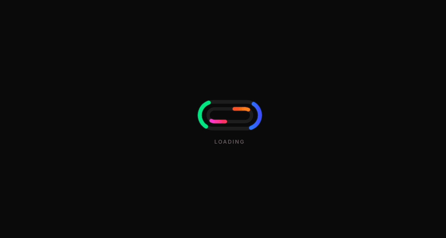
An animated pill loader for React built with TypeScript, Framer Motion, and SVG. The wide 2:1 shape fits naturally inside buttons, headers, cards, and inline loading states, where a square spinner feels too bulky. Two nested pill-shaped tracks each carry a pair of glowing comet runners that chase each other around the loop. The outer pair moves clockwise, and the inner pair moves counter-clockwise at a slower pace and starts a quarter-lap offset, so the runners keep crossing past each other instead of lining up. Each loop is a single SVG path animated through strokeDashoffset. With pathLength={1}, the dash and gap add up to exactly half the path, so the pattern repeats twice per lap and gives you two runners from one element. The outer loop uses a green-to-cyan-to-blue gradient and the inner loop an orange-to-red-to-magenta gradient running in the opposite direction, both softened with a Gaussian blur glow filter. Faint background tracks use currentColor at low opacity, so the shape stays visible and adapts to light or dark themes. Gradient and filter IDs come from React's useId, so multiple loaders can share a page without conflicts. The wrapper uses role="status" with an accessible label, and the pulsing visible label is hidden from screen readers so the status is announced once, not twice. All motion stops when prefers-reduced-motion is enabled. Size, speed, and label are configurable via props. It works in Vite, Create React App, and Next.js, and pairs with the Animated Loop Loader for a matching set.
Animated Loop Loader - React JS Loading Spinner
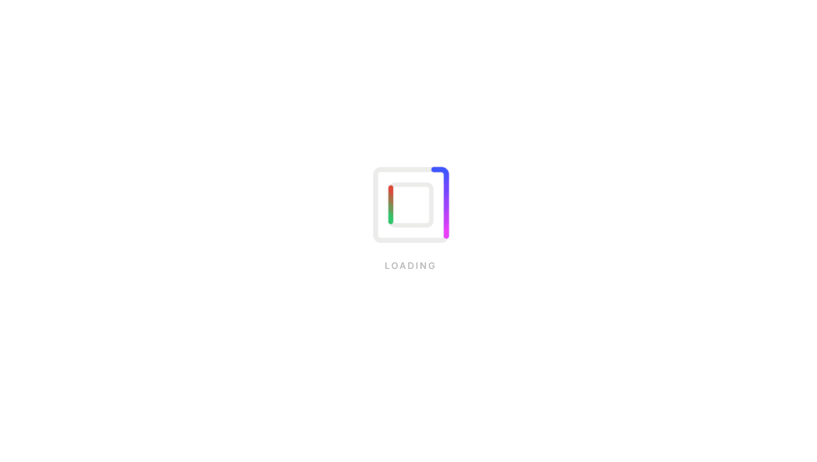
An animated loop loader component for React JS built with TypeScript, Framer Motion, and SVG, useful as a page loader, a spinner for async states, or a splash screen indicator. Two rounded-square tracks are nested inside each other, and a glowing gradient runner travels around each one. The outer runner moves clockwise and the inner runner moves counter-clockwise at a slightly slower pace, so the two loops constantly shift against each other instead of syncing up. Each runner is a single SVG path animated through strokeDashoffset, with pathLength={1} normalizing the dash values so the runner length stays consistent at any size. The outer loop uses a cyan-to-blue-to-magenta gradient and the inner loop uses an orange-to-red-to-green gradient, both softened with a Gaussian blur glow filter. Faint background tracks use currentColor at low opacity, so the frame adapts automatically to light or dark themes. Gradient and filter IDs are generated with React's useId, so you can render multiple loaders on the same page without ID collisions. An optional pulsing text label sits below the spinner. The loader uses role="status" with an accessible label for screen readers, and all motion stops when the user has prefers-reduced-motion enabled. Size, speed, and label text are configurable via props. It works in Vite, Create React App, and Next.js.
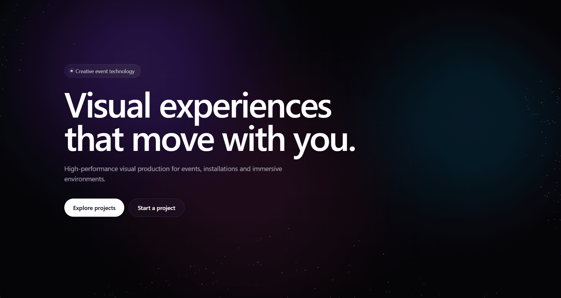
Particle Flow Background - Next.js Canvas Animation
An interactive particle flow background component built with Next.js, TypeScript, and the HTML Canvas API - no third-party animation libraries. Hundreds of particles flow across the canvas following a noise-like vector field built from layered sine and cosine functions - each particle traces a short line segment from its previous position to its current one, which creates the flowing trail effect. Moving the cursor near particles creates a swirl and slight repulsion force so the flow reacts naturally without particles clustering. The animation is throttled with requestAnimationFrame, pauses automatically when the tab is hidden using the Page Visibility API, and stops when the component scrolls out of view using IntersectionObserver. Canvas size tracks the container using ResizeObserver and redraws immediately on resize so the canvas is never empty. Three animated background glow orbs drift slowly using CSS keyframe animations defined in CSS Modules. An optional subtle grid overlay uses a CSS mask-image radial gradient to fade at the edges. All animations respect prefers-reduced-motion - particles freeze and orbs stop when the user has reduced motion enabled. Particle colors, glow colors, density, speed, and spotlight size are all configurable via props. Works as a "use client" component in the Next.js App Router.
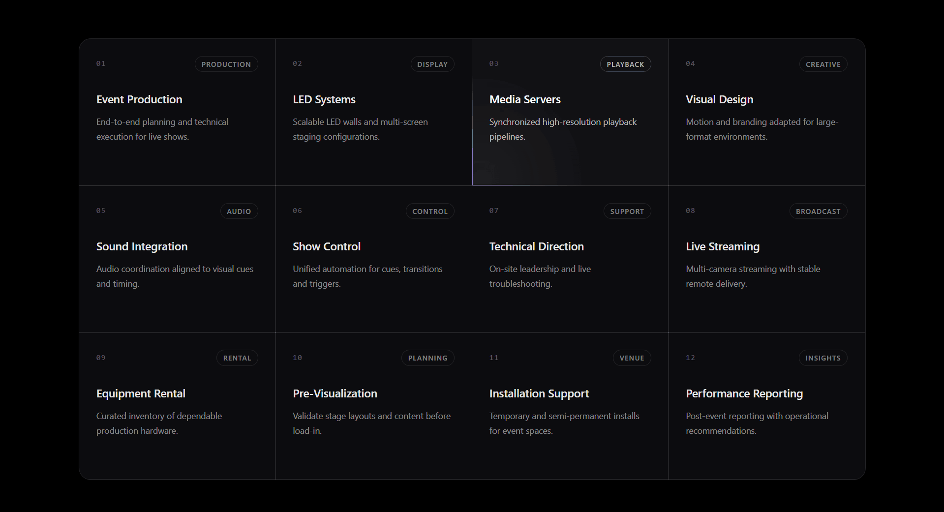
Spotlight Cards Grid Component - Next.js Tailwind CSS
A dark-themed spotlight cards grid built with Next.js and Tailwind CSS. Each card tracks the mouse cursor position using onPointerMove and requestAnimationFrame - the pointer coordinates are written as CSS custom properties --x and --y directly on the card element, then consumed by a radial-gradient on the border highlight layer and the surface wash layer. The border spotlight uses CSS mask compositing to isolate only the 1px border edge so the glow appears on the border only - not the card fill. A second very low opacity radial gradient creates a subtle surface wash that follows the same cursor position. Both effects are throttled to one requestAnimationFrame per pointer event so performance stays smooth even on fast mouse movement. Cards support an optional href that wraps the card in a Next.js Link with a visible focus-visible ring for keyboard users. Spotlight size and accent color are configurable via props and passed as CSS custom properties so every card inherits them from the grid wrapper. Works as a "use client" component in the Next.js App Router.
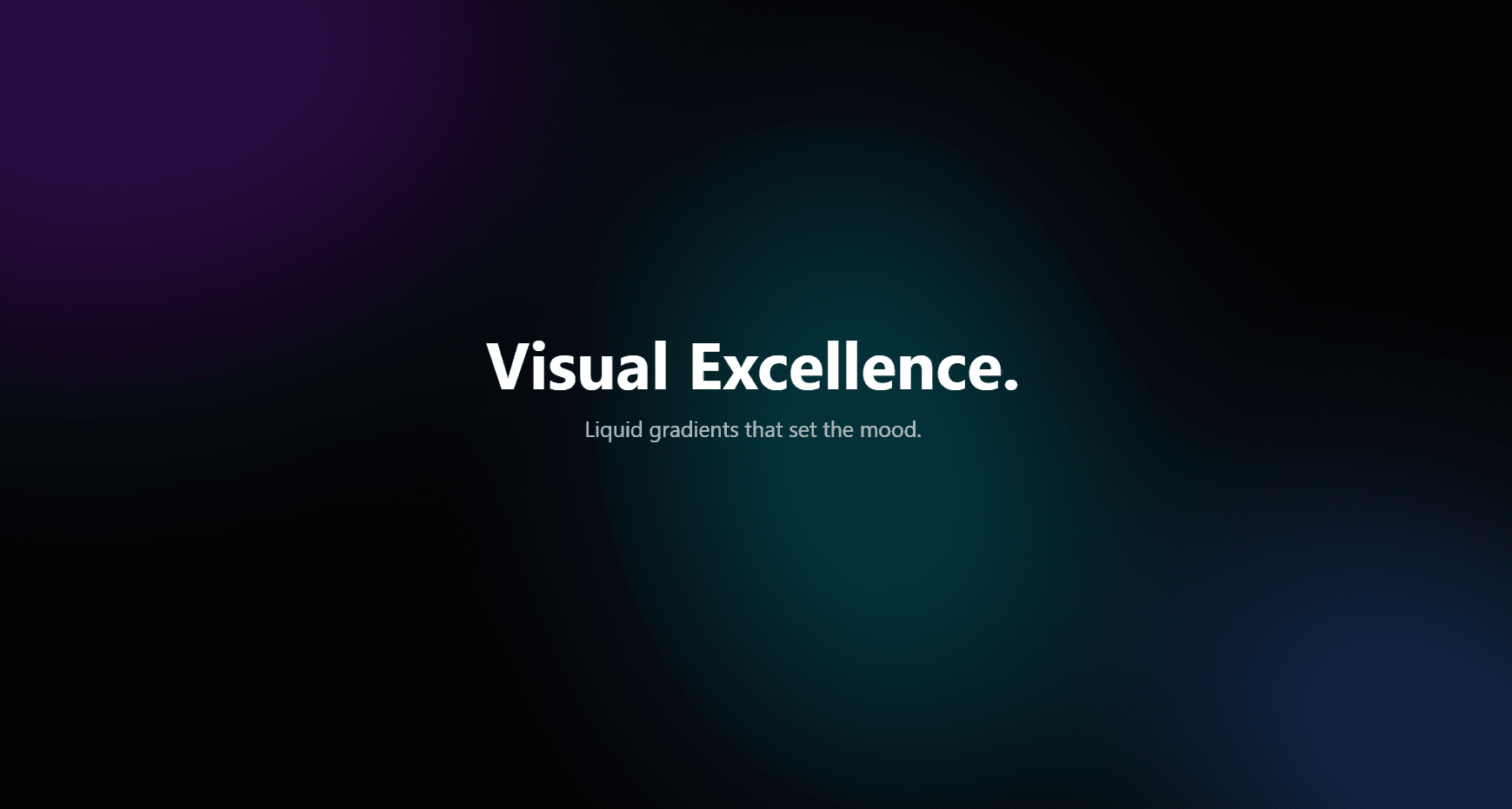
Animated Mesh Gradient Background - Next.js CSS Modules
An animated mesh gradient background component built with Next.js and CSS Modules - no canvas, no WebGL, no JavaScript animation. Three oval blobs are positioned absolutely inside a filter: blur(120px) container - the extreme blur is what creates the liquid mesh look. Each blob runs two independent CSS animations simultaneously: a rotate keyframe that spins it continuously and a scale keyframe that pulses it between 90% and 110% - because rotate and scale are separate CSS properties they compose without overwriting each other. mix-blend-mode: screen on each blob makes the overlapping colors behave like light mixing instead of paint mixing, which is what gives the gradient its glow. A bg-black/40 overlay sits above the blob layer to keep text contrast readable without killing the gradient. The component wraps any children so it works as a full-page hero background, a card background, or a section background. Fully respects prefers-reduced-motion - all animations stop for users who have it enabled. Works as a Next.js App Router server component - no "use client" needed.
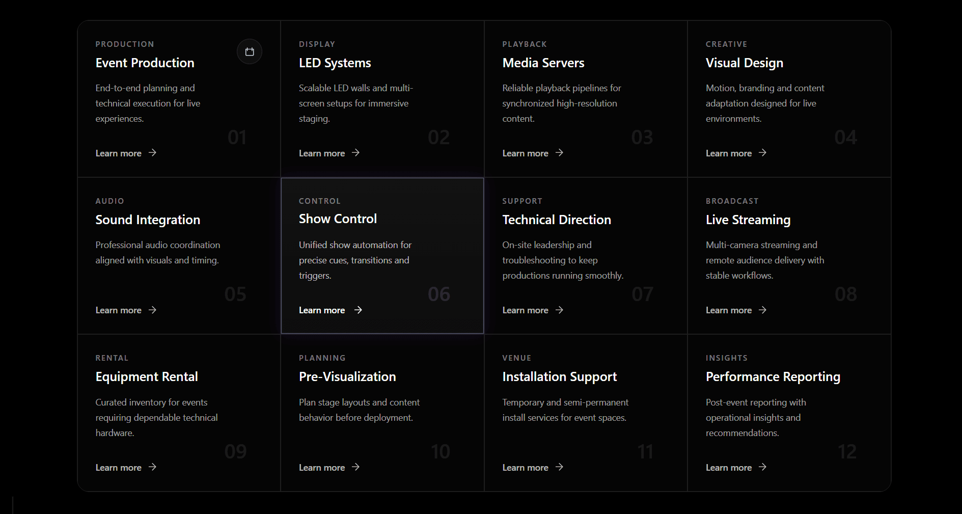
Animated Cards Grid Component - Next.js Tailwind CSS
A dark-themed animated cards grid built with Next.js and Tailwind CSS. Renders a responsive grid with shared borders between cards - no double borders, no gaps - using a single outer border on the wrapper and border border-white/10 on each card so the lines align perfectly at every breakpoint. Each card has a subtle violet border glow and inset shadow that fades in on hover, a soft background lift gradient, a title that shifts up 2px on hover, a description that brightens, a "Learn more" arrow that slides right, and a ghost index number in the bottom-right corner. Supports an optional icon prop that renders in a rounded bordered container top-right, an eyebrow label above the title, and an optional href that wraps the card in a Next.js Link - if no href is passed it renders as a plain div. Fully typed in TypeScript with exported types for easy reuse across pages. Works in the Next.js App Router as a server component - no "use client" needed.
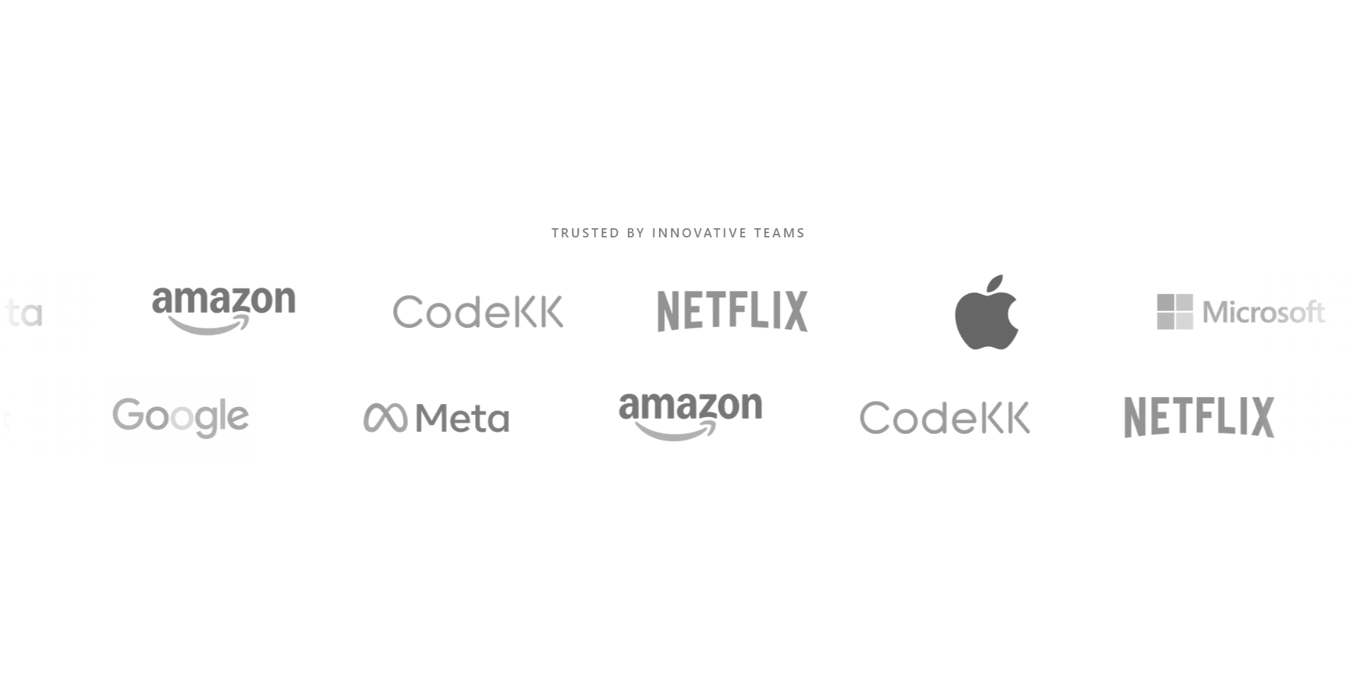
Logo Cloud Marquee Component - Next.js Tailwind CSS
A seamless infinite scrolling logo marquee component built for Next.js with Tailwind CSS and TypeScript. Uses the Web Animations API directly on a duplicated track div to achieve a perfect loop with zero layout shift - no CSS keyframe tricks that can cause a visible jump at the seam. Hover slows the animation down smoothly by ramping the playbackRate with requestAnimationFrame instead of snapping to a new speed, so the transition in and out always feels fluid. Supports left and right scroll direction, pauseOnHover mode for a full stop, per-logo href links that open in a new tab, grayscale filter with opacity that lifts on hover, and left/right edge fade masks using gradient overlays. Fully respects prefers-reduced-motion - animation skips entirely for users who have reduced motion enabled. The demo shows two rows scrolling in opposite directions, which is the standard "trusted by" section pattern seen on SaaS landing pages. Built as a "use client" component so it works in the Next.js App Router out of the box.
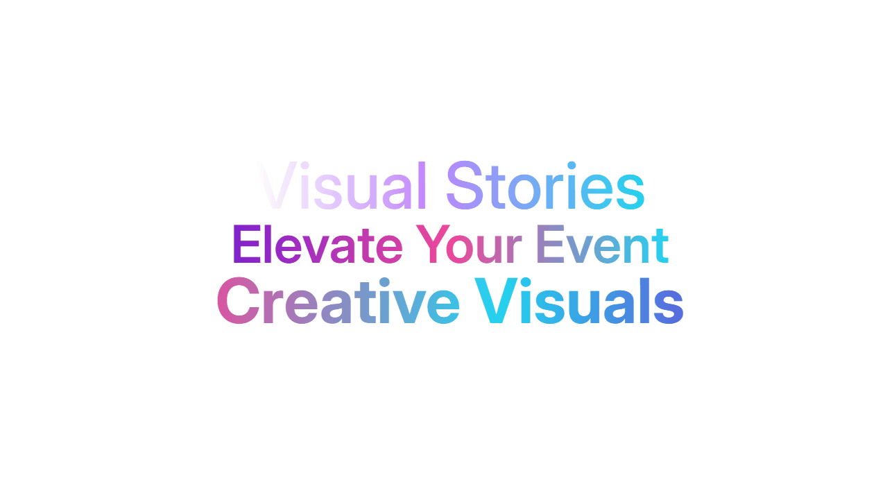
React Gradient Text Component - Animated CSS Gradient
A reusable gradient text component built with React, TypeScript, and CSS Modules. Accepts any gradient string via the gradient prop so you can pass any linear-gradient, radial-gradient, or conic-gradient you want. The animated prop enables a smooth infinite scrolling gradient animation driven by a CSS background-position keyframe - speed is controlled via the speed prop so you can pass "2s" for fast or "8s" for slow without touching any CSS. The as prop is fully polymorphic - render the gradient text as h1, h2, p, span, or any valid HTML element with full TypeScript type safety. Respects prefers-reduced-motion - animation automatically stops for users who have reduced motion enabled in their OS settings. Uses CSS custom properties to pass gradient and speed values from React props into the stylesheet, keeping all animation logic in CSS where it belongs.

Responsive Testimonial Carousel with Swiper.js - HTML Tailwind CSS
A modern dark-themed testimonial carousel built with HTML, Tailwind CSS, and Swiper.js. Features a centered active slide that glows with an indigo border while inactive slides scale down and blur - creating a clean focus effect without any extra JavaScript. Each card includes a star rating, review text, user avatar with an indigo ring, name, and job title. The pagination dots animate from a small circle to a wide pill shape on the active slide. Navigation arrows have a hover state that shifts to indigo. Autoplay pauses on mouse enter and resumes on leave. Built for landing pages, SaaS marketing sites, agency portfolios, and any page that needs a professional social proof section. Single HTML file with CDN links - no build step, no npm, open it in a browser and it works. Key features: Active slide highlight with indigo glow border Inactive slides scale to 88% with blur and reduced opacity Animated pagination - dot expands to pill on active Custom prev/next buttons with indigo hover state Autoplay with pause on hover Responsive - 1 slide on mobile, 1.5 on landscape, 2 on tablet, 3 on desktop Ambient background glow blobs using fixed blur divs Plus Jakarta Sans font via Google Fonts Remix Icons for stars, arrows, and quote watermark

Animated Tab Component React Framer Motion
A smooth animated tab switcher built with React, Tailwind CSS, and Framer Motion. The active tab indicator slides between buttons using Framer Motion's layoutId - so the black pill animates fluidly from one tab to the next with a spring transition instead of an abrupt jump. Tab content fades in and out with a vertical slide and blur filter using AnimatePresence with mode="wait" - the exit animation completes before the new content enters, keeping transitions clean and never overlapping. Tabs and content are defined as plain arrays and objects at the top of the file - adding a new tab is just adding one entry to each. Written with TypeScript, fully typed content access using keyof typeof content. Works as a "use client" component in Next.js App Router or as a standard React component in Vite.
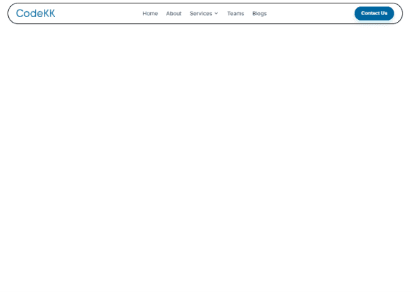
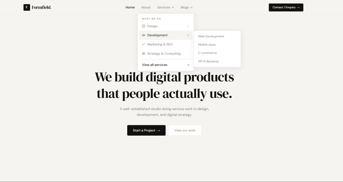
Floating Navbar with Dropdown Menu React Tailwind CSS
A floating pill-shaped navbar built with React, Tailwind CSS, and TypeScript - fixed at the top center of the viewport with a soft border and shadow. Navigation links are defined as a data array so adding or removing items is just editing one object, no JSX changes needed. The Services link has a multi-item dropdown that appears on hover using pure CSS group utilities - group-hover:opacity-100, group-hover:pointer-events-auto, group-hover:translate-y-2 - no JavaScript state required for the open/close logic. The dropdown chevron icon does a clean swap between ChevronDown and ChevronUp using layered absolute positioning and opacity transitions. The contact button is a separate PulseContactButton component with an animated pulse ring behind it using Tailwind's built-in animate-pulse on an absolutely positioned background span. Fully typed in TypeScript with prop types for the button component and clean separation between the navbar data, layout, and the reusable button.
Scroll to Top Button React Tailwind CSS Progress Indicator
A scroll-to-top button built with React, Tailwind CSS, TypeScript, and Framer Motion - with an animated circular progress ring that fills as the user scrolls down the page. The button stays hidden until the user scrolls past 100px, then fades and scales in smoothly. Scroll progress is tracked using requestAnimationFrame for performance, then smoothed through a Framer Motion spring before being mapped to the SVG stroke-dashoffset - so the ring fills fluidly instead of jumping with every scroll event. Clicking the button triggers a native smooth scroll back to the top. Hover and tap states use spring-based scale transforms, and the whole button enters and exits with AnimatePresence. Fully typed in TypeScript with cleanup handled correctly on unmount to avoid memory leaks from the scroll listener and animation frame.
Animated Bookmark Button React Framer Motion
An animated bookmark toggle button built with React, Tailwind CSS, and Framer Motion. Click it once - the icon swaps from Bookmark to BookmarkCheck with a satisfying spring animation. Click again - it snaps back. The icon entrance uses a combination of opacity, vertical slide, scale, and a subtle rotation spring so it never feels like a flat toggle. AnimatePresence with mode="wait" handles the exit animation before the new icon enters, so both never appear on screen at the same time. The button itself scales up slightly on hover and compresses on tap using whileHover and whileTap - all physics-based with spring easing. Icons are from Lucide React. Single component, zero prop drilling, state lives in one useState hook.
Accordion FAQ Tailwind CSS
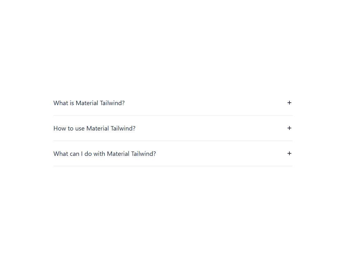
A minimal, single-open accordion built entirely with Tailwind CSS and a small vanilla JavaScript toggle function - no custom CSS, no external libraries. Each item expands smoothly using max-h and opacity transitions controlled by Tailwind utility classes swapped in and out via JS. The toggle icon is a + SVG that rotates 45° into an × when the item opens, giving a clean visual indicator without swapping elements. Only one accordion item can be open at a time - opening a new one automatically closes the previous. Fully responsive across mobile, tablet, and desktop using Tailwind's responsive breakpoint prefixes. Uses the Tailwind CSS v4 browser CDN so it works in a single HTML file with zero setup.
FAQ Accordion HTML CSS JavaScript
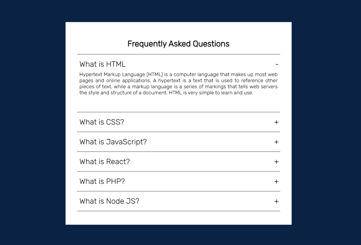
A clean FAQ accordion built with plain HTML, CSS, and vanilla JavaScript - no libraries, no dependencies. Click any question to expand the answer, click again to collapse it. Multiple items can stay open at the same time. The toggle indicator switches between + and - using a CSS ::before pseudo-element, so no extra HTML needed. The expand/collapse animation runs on a CSS height transition with overflow: hidden - smooth and lightweight. Styled with a white card on a dark navy background using the Rubik font from Google Fonts. Six questions covering HTML, CSS, JavaScript, React, PHP, and Node.js - easy to swap out for your own content by just editing the .container divs in the HTML.
FAQ Accordion HTML CSS JavaScript
A clean FAQ accordion built with plain HTML, CSS, and vanilla JavaScript - no libraries, no dependencies. Click any question to expand the answer, click again to collapse it. Multiple items can stay open at the same time. The toggle indicator switches between + and - using a CSS ::before pseudo-element, so no extra HTML needed. The expand/collapse animation runs on a CSS height transition with overflow: hidden - smooth and lightweight. Styled with a white card on a dark navy background using the Rubik font from Google Fonts. Six questions covering HTML, CSS, JavaScript, React, PHP, and Node.js - easy to swap out for your own content by just editing the .container divs in the HTML.
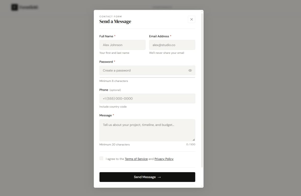
Responsive Modal Popup Form Tailwind CSS Javascript
A centered modal popup with a fully validated contact form — built with HTML, Tailwind CSS, and vanilla JavaScript. No frameworks, no libraries, just clean utility-first code. The modal opens from a trigger button, animates in with a spring transition, and traps focus inside for full keyboard accessibility. The form has five fields: full name, email, password, phone (optional), and a message textarea. Every required field validates on blur first, then switches to live input validation so it doesn't yell at you before you've finished typing. Password has a show/hide toggle and a 5-level strength bar that shifts from red to green. The textarea tracks characters live with a counter that warns at 450/500. On submit it validates everything at once, focuses the first error automatically, shows a loading spinner, and transitions to a success state after the async call. Resetting brings everything cleanly back to zero. Tailwind handles all styling — layout, color, states, responsive, transitions. Custom CSS is kept to exactly 4 things that Tailwind genuinely cannot do: the modal's dual-easing open/close transition, the strength bar width + color transition, the checkbox checkmark pseudo-element, and scrollbar styling.
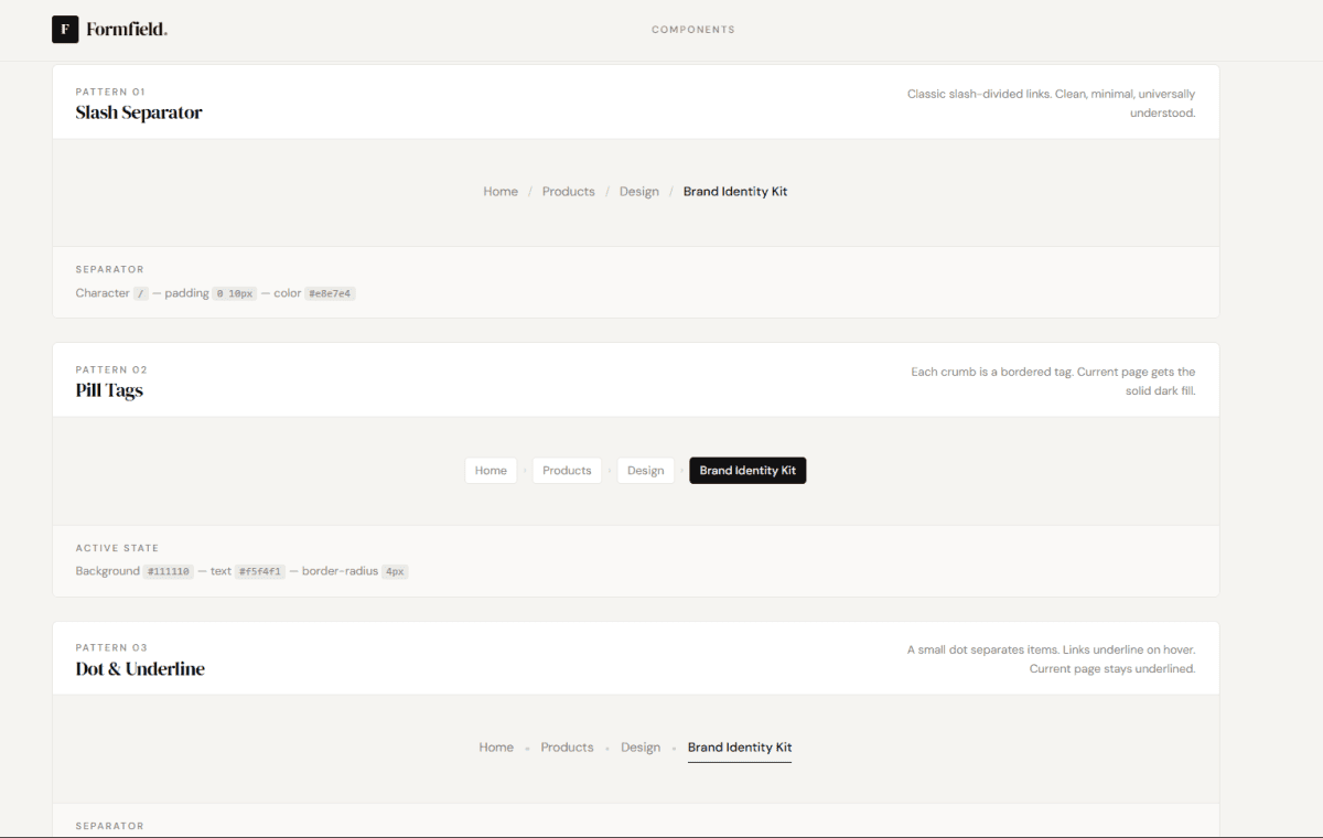
5 Breadcrumb UI Patterns Tailwind CSS
Five distinct breadcrumb navigation patterns built with pure HTML and Tailwind CSS — no JavaScript, no dependencies. Each pattern follows the same warm monochrome design system but takes a completely different visual approach. Pattern 01 uses a classic slash separator with muted-to-ink hover transitions. Pattern 02 wraps each crumb in a bordered pill tag, with the current page getting a solid dark fill matching the CTA button style. Pattern 03 uses a 4×4px circular dot separator with underline hover states on links and a permanent underline on the active crumb. Pattern 04 replaces the home link with a bordered icon button and uses SVG chevron arrows as separators — structured and compact. Pattern 05 is a stepped numbered breadcrumb with a horizontal line connector and three distinct states: completed (checkmark), active (dark fill), and upcoming (muted) — useful for multi-step flows and deep hierarchies. All five are horizontally scrollable on mobile with hidden scrollbars, fully accessible with aria-label and aria-current="page", and use DM Serif Display for headings and DM Sans for all breadcrumb text on a warm #f5f4f1 background.
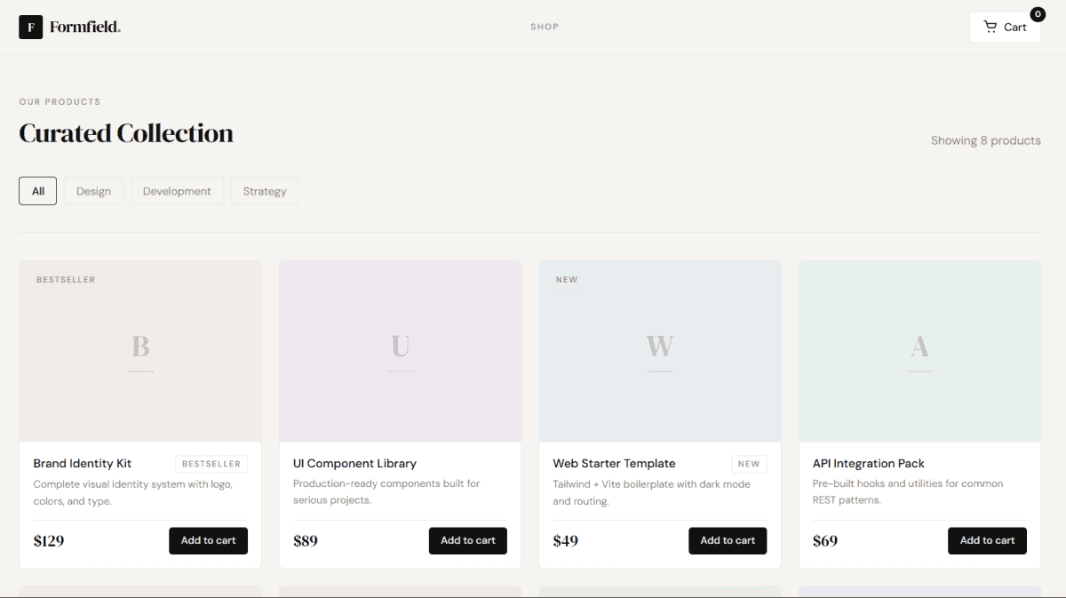
Dynamic Product Cart Tailwind CSS and JavaScript
A fully dynamic product cart page built with pure HTML, Tailwind CSS, and vanilla JavaScript — no frameworks, no dependencies. Features an 8-product grid with live category filtering, a slide-in cart sidebar with overlay, real-time quantity controls, line totals, promo code input, and an animated cart badge. Products are organized into Design, Development, and Strategy categories — switching filters updates the grid and product count instantly. The cart sidebar handles empty state, item addition and removal, quantity increment and decrement, and a checkout flow. Typography uses DM Serif Display for prices and headings, DM Sans for all body and UI text, on a warm #f5f4f1 background with #111110 ink, #888580 muted gray, and #e8e7e4 borders — no gradients, no colored accents, nothing decorative that doesn't earn its place.
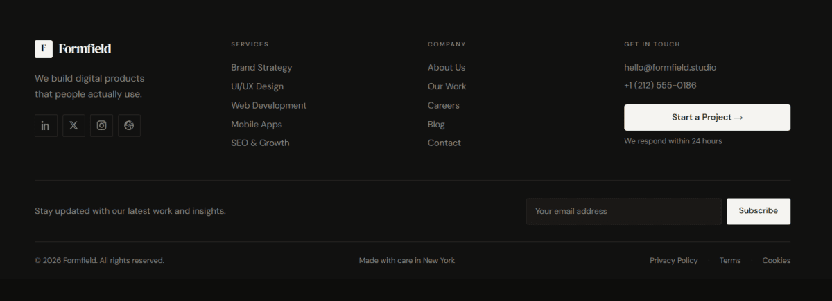
Dark Agency Footer Tailwind CSS
A dark, minimal agency footer built with pure HTML and Tailwind CSS — no JavaScript, no gradients, no gimmicks. Three-row layout with a 4-column main section (brand, services, company, contact/CTA), a newsletter bar with inline email input, and a clean bottom bar with copyright and legal links. Social icons are square-bordered and fill on hover. Typography uses DM Serif Display for the logo and DM Sans for everything else, all on a warm near-black background with subtle warm-gray borders. Fully responsive — 4 columns on desktop, 2×2 grid on tablet, single centered stack on mobile. The only custom CSS is for hover transitions that Tailwind can't handle natively.
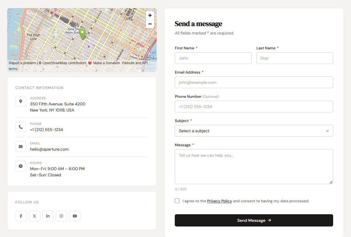
Professional Contact Us Page HTML, CSS, Js
A clean, professional Contact Us page built with pure HTML, CSS, and Vanilla JS — no frameworks, no gradients, no fluff. Features a two-column layout with a contact form on the right and office info, map, and social links on the left. Fully responsive with a collapsible mobile nav. Includes real-time form validation, character counter, loading state on submit, and a toast notification on success. Typography uses DM Serif Display for headings and DM Sans for body text, with a warm neutral background, white cards, 1px borders, and a near-black accent — professional and minimal without being boring.
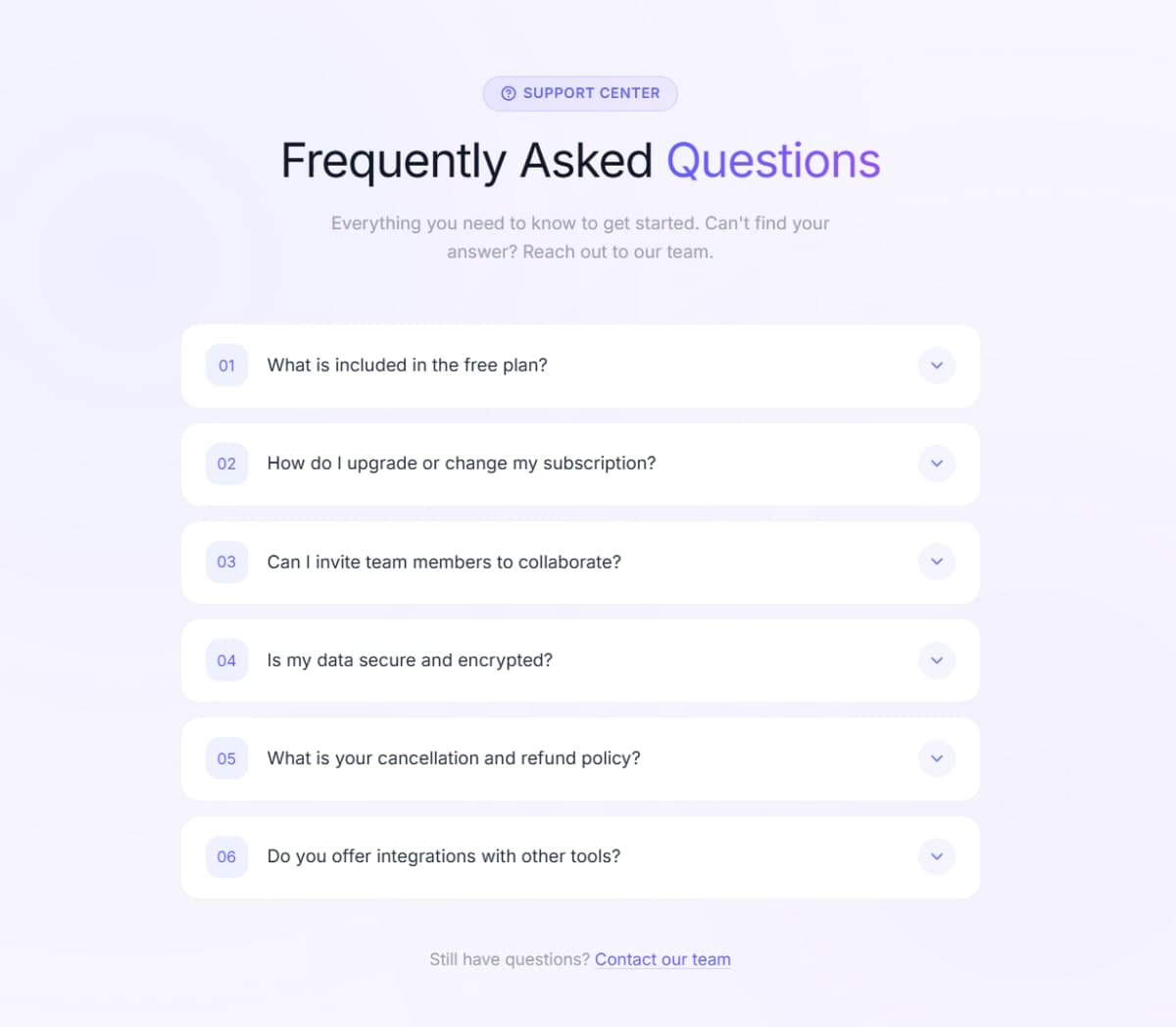
FAQ Accordion with Numbered Badges
Animated FAQ accordion with numbered badge indicators, smooth expand/collapse, indigo gradient glow, chevron rotation, and full keyboard accessibility. HTML,Tailwind CSS & JS.
Toggle button
Share a UI component with the community. It will be reviewed before publishing.
Button
Share a UI component with the community. It will be reviewed before publishing.