// src/components/ShareSheet/ShareSheet.tsx
"use client";

/**
 * ShareSheet — a Share button that morphs into a share panel
 * Stack: React + TypeScript + Tailwind CSS v4 + Motion (motion/react)
 * Deps:  npm i motion react-icons
 *
 * - Click: the button stretches into a panel (shared layout animation) and the
 *   share icon flies from the button into the panel header
 * - Targets rise in on a stagger; on hover a tile lifts, fills with its brand
 *   colour and glows
 * - Link field with a Copy button that springs into "Copied"
 * - "More" opens the device's native share sheet where supported
 * - Escape / click outside / close button morph it back into the button
 * - Reduced motion handled via <MotionConfig reducedMotion="user">
 */

import { useEffect, useId, useRef, useState, type CSSProperties } from "react";
import {
  AnimatePresence,
  MotionConfig,
  motion,
  type Transition,
  type Variants,
} from "motion/react";
import type { IconType } from "react-icons";
import {
  FaXTwitter,
  FaLinkedinIn,
  FaFacebookF,
  FaWhatsapp,
  FaTelegram,
  FaReddit,
} from "react-icons/fa6";
import {
  FiShare2,
  FiX,
  FiLink,
  FiCheck,
  FiCopy,
  FiMail,
  FiMoreHorizontal,
} from "react-icons/fi";

export type ShareSheetNetwork =
  | "x"
  | "linkedin"
  | "facebook"
  | "whatsapp"
  | "telegram"
  | "reddit"
  | "email";

export interface ShareSheetProps {
  /** Defaults to the current page URL */
  url?: string;
  /** Defaults to document.title */
  title?: string;
  /** Message sent with the link; defaults to the title */
  text?: string;
  /** Which targets to show, in order */
  networks?: ShareSheetNetwork[];
  /** Open the panel above or below the button */
  placement?: "top" | "bottom";
  /** Pin the panel to the button's left or right edge */
  align?: "start" | "end";
  /** Button text */
  label?: string;
  /** Panel heading */
  heading?: string;
  className?: string;
}

interface ShareInfo {
  url: string;
  title: string;
  text: string;
}

interface NetworkConfig {
  label: string;
  icon: IconType;
  color: string;
  href: (info: ShareInfo) => string;
}

const enc = encodeURIComponent;

const NETWORKS: Record<ShareSheetNetwork, NetworkConfig> = {
  x: {
    label: "X",
    icon: FaXTwitter,
    color: "#0f1419",
    href: ({ url, text }) =>
      `https://x.com/intent/post?url=${enc(url)}&text=${enc(text)}`,
  },
  linkedin: {
    label: "LinkedIn",
    icon: FaLinkedinIn,
    color: "#0a66c2",
    href: ({ url }) =>
      `https://www.linkedin.com/sharing/share-offsite/?url=${enc(url)}`,
  },
  facebook: {
    label: "Facebook",
    icon: FaFacebookF,
    color: "#1877f2",
    href: ({ url }) =>
      `https://www.facebook.com/sharer/sharer.php?u=${enc(url)}`,
  },
  whatsapp: {
    label: "WhatsApp",
    icon: FaWhatsapp,
    color: "#25d366",
    href: ({ url, text }) => `https://wa.me/?text=${enc(`${text} ${url}`)}`,
  },
  telegram: {
    label: "Telegram",
    icon: FaTelegram,
    color: "#26a5e4",
    href: ({ url, text }) =>
      `https://t.me/share/url?url=${enc(url)}&text=${enc(text)}`,
  },
  reddit: {
    label: "Reddit",
    icon: FaReddit,
    color: "#ff4500",
    href: ({ url, title }) =>
      `https://www.reddit.com/submit?url=${enc(url)}&title=${enc(title)}`,
  },
  email: {
    label: "Email",
    icon: FiMail,
    color: "#525252",
    href: ({ url, title, text }) =>
      `mailto:?subject=${enc(title)}&body=${enc(`${text}\n\n${url}`)}`,
  },
};

const DEFAULT_NETWORKS: ShareSheetNetwork[] = [
  "x",
  "linkedin",
  "facebook",
  "whatsapp",
  "telegram",
  "reddit",
  "email",
];

const morph: Transition = { type: "spring", stiffness: 420, damping: 36 };

const gridVariants: Variants = {
  hidden: {},
  show: { transition: { staggerChildren: 0.035, delayChildren: 0.16 } },
};

const tileVariants: Variants = {
  hidden: { opacity: 0, y: 14, scale: 0.9 },
  show: {
    opacity: 1,
    y: 0,
    scale: 1,
    transition: { type: "spring", stiffness: 400, damping: 26 },
  },
};

const brand = (color: string) => ({ "--brand": color }) as CSSProperties;

const tileLink =
  "group flex flex-col items-center gap-1.5 rounded-2xl p-1 outline-none";

const tileIcon =
  "grid size-12 place-items-center rounded-2xl bg-neutral-100 text-neutral-700 " +
  "transition duration-200 ease-out " +
  "group-hover:-translate-y-1 group-hover:bg-(--brand) group-hover:text-white " +
  "group-hover:shadow-[0_10px_24px_-8px_var(--brand)] " +
  "group-focus-visible:-translate-y-1 group-focus-visible:bg-(--brand) group-focus-visible:text-white " +
  "group-focus-visible:ring-2 group-focus-visible:ring-(--brand) group-focus-visible:ring-offset-2 " +
  "dark:bg-neutral-800 dark:text-neutral-300 dark:group-focus-visible:ring-offset-neutral-900";

const tileLabel =
  "text-[11px] font-medium text-neutral-500 dark:text-neutral-400";

async function copyText(value: string): Promise<boolean> {
  try {
    await navigator.clipboard.writeText(value);
    return true;
  } catch {
    const el = document.createElement("textarea");
    el.value = value;
    el.style.position = "fixed";
    el.style.opacity = "0";
    document.body.appendChild(el);
    el.select();
    const ok = document.execCommand("copy");
    el.remove();
    return ok;
  }
}

export default function ShareSheet({
  url,
  title,
  text,
  networks = DEFAULT_NETWORKS,
  placement = "top",
  align = "start",
  label = "Share",
  heading = "Share this page",
  className = "",
}: ShareSheetProps) {
  const uid = useId();
  const shellId = `${uid}-shell`;
  const iconId = `${uid}-icon`;
  const headingId = `${uid}-heading`;

  const [open, setOpen] = useState(false);
  const [copied, setCopied] = useState(false);
  const [canNativeShare, setCanNativeShare] = useState(false);
  const [info, setInfo] = useState<ShareInfo>({ url: "", title: "", text: "" });

  const rootRef = useRef<HTMLDivElement>(null);
  const triggerRef = useRef<HTMLButtonElement>(null);
  const firstItemRef = useRef<HTMLAnchorElement>(null);
  const restoreFocus = useRef(false);
  const copyTimer = useRef<number | undefined>(undefined);

  const openSheet = () => {
    const resolvedTitle = title ?? document.title;
    setInfo({
      url: url ?? window.location.href,
      title: resolvedTitle,
      text: text ?? resolvedTitle,
    });
    setCanNativeShare(typeof navigator.share === "function");
    setCopied(false);
    setOpen(true);
  };

  const closeSheet = (returnFocus = true) => {
    restoreFocus.current = returnFocus;
    setOpen(false);
  };

  useEffect(() => {
    if (open) {
      firstItemRef.current?.focus({ preventScroll: true });
    } else if (restoreFocus.current) {
      triggerRef.current?.focus();
      restoreFocus.current = false;
    }
  }, [open]);

  useEffect(() => {
    if (!open) return;
    const onPointerDown = (e: globalThis.PointerEvent) => {
      if (!rootRef.current?.contains(e.target as Node)) closeSheet(false);
    };
    const onKeyDown = (e: globalThis.KeyboardEvent) => {
      if (e.key === "Escape") closeSheet(true);
    };
    document.addEventListener("pointerdown", onPointerDown);
    document.addEventListener("keydown", onKeyDown);
    return () => {
      document.removeEventListener("pointerdown", onPointerDown);
      document.removeEventListener("keydown", onKeyDown);
    };
  }, [open]);

  useEffect(() => () => window.clearTimeout(copyTimer.current), []);

  const handleCopy = async () => {
    const ok = await copyText(info.url);
    if (!ok) return;
    setCopied(true);
    window.clearTimeout(copyTimer.current);
    copyTimer.current = window.setTimeout(() => setCopied(false), 1800);
  };

  const handleNativeShare = async () => {
    try {
      await navigator.share({
        title: info.title,
        text: info.text,
        url: info.url,
      });
    } catch {
      /* user dismissed the sheet */
    }
  };

  const panelPosition = [
    placement === "top" ? "bottom-0" : "top-0",
    align === "start" ? "left-0" : "right-0",
  ].join(" ");

  const buttonClass =
    "flex h-12 items-center gap-2 border border-neutral-200 bg-white px-5 text-sm font-medium " +
    "text-neutral-900 shadow-sm outline-none hover:bg-neutral-50 " +
    "focus-visible:ring-2 focus-visible:ring-neutral-900 focus-visible:ring-offset-2 " +
    "dark:border-neutral-800 dark:bg-neutral-900 dark:text-neutral-100 dark:hover:bg-neutral-800 " +
    "dark:focus-visible:ring-white dark:focus-visible:ring-offset-neutral-950";

  return (
    <MotionConfig reducedMotion="user" transition={morph}>
      <div ref={rootRef} className={`relative inline-block ${className}`}>
        {!open ? (
          <motion.button
            ref={triggerRef}
            layoutId={shellId}
            type="button"
            onClick={openSheet}
            aria-haspopup="dialog"
            aria-expanded={false}
            whileTap={{ scale: 0.96 }}
            style={{ borderRadius: 24 }}
            className={buttonClass}
          >
            <motion.span layoutId={iconId} className="grid place-items-center">
              <FiShare2 size={16} aria-hidden="true" />
            </motion.span>
            <motion.span layout="position">{label}</motion.span>
          </motion.button>
        ) : (
          <>
            {/* Ghost keeps the button's space in the layout while the panel is open */}
            <span
              aria-hidden="true"
              className={`${buttonClass} invisible rounded-3xl`}
            >
              <FiShare2 size={16} />
              {label}
            </span>

            <motion.div
              layoutId={shellId}
              role="dialog"
              aria-modal="false"
              aria-labelledby={headingId}
              style={{ borderRadius: 20 }}
              className={`absolute z-50 w-[min(20rem,calc(100vw-2rem))] overflow-hidden border border-neutral-200 bg-white p-4 shadow-2xl dark:border-neutral-800 dark:bg-neutral-900 ${panelPosition}`}
            >
              {/* Header */}
              <motion.div
                layout="position"
                className="mb-4 flex items-center gap-2.5"
              >
                <motion.span
                  layoutId={iconId}
                  className="grid size-8 place-items-center rounded-full bg-neutral-900 text-white dark:bg-white dark:text-neutral-900"
                >
                  <FiShare2 size={14} aria-hidden="true" />
                </motion.span>
                <motion.h2
                  id={headingId}
                  initial={{ opacity: 0, x: -6 }}
                  animate={{ opacity: 1, x: 0, transition: { delay: 0.12 } }}
                  className="text-sm font-semibold text-neutral-900 dark:text-neutral-100"
                >
                  {heading}
                </motion.h2>
                <motion.button
                  type="button"
                  onClick={() => closeSheet(true)}
                  aria-label="Close"
                  initial={{ opacity: 0, rotate: -90 }}
                  animate={{
                    opacity: 1,
                    rotate: 0,
                    transition: { delay: 0.14 },
                  }}
                  whileHover={{ rotate: 90 }}
                  whileTap={{ scale: 0.9 }}
                  className="ml-auto grid size-8 place-items-center rounded-full text-neutral-500 outline-none hover:bg-neutral-100 hover:text-neutral-900 focus-visible:ring-2 focus-visible:ring-neutral-900 dark:text-neutral-400 dark:hover:bg-neutral-800 dark:hover:text-white dark:focus-visible:ring-white"
                >
                  <FiX size={16} aria-hidden="true" />
                </motion.button>
              </motion.div>

              {/* Targets */}
              <motion.ul
                layout="position"
                variants={gridVariants}
                initial="hidden"
                animate="show"
                className="grid grid-cols-4 gap-x-2 gap-y-3"
              >
                {networks.map((id, i) => {
                  const n = NETWORKS[id];
                  const Icon = n.icon;
                  return (
                    <motion.li key={id} variants={tileVariants}>
                      <motion.a
                        ref={i === 0 ? firstItemRef : undefined}
                        href={n.href(info)}
                        target="_blank"
                        rel="noopener noreferrer"
                        aria-label={`Share on ${n.label}`}
                        whileTap={{ scale: 0.92 }}
                        style={brand(n.color)}
                        className={tileLink}
                      >
                        <span className={tileIcon}>
                          <Icon size={19} aria-hidden="true" />
                        </span>
                        <span className={tileLabel}>{n.label}</span>
                      </motion.a>
                    </motion.li>
                  );
                })}

                {canNativeShare && (
                  <motion.li variants={tileVariants}>
                    <motion.button
                      type="button"
                      onClick={handleNativeShare}
                      aria-label="More sharing options"
                      whileTap={{ scale: 0.92 }}
                      style={brand("#404040")}
                      className={`${tileLink} w-full`}
                    >
                      <span className={tileIcon}>
                        <FiMoreHorizontal size={19} aria-hidden="true" />
                      </span>
                      <span className={tileLabel}>More</span>
                    </motion.button>
                  </motion.li>
                )}
              </motion.ul>

              {/* Link + copy */}
              <motion.div
                layout="position"
                initial={{ opacity: 0, y: 10 }}
                animate={{ opacity: 1, y: 0, transition: { delay: 0.28 } }}
                className="mt-4 flex items-center gap-2 rounded-xl border border-neutral-200 bg-neutral-50 p-1.5 pl-3 dark:border-neutral-800 dark:bg-neutral-950"
              >
                <FiLink
                  size={14}
                  aria-hidden="true"
                  className="shrink-0 text-neutral-400"
                />
                <input
                  readOnly
                  value={info.url}
                  aria-label="Page link"
                  onFocus={(e) => e.currentTarget.select()}
                  className="min-w-0 flex-1 truncate bg-transparent text-xs text-neutral-600 outline-none dark:text-neutral-400"
                />
                <motion.button
                  layout
                  type="button"
                  onClick={handleCopy}
                  whileTap={{ scale: 0.94 }}
                  style={{ borderRadius: 8 }}
                  className={`flex h-8 shrink-0 items-center gap-1.5 px-3 text-xs font-semibold outline-none focus-visible:ring-2 focus-visible:ring-offset-1 ${
                    copied
                      ? "bg-green-600 text-white focus-visible:ring-green-600"
                      : "bg-neutral-900 text-white focus-visible:ring-neutral-900 dark:bg-white dark:text-neutral-900 dark:focus-visible:ring-white"
                  }`}
                >
                  <AnimatePresence mode="popLayout" initial={false}>
                    <motion.span
                      key={copied ? "copied" : "copy"}
                      initial={{ opacity: 0, y: 10 }}
                      animate={{ opacity: 1, y: 0 }}
                      exit={{ opacity: 0, y: -10 }}
                      transition={{ duration: 0.15 }}
                      className="flex items-center gap-1.5"
                    >
                      {copied ? (
                        <FiCheck size={13} aria-hidden="true" />
                      ) : (
                        <FiCopy size={13} aria-hidden="true" />
                      )}
                      {copied ? "Copied" : "Copy"}
                    </motion.span>
                  </AnimatePresence>
                </motion.button>
              </motion.div>

              <span role="status" aria-live="polite" className="sr-only">
                {copied ? "Link copied" : ""}
              </span>
            </motion.div>
          </>
        )}
      </div>
    </MotionConfig>
  );
}Component details
Overview, install command, dependencies, and project links.
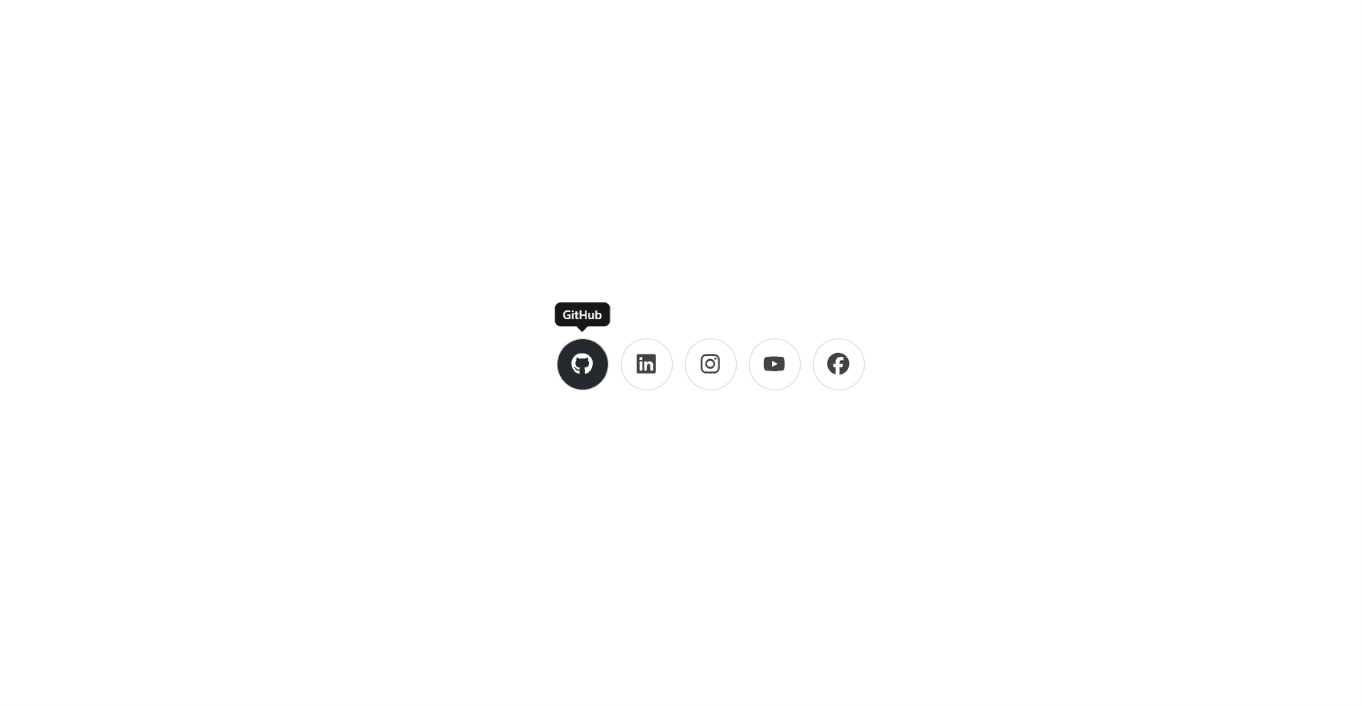
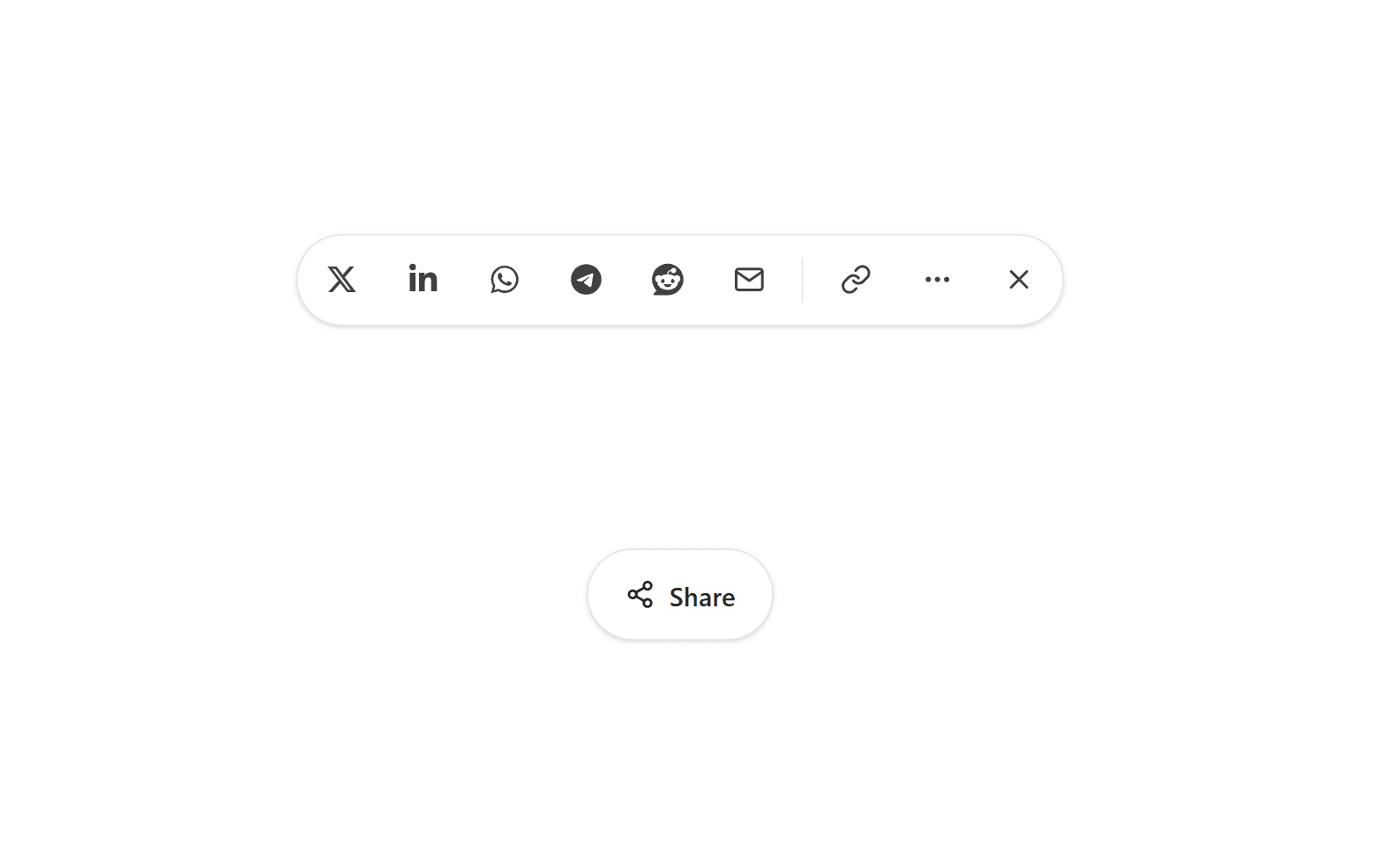
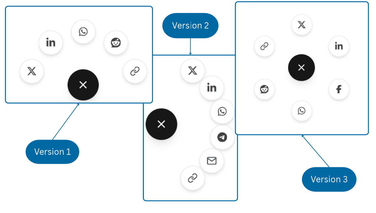
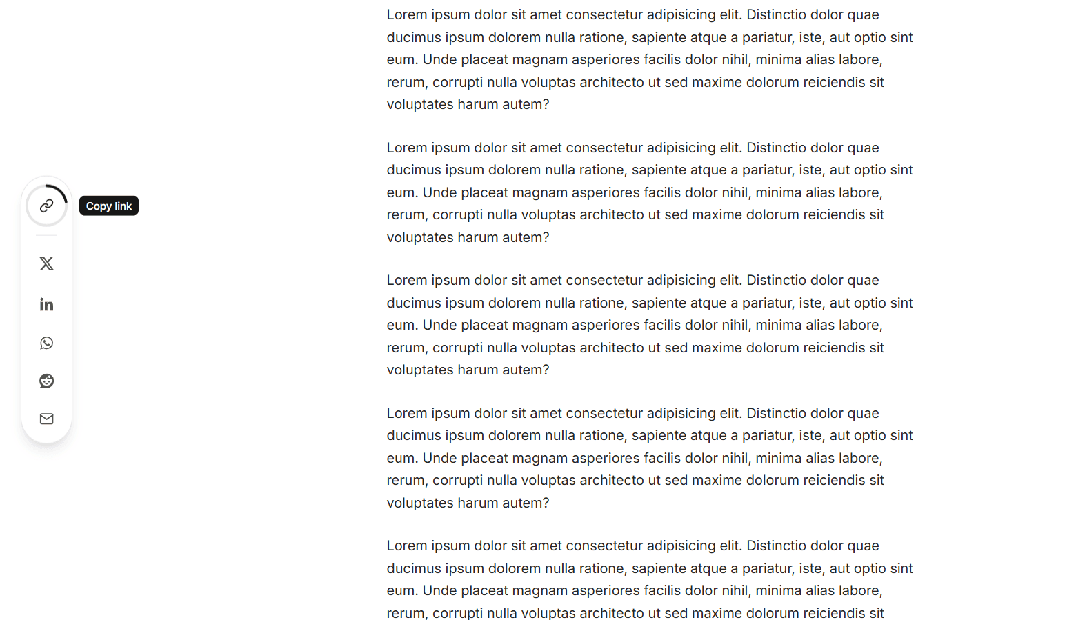
A share button for React that morphs into a full share panel, built with TypeScript, Motion, Tailwind CSS v4, and React Icons. When clicked, the pill-shaped button stretches into a rounded panel using a shared layout animation, and the share icon flies from the button into the panel's header. The heading slides in, the close button spins into place, and the share targets rise in one after another on a stagger. It supports X, LinkedIn, Facebook, WhatsApp, Telegram, Reddit, and Email, laid out in a tidy four-column grid, and the networks prop picks which ones appear and in what order. Hovering or focusing a tile lifts it, fills it with the platform's brand color, and adds a soft glow in the same color. Below the grid, a read-only link field selects the whole URL on focus, and its Copy button springs into a green "Copied" state with a check mark and announces "Link copied" to screen readers. It uses the Clipboard API with a fallback for older browsers. On devices that support the Web Share API, an extra "More" tile opens the device's native share sheet. The placement prop opens the panel above or below the button, and align pins it to the button's left or right edge, so it fits in a footer, a header, or a corner of the page. An invisible placeholder keeps the button's space while the panel is open, so nearby content never jumps. The shared URL and title default to the current page and document.title, and are read at the moment the panel opens, so they stay correct in single-page apps. The panel closes on Escape, on a click outside, or with the close button, and morphs back into the button. Focus moves to the first target when it opens and returns to the button when closed with the keyboard. Dark mode is built in through Tailwind's dark: variants. When prefers-reduced-motion is enabled, the movement and morphing are turned off and elements simply fade. It works in Vite, Create React App, and Next.js.
Install
npm install react-icons, framer-motionDependencies
Discussion
Feedback, implementation tips, and usage notes.
Comments
Sign in to join the conversation
Similar Components
More from the same category