// src/components/RadialShare/RadialShare.tsx
"use client";

/**
 * RadialShare — a round share button that bursts its targets out along an arc
 * Stack: React + TypeScript + Tailwind CSS v4 + Motion (motion/react)
 * Deps:  npm i motion react-icons
 *
 * - Click: the icon spins into an X, a ring ripples out, targets fly out on springs
 * - Arc direction, radius and spread are all props
 * - Hover / focus: target grows, fills with brand colour, label appears
 * - Copy link flips to a check mark and announces "Link copied"
 * - Escape / click outside closes; targets fly back in reverse order
 */

import { useEffect, useId, useRef, useState, type CSSProperties } from "react";
import { AnimatePresence, motion, useReducedMotion } from "motion/react";
import type { IconType } from "react-icons";
import {
  FaXTwitter,
  FaLinkedinIn,
  FaFacebookF,
  FaWhatsapp,
  FaTelegram,
  FaReddit,
} from "react-icons/fa6";
import { FiShare2, FiX, FiLink, FiCheck, FiMail } from "react-icons/fi";

export type RadialTarget =
  | "x"
  | "linkedin"
  | "facebook"
  | "whatsapp"
  | "telegram"
  | "reddit"
  | "email"
  | "copy";

export type RadialDirection = "up" | "down" | "left" | "right";

export interface RadialShareProps {
  /** Defaults to the current page URL */
  url?: string;
  /** Defaults to document.title */
  title?: string;
  /** Message sent with the link; defaults to the title */
  text?: string;
  /** Which targets to show, in arc order */
  targets?: RadialTarget[];
  /** Which way the arc opens */
  direction?: RadialDirection;
  /** Distance from the centre button to each target, in px */
  radius?: number;
  /** Arc width in degrees (360 = full circle) */
  spread?: number;
  /** Centre button diameter in px */
  size?: number;
  className?: string;
}

interface ShareInfo {
  url: string;
  title: string;
  text: string;
}

interface LinkTarget {
  kind: "link";
  label: string;
  icon: IconType;
  color: string;
  href: (info: ShareInfo) => string;
}

const enc = encodeURIComponent;

const LINKS: Record<Exclude<RadialTarget, "copy">, LinkTarget> = {
  x: {
    kind: "link",
    label: "X",
    icon: FaXTwitter,
    color: "#0f1419",
    href: ({ url, text }) =>
      `https://x.com/intent/post?url=${enc(url)}&text=${enc(text)}`,
  },
  linkedin: {
    kind: "link",
    label: "LinkedIn",
    icon: FaLinkedinIn,
    color: "#0a66c2",
    href: ({ url }) =>
      `https://www.linkedin.com/sharing/share-offsite/?url=${enc(url)}`,
  },
  facebook: {
    kind: "link",
    label: "Facebook",
    icon: FaFacebookF,
    color: "#1877f2",
    href: ({ url }) =>
      `https://www.facebook.com/sharer/sharer.php?u=${enc(url)}`,
  },
  whatsapp: {
    kind: "link",
    label: "WhatsApp",
    icon: FaWhatsapp,
    color: "#25d366",
    href: ({ url, text }) => `https://wa.me/?text=${enc(`${text} ${url}`)}`,
  },
  telegram: {
    kind: "link",
    label: "Telegram",
    icon: FaTelegram,
    color: "#26a5e4",
    href: ({ url, text }) =>
      `https://t.me/share/url?url=${enc(url)}&text=${enc(text)}`,
  },
  reddit: {
    kind: "link",
    label: "Reddit",
    icon: FaReddit,
    color: "#ff4500",
    href: ({ url, title }) =>
      `https://www.reddit.com/submit?url=${enc(url)}&title=${enc(title)}`,
  },
  email: {
    kind: "link",
    label: "Email",
    icon: FiMail,
    color: "#525252",
    href: ({ url, title, text }) =>
      `mailto:?subject=${enc(title)}&body=${enc(`${text}\n\n${url}`)}`,
  },
};

const DEFAULT_TARGETS: RadialTarget[] = [
  "x",
  "linkedin",
  "whatsapp",
  "reddit",
  "copy",
];

const DIRECTION_ANGLE: Record<RadialDirection, number> = {
  up: -90,
  down: 90,
  left: 180,
  right: 0,
};

const ITEM = 44; // target diameter in px

const itemClass =
  "group relative grid size-11 place-items-center rounded-full border border-neutral-200 bg-white " +
  "text-neutral-700 shadow-md outline-none transition-colors " +
  "hover:border-transparent hover:bg-(--brand) hover:text-white " +
  "focus-visible:border-transparent focus-visible:bg-(--brand) focus-visible:text-white " +
  "focus-visible:ring-2 focus-visible:ring-(--brand) focus-visible:ring-offset-2 " +
  "dark:border-neutral-700 dark:bg-neutral-900 dark:text-neutral-300 dark:focus-visible:ring-offset-neutral-950";

const brand = (color: string) => ({ "--brand": color }) as CSSProperties;

function Tooltip({ children }: { children: string }) {
  return (
    <span className="pointer-events-none absolute bottom-full left-1/2 mb-2 -translate-x-1/2 translate-y-1 whitespace-nowrap rounded-md bg-neutral-900 px-2 py-1 text-xs font-medium text-white opacity-0 transition duration-150 group-hover:translate-y-0 group-hover:opacity-100 group-focus-visible:translate-y-0 group-focus-visible:opacity-100 dark:bg-white dark:text-neutral-900">
      {children}
    </span>
  );
}

/** Evenly place n points on an arc; returns x/y offsets from the centre */
function arcPositions(
  n: number,
  direction: RadialDirection,
  spread: number,
  radius: number,
) {
  const center = DIRECTION_ANGLE[direction];
  const fullCircle = spread >= 360;
  const step = n > 1 ? spread / (fullCircle ? n : n - 1) : 0;
  const start = n > 1 ? center - (fullCircle ? 0 : spread / 2) : center;

  return Array.from({ length: n }, (_, i) => {
    const rad = ((start + step * i) * Math.PI) / 180;
    return { x: Math.cos(rad) * radius, y: Math.sin(rad) * radius };
  });
}

async function copyText(value: string): Promise<boolean> {
  try {
    await navigator.clipboard.writeText(value);
    return true;
  } catch {
    const el = document.createElement("textarea");
    el.value = value;
    el.style.position = "fixed";
    el.style.opacity = "0";
    document.body.appendChild(el);
    el.select();
    const ok = document.execCommand("copy");
    el.remove();
    return ok;
  }
}

export default function RadialShare({
  url,
  title,
  text,
  targets = DEFAULT_TARGETS,
  direction = "up",
  radius = 96,
  spread = 150,
  size = 56,
  className = "",
}: RadialShareProps) {
  const reduce = useReducedMotion() ?? false;
  const menuId = useId();

  const [open, setOpen] = useState(false);
  const [copied, setCopied] = useState(false);
  const [info, setInfo] = useState<ShareInfo>({ url: "", title: "", text: "" });

  const rootRef = useRef<HTMLDivElement>(null);
  const triggerRef = useRef<HTMLButtonElement>(null);
  const firstItemRef = useRef<HTMLElement | null>(null);
  const restoreFocus = useRef(false);
  const copyTimer = useRef<number | undefined>(undefined);

  const positions = arcPositions(targets.length, direction, spread, radius);
  const n = targets.length;

  const toggle = () => {
    if (open) {
      restoreFocus.current = true;
      setOpen(false);
      return;
    }
    const resolvedTitle = title ?? document.title;
    setInfo({
      url: url ?? window.location.href,
      title: resolvedTitle,
      text: text ?? resolvedTitle,
    });
    setOpen(true);
  };

  useEffect(() => {
    if (open) {
      firstItemRef.current?.focus();
    } else if (restoreFocus.current) {
      triggerRef.current?.focus();
      restoreFocus.current = false;
    }
  }, [open]);

  useEffect(() => {
    if (!open) return;
    const onPointerDown = (e: globalThis.PointerEvent) => {
      if (!rootRef.current?.contains(e.target as Node)) setOpen(false);
    };
    const onKeyDown = (e: globalThis.KeyboardEvent) => {
      if (e.key === "Escape") {
        restoreFocus.current = true;
        setOpen(false);
      }
    };
    document.addEventListener("pointerdown", onPointerDown);
    document.addEventListener("keydown", onKeyDown);
    return () => {
      document.removeEventListener("pointerdown", onPointerDown);
      document.removeEventListener("keydown", onKeyDown);
    };
  }, [open]);

  useEffect(() => () => window.clearTimeout(copyTimer.current), []);

  const handleCopy = async () => {
    const ok = await copyText(info.url);
    if (!ok) return;
    setCopied(true);
    window.clearTimeout(copyTimer.current);
    copyTimer.current = window.setTimeout(() => setCopied(false), 1600);
  };

  return (
    <div
      ref={rootRef}
      className={`relative inline-grid place-items-center ${className}`}
      style={{ width: size, height: size }}
    >
      {/* Ripple ring on open */}
      <AnimatePresence>
        {open && !reduce && (
          <motion.span
            key="ripple"
            aria-hidden="true"
            className="pointer-events-none absolute inset-0 rounded-full border-2 border-neutral-400 dark:border-neutral-500"
            initial={{ scale: 1, opacity: 0.6 }}
            animate={{ scale: 2.2, opacity: 0 }}
            exit={{ opacity: 0 }}
            transition={{ duration: 0.6, ease: "easeOut" }}
          />
        )}
      </AnimatePresence>

      {/* Targets */}
      <AnimatePresence>
        {open && (
          <motion.ul
            key="menu"
            id={menuId}
            aria-label="Share this page"
            className="absolute inset-0"
            exit={{ transition: { duration: 0.3 } }}
          >
            {targets.map((id, i) => {
              const { x, y } = positions[i];
              const setFirst =
                i === 0
                  ? (el: HTMLElement | null) => {
                      firstItemRef.current = el;
                    }
                  : undefined;

              const motionProps = {
                initial: reduce
                  ? { x, y, opacity: 0 }
                  : { x: 0, y: 0, scale: 0, opacity: 0, rotate: -120 },
                animate: {
                  x,
                  y,
                  scale: 1,
                  opacity: 1,
                  rotate: 0,
                  transition: reduce
                    ? { duration: 0.15 }
                    : {
                        type: "spring" as const,
                        stiffness: 420,
                        damping: 22,
                        delay: i * 0.04,
                      },
                },
                exit: reduce
                  ? { opacity: 0, transition: { duration: 0.1 } }
                  : {
                      x: 0,
                      y: 0,
                      scale: 0,
                      opacity: 0,
                      rotate: -120,
                      transition: {
                        duration: 0.2,
                        ease: "easeIn" as const,
                        delay: (n - 1 - i) * 0.03,
                      },
                    },
                style: {
                  position: "absolute" as const,
                  left: "50%",
                  top: "50%",
                  marginLeft: -ITEM / 2,
                  marginTop: -ITEM / 2,
                },
              };

              if (id === "copy") {
                return (
                  <motion.li key={id} {...motionProps}>
                    <motion.button
                      ref={setFirst}
                      type="button"
                      onClick={handleCopy}
                      aria-label={copied ? "Link copied" : "Copy link"}
                      whileHover={reduce ? undefined : { scale: 1.12 }}
                      whileTap={{ scale: 0.9 }}
                      style={brand(copied ? "#16a34a" : "#404040")}
                      className={`${itemClass} ${copied ? "border-transparent bg-(--brand) text-white dark:bg-(--brand) dark:text-white" : ""}`}
                    >
                      <AnimatePresence mode="wait" initial={false}>
                        <motion.span
                          key={copied ? "check" : "link"}
                          initial={{ opacity: 0, scale: 0.4 }}
                          animate={{ opacity: 1, scale: 1 }}
                          exit={{ opacity: 0, scale: 0.4 }}
                          transition={{ duration: 0.14 }}
                          className="grid place-items-center"
                        >
                          {copied ? (
                            <FiCheck size={18} aria-hidden="true" />
                          ) : (
                            <FiLink size={18} aria-hidden="true" />
                          )}
                        </motion.span>
                      </AnimatePresence>
                      <Tooltip>{copied ? "Copied!" : "Copy link"}</Tooltip>
                    </motion.button>
                  </motion.li>
                );
              }

              const t = LINKS[id];
              const Icon = t.icon;
              return (
                <motion.li key={id} {...motionProps}>
                  <motion.a
                    ref={setFirst}
                    href={t.href(info)}
                    target="_blank"
                    rel="noopener noreferrer"
                    aria-label={`Share on ${t.label}`}
                    whileHover={reduce ? undefined : { scale: 1.12 }}
                    whileTap={{ scale: 0.9 }}
                    style={brand(t.color)}
                    className={itemClass}
                  >
                    <Icon size={18} aria-hidden="true" />
                    <Tooltip>{t.label}</Tooltip>
                  </motion.a>
                </motion.li>
              );
            })}
          </motion.ul>
        )}
      </AnimatePresence>

      {/* Centre button */}
      <motion.button
        ref={triggerRef}
        type="button"
        onClick={toggle}
        aria-expanded={open}
        aria-controls={open ? menuId : undefined}
        aria-label={open ? "Close share menu" : "Share"}
        whileHover={reduce ? undefined : { scale: 1.06 }}
        whileTap={{ scale: 0.92 }}
        className="relative z-10 grid size-full place-items-center rounded-full bg-neutral-900 text-white shadow-lg outline-none focus-visible:ring-2 focus-visible:ring-neutral-900 focus-visible:ring-offset-2 dark:bg-white dark:text-neutral-900 dark:focus-visible:ring-white dark:focus-visible:ring-offset-neutral-950"
      >
        <AnimatePresence mode="wait" initial={false}>
          <motion.span
            key={open ? "close" : "share"}
            initial={
              reduce ? { opacity: 0 } : { opacity: 0, rotate: -180, scale: 0.5 }
            }
            animate={{ opacity: 1, rotate: 0, scale: 1 }}
            exit={
              reduce ? { opacity: 0 } : { opacity: 0, rotate: 180, scale: 0.5 }
            }
            transition={{ duration: 0.2 }}
            className="grid place-items-center"
          >
            {open ? (
              <FiX size={Math.round(size * 0.4)} aria-hidden="true" />
            ) : (
              <FiShare2 size={Math.round(size * 0.36)} aria-hidden="true" />
            )}
          </motion.span>
        </AnimatePresence>
      </motion.button>

      <span role="status" aria-live="polite" className="sr-only">
        {copied ? "Link copied" : ""}
      </span>
    </div>
  );
}Component details
Overview, install command, dependencies, and project links.
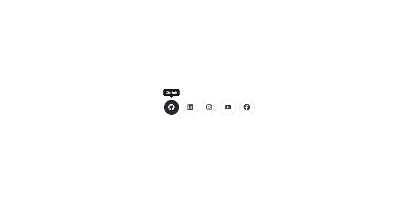
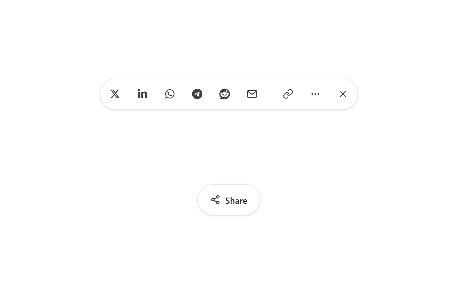
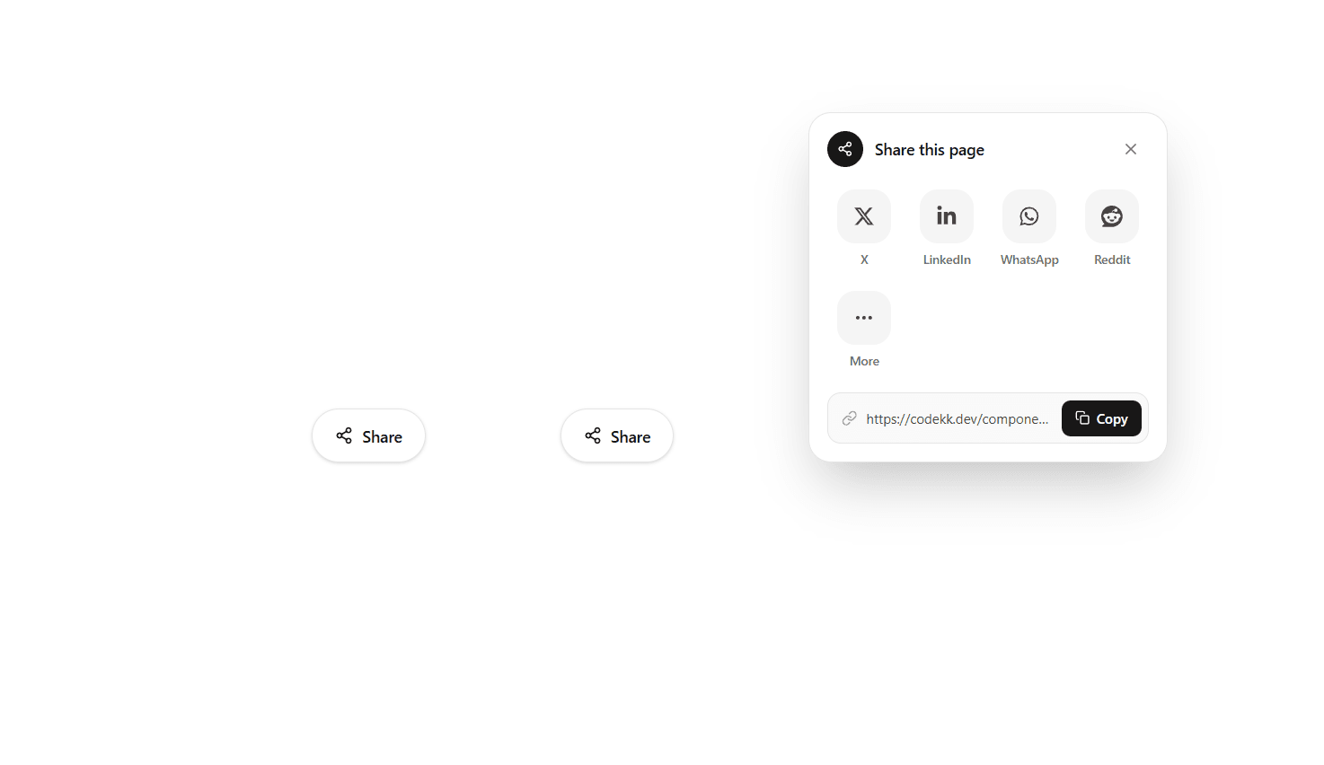
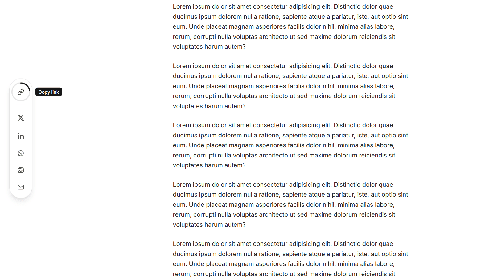
A round share button for React built with TypeScript, Motion, Tailwind CSS v4, and React Icons. When clicked, the share icon spins into an X, a ripple ring pulses outward, and the share targets burst out along an arc on springy, staggered animations. When it closes, they fly back into the center in reverse order. The arc is fully configurable. direction sets which way it opens (up, down, left, or right), radius sets how far the targets travel, and spread sets the arc width, so it can be a tight fan, a wide semicircle, or a full 360° ring with evenly spaced targets. It supports X, LinkedIn, Facebook, WhatsApp, Telegram, Reddit, Email, and Copy link, and the targets prop picks which ones appear and in what order. Hovering or focusing a target makes it grow, fill with the platform's brand color, and show a tooltip label. The Copy link target uses the Clipboard API with a fallback for older browsers, flips to a green check mark, and announces "Link copied" to screen readers. The shared URL and title default to the current page and document.title, and are read at the moment the menu opens, so they stay correct in single-page apps. Share links open in a new tab with noopener noreferrer. The menu closes on Escape or on a click outside. Focus moves to the first target when it opens and returns to the button when it closes. The button uses aria-expanded and aria-controls, and every target has an accessible label. Dark mode is built in through Tailwind's dark: variants. When prefers-reduced-motion is enabled, the springs, spin, and ripple are replaced with a simple fade. It works in Vite, Create React App, and Next.js.
Install
npm install framer-motion, react-iconsDependencies
Discussion
Feedback, implementation tips, and usage notes.
Comments
Sign in to join the conversation
Similar Components
More from the same category