"use client";

/**
 * ShareDock — a responsive share dock for articles / docs pages
 * Stack: React + TypeScript + Tailwind CSS v4 + Motion (motion/react)
 * Deps:  npm i motion react-icons
 *
 * Wide screens (>= railMinWidth):
 * - Vertical rail slides in from the screen edge once the reader scrolls past `showAfter`
 * - Top button is a reading-progress ring (live %) that copies the link on click
 * - macOS-dock style magnification: icons swell as the cursor moves along the rail
 * - Hover / focus: icon fills with brand colour, label pill slides out beside it
 *
 * Smaller screens (tablets, phones):
 * - Compact bar slides up at the bottom of the screen, clear of the content column
 * - Same progress ring + copy link, the share icons, and the native share sheet
 * - Respects the iPhone home-indicator safe area
 */

import {
  useEffect,
  useRef,
  useState,
  type CSSProperties,
  type ReactNode,
  type RefObject,
} from "react";
import {
  AnimatePresence,
  motion,
  useMotionValue,
  useMotionValueEvent,
  useReducedMotion,
  useScroll,
  useSpring,
  useTransform,
  type MotionValue,
} from "motion/react";
import type { IconType } from "react-icons";
import {
  FaXTwitter,
  FaLinkedinIn,
  FaFacebookF,
  FaWhatsapp,
  FaTelegram,
  FaReddit,
} from "react-icons/fa6";
import { FiLink, FiCheck, FiMail, FiMoreHorizontal } from "react-icons/fi";

export type DockNetwork =
  | "x"
  | "linkedin"
  | "facebook"
  | "whatsapp"
  | "telegram"
  | "reddit"
  | "email";

export interface ShareDockProps {
  /** Defaults to the current page URL */
  url?: string;
  /** Defaults to document.title */
  title?: string;
  /** Message sent with the link; defaults to the title */
  text?: string;
  /** Which targets to show (top to bottom on the rail, left to right on the bar) */
  networks?: DockNetwork[];
  /** Which screen edge the rail sits on */
  side?: "left" | "right";
  /** Scroll progress (0–1) after which the dock appears */
  showAfter?: number;
  /** Track reading progress of this element instead of the whole page */
  target?: RefObject<HTMLElement | null>;
  /** Screen width (px) from which the side rail is used; below it, the bottom bar */
  railMinWidth?: number;
  /** What to show below railMinWidth */
  mobile?: "bar" | "hidden";
  className?: string;
}

interface ShareInfo {
  url: string;
  title: string;
  text: string;
}

interface NetworkConfig {
  label: string;
  icon: IconType;
  color: string;
  href: (info: ShareInfo) => string;
}

const enc = encodeURIComponent;

const NETWORKS: Record<DockNetwork, NetworkConfig> = {
  x: {
    label: "Share on X",
    icon: FaXTwitter,
    color: "#0f1419",
    href: ({ url, text }) =>
      `https://x.com/intent/post?url=${enc(url)}&text=${enc(text)}`,
  },
  linkedin: {
    label: "Share on LinkedIn",
    icon: FaLinkedinIn,
    color: "#0a66c2",
    href: ({ url }) =>
      `https://www.linkedin.com/sharing/share-offsite/?url=${enc(url)}`,
  },
  facebook: {
    label: "Share on Facebook",
    icon: FaFacebookF,
    color: "#1877f2",
    href: ({ url }) =>
      `https://www.facebook.com/sharer/sharer.php?u=${enc(url)}`,
  },
  whatsapp: {
    label: "Share on WhatsApp",
    icon: FaWhatsapp,
    color: "#25d366",
    href: ({ url, text }) => `https://wa.me/?text=${enc(`${text} ${url}`)}`,
  },
  telegram: {
    label: "Share on Telegram",
    icon: FaTelegram,
    color: "#26a5e4",
    href: ({ url, text }) =>
      `https://t.me/share/url?url=${enc(url)}&text=${enc(text)}`,
  },
  reddit: {
    label: "Share on Reddit",
    icon: FaReddit,
    color: "#ff4500",
    href: ({ url, title }) =>
      `https://www.reddit.com/submit?url=${enc(url)}&title=${enc(title)}`,
  },
  email: {
    label: "Share by email",
    icon: FiMail,
    color: "#525252",
    href: ({ url, title, text }) =>
      `mailto:?subject=${enc(title)}&body=${enc(`${text}\n\n${url}`)}`,
  },
};

const DEFAULT_NETWORKS: DockNetwork[] = [
  "x",
  "linkedin",
  "whatsapp",
  "reddit",
  "email",
];

const BASE = 40; // resting icon size on the rail (px)
const MAX = 58; // magnified icon size on the rail (px)
const RANGE = 110; // how far (px) from the cursor magnification reaches
const RING = 52; // progress ring size on the rail (px)
const BAR_RING = 40; // progress ring size on the bottom bar (px)

const brand = (color: string) => ({ "--brand": color }) as CSSProperties;

/* ---------- Media query (SSR safe) ---------- */

function useMediaQuery(query: string) {
  const [matches, setMatches] = useState(false);
  useEffect(() => {
    const mql = window.matchMedia(query);
    const update = () => setMatches(mql.matches);
    update();
    mql.addEventListener("change", update);
    return () => mql.removeEventListener("change", update);
  }, [query]);
  return matches;
}

/* ---------- Label pill (rail only) ---------- */

function Label({
  side,
  children,
}: {
  side: "left" | "right";
  children: string;
}) {
  const pos =
    side === "left"
      ? "left-full ml-3 -translate-x-1"
      : "right-full mr-3 translate-x-1";
  return (
    <span
      className={`pointer-events-none absolute top-1/2 -translate-y-1/2 whitespace-nowrap rounded-md bg-neutral-900 px-2 py-1 text-xs font-medium text-white opacity-0 transition duration-150 group-hover:translate-x-0 group-hover:opacity-100 group-focus-visible:translate-x-0 group-focus-visible:opacity-100 dark:bg-white dark:text-neutral-900 ${pos}`}
    >
      {children}
    </span>
  );
}

/* ---------- Progress ring + copy link ---------- */

interface ProgressButtonProps {
  progress: MotionValue<number>;
  percent: MotionValue<string>;
  copied: boolean;
  onCopy: () => void;
  size: number;
  /** Rail only: which side the label pill opens toward */
  side?: "left" | "right";
}

function ProgressButton({
  progress,
  percent,
  copied,
  onCopy,
  size,
  side,
}: ProgressButtonProps) {
  return (
    <button
      type="button"
      onClick={onCopy}
      aria-label={copied ? "Link copied" : "Copy link"}
      className="group relative grid shrink-0 place-items-center rounded-full outline-none focus-visible:ring-2 focus-visible:ring-neutral-900 dark:focus-visible:ring-white"
      style={{ width: size, height: size }}
    >
      <svg
        aria-hidden="true"
        viewBox="0 0 52 52"
        className="absolute inset-0 -rotate-90"
        width={size}
        height={size}
      >
        <circle
          cx="26"
          cy="26"
          r="23"
          fill="none"
          strokeWidth="3"
          className="stroke-neutral-200 dark:stroke-neutral-800"
        />
        <motion.circle
          cx="26"
          cy="26"
          r="23"
          fill="none"
          strokeWidth="3"
          strokeLinecap="round"
          style={{ pathLength: progress }}
          className={
            copied ? "stroke-green-600" : "stroke-neutral-900 dark:stroke-white"
          }
        />
      </svg>

      <AnimatePresence mode="wait" initial={false}>
        {copied ? (
          <motion.span
            key="check"
            initial={{ scale: 0.4, opacity: 0 }}
            animate={{ scale: 1, opacity: 1 }}
            exit={{ scale: 0.4, opacity: 0 }}
            transition={{ duration: 0.15 }}
            className="grid place-items-center text-green-600"
          >
            <FiCheck size={size < 48 ? 16 : 18} aria-hidden="true" />
          </motion.span>
        ) : (
          <motion.span
            key="progress"
            initial={{ opacity: 0 }}
            animate={{ opacity: 1 }}
            exit={{ opacity: 0 }}
            transition={{ duration: 0.12 }}
            className="relative grid place-items-center"
          >
            <motion.span
              className={`font-semibold tabular-nums text-neutral-700 transition-opacity group-hover:opacity-0 group-focus-visible:opacity-0 dark:text-neutral-200 ${
                size < 48 ? "text-[10px]" : "text-[11px]"
              }`}
            >
              {percent}
            </motion.span>
            <FiLink
              size={size < 48 ? 15 : 17}
              aria-hidden="true"
              className="absolute text-neutral-900 opacity-0 transition-opacity group-hover:opacity-100 group-focus-visible:opacity-100 dark:text-white"
            />
          </motion.span>
        )}
      </AnimatePresence>

      {side && <Label side={side}>{copied ? "Copied!" : "Copy link"}</Label>}
    </button>
  );
}

/* ---------- Magnifying rail item ---------- */

interface DockItemProps {
  mouseY: MotionValue<number>;
  reduce: boolean;
  side: "left" | "right";
  label: string;
  color: string;
  href: string;
  children: ReactNode;
}

function DockItem({
  mouseY,
  reduce,
  side,
  label,
  color,
  href,
  children,
}: DockItemProps) {
  const ref = useRef<HTMLLIElement>(null);

  const distance = useTransform(mouseY, (y) => {
    const b = ref.current?.getBoundingClientRect();
    if (!b || !Number.isFinite(y)) return RANGE * 2;
    return y - (b.top + b.height / 2);
  });

  const rawSize = useTransform(distance, [-RANGE, 0, RANGE], [BASE, MAX, BASE]);
  const size = useSpring(rawSize, { stiffness: 320, damping: 22, mass: 0.2 });
  const iconScale = useTransform(size, [BASE, MAX], [1, 1.3]);

  return (
    <li
      ref={ref}
      className="relative grid place-items-center"
      style={{ width: MAX }}
    >
      <motion.a
        href={href}
        target="_blank"
        rel="noopener noreferrer"
        aria-label={label}
        style={{
          ...brand(color),
          width: reduce ? BASE : size,
          height: reduce ? BASE : size,
        }}
        whileTap={{ scale: 0.9 }}
        className="group relative grid place-items-center rounded-full text-neutral-600 outline-none transition-colors hover:bg-(--brand) hover:text-white focus-visible:bg-(--brand) focus-visible:text-white focus-visible:ring-2 focus-visible:ring-(--brand) focus-visible:ring-offset-2 dark:text-neutral-300 dark:focus-visible:ring-offset-neutral-900"
      >
        <motion.span
          style={{ scale: reduce ? 1 : iconScale }}
          className="grid place-items-center"
        >
          {children}
        </motion.span>
        <Label side={side}>{label}</Label>
      </motion.a>
    </li>
  );
}

/* ---------- Bottom bar item ---------- */

const barBtn =
  "grid size-10 shrink-0 place-items-center rounded-full text-neutral-600 outline-none transition-colors " +
  "hover:bg-(--brand) hover:text-white active:bg-(--brand) active:text-white " +
  "focus-visible:bg-(--brand) focus-visible:text-white focus-visible:ring-2 focus-visible:ring-(--brand) " +
  "dark:text-neutral-300";

/* ---------- Clipboard ---------- */

async function copyText(value: string): Promise<boolean> {
  try {
    await navigator.clipboard.writeText(value);
    return true;
  } catch {
    const el = document.createElement("textarea");
    el.value = value;
    el.style.position = "fixed";
    el.style.opacity = "0";
    document.body.appendChild(el);
    el.select();
    const ok = document.execCommand("copy");
    el.remove();
    return ok;
  }
}

/* ---------- Main ---------- */

export default function ShareDock({
  url,
  title,
  text,
  networks = DEFAULT_NETWORKS,
  side = "left",
  showAfter = 0.08,
  target,
  railMinWidth = 1024,
  mobile = "bar",
  className = "",
}: ShareDockProps) {
  const reduce = useReducedMotion() ?? false;
  const isWide = useMediaQuery(`(min-width: ${railMinWidth}px)`);

  const [visible, setVisible] = useState(false);
  const [copied, setCopied] = useState(false);
  const [info, setInfo] = useState<ShareInfo>({ url: "", title: "", text: "" });
  const [canNativeShare, setCanNativeShare] = useState(false);
  const copyTimer = useRef<number | undefined>(undefined);

  // Reading progress
  const { scrollYProgress } = useScroll(
    target ? { target, offset: ["start start", "end end"] } : {},
  );
  const progress = useSpring(scrollYProgress, {
    stiffness: 200,
    damping: 30,
    restDelta: 0.001,
  });
  const percent = useTransform(
    progress,
    (v) => `${Math.round(Math.min(Math.max(v, 0), 1) * 100)}%`,
  );

  // Show / hide + resolve page details when the dock appears
  useMotionValueEvent(scrollYProgress, "change", (v) => {
    const shouldShow = v > showAfter;
    if (shouldShow && !visible) {
      const resolvedTitle = title ?? document.title;
      setInfo({
        url: url ?? window.location.href,
        title: resolvedTitle,
        text: text ?? resolvedTitle,
      });
      setCanNativeShare(typeof navigator.share === "function");
    }
    if (shouldShow !== visible) setVisible(shouldShow);
  });

  useEffect(() => () => window.clearTimeout(copyTimer.current), []);

  // Rail magnification
  const mouseY = useMotionValue(Number.POSITIVE_INFINITY);

  const handleCopy = async () => {
    const ok = await copyText(info.url);
    if (!ok) return;
    setCopied(true);
    window.clearTimeout(copyTimer.current);
    copyTimer.current = window.setTimeout(() => setCopied(false), 1600);
  };

  const handleNativeShare = async () => {
    try {
      await navigator.share({
        title: info.title,
        text: info.text,
        url: info.url,
      });
    } catch {
      /* user dismissed the sheet */
    }
  };

  const showRail = visible && isWide;
  const showBar = visible && !isWide && mobile === "bar";

  const edge = side === "left" ? "left-4 xl:left-6" : "right-4 xl:right-6";
  const offscreen = side === "left" ? -90 : 90;

  return (
    <>
      {/* ---------- Side rail (wide screens) ---------- */}
      <div
        className={`fixed top-1/2 z-40 -translate-y-1/2 ${edge} ${className}`}
      >
        <AnimatePresence>
          {showRail && (
            <motion.nav
              key="rail"
              aria-label="Share this page"
              initial={reduce ? { opacity: 0 } : { opacity: 0, x: offscreen }}
              animate={{ opacity: 1, x: 0 }}
              exit={reduce ? { opacity: 0 } : { opacity: 0, x: offscreen }}
              transition={{ type: "spring", stiffness: 300, damping: 28 }}
              onPointerMove={(e) => !reduce && mouseY.set(e.clientY)}
              onPointerLeave={() => mouseY.set(Number.POSITIVE_INFINITY)}
              className="flex flex-col items-center gap-1 rounded-full border border-neutral-200 bg-white/80 py-2 shadow-lg backdrop-blur-md dark:border-neutral-800 dark:bg-neutral-900/80"
            >
              <ProgressButton
                progress={progress}
                percent={percent}
                copied={copied}
                onCopy={handleCopy}
                size={RING}
                side={side}
              />

              <span
                aria-hidden="true"
                className="my-1 h-px w-6 bg-neutral-200 dark:bg-neutral-700"
              />

              <ul className="flex flex-col items-center gap-1">
                {networks.map((id) => {
                  const n = NETWORKS[id];
                  const Icon = n.icon;
                  return (
                    <DockItem
                      key={id}
                      mouseY={mouseY}
                      reduce={reduce}
                      side={side}
                      label={n.label}
                      color={n.color}
                      href={n.href(info)}
                    >
                      <Icon size={17} aria-hidden="true" />
                    </DockItem>
                  );
                })}
              </ul>
            </motion.nav>
          )}
        </AnimatePresence>
      </div>

      {/* ---------- Bottom bar (tablets, phones) ---------- */}
      <AnimatePresence>
        {showBar && (
          <motion.nav
            key="bar"
            aria-label="Share this page"
            initial={reduce ? { opacity: 0 } : { opacity: 0, y: 90 }}
            animate={{ opacity: 1, y: 0 }}
            exit={reduce ? { opacity: 0 } : { opacity: 0, y: 90 }}
            transition={{ type: "spring", stiffness: 300, damping: 30 }}
            style={{ bottom: "calc(env(safe-area-inset-bottom, 0px) + 1rem)" }}
            className={`fixed inset-x-0 z-40 mx-auto flex w-max max-w-[calc(100vw-1.5rem)] items-center gap-0.5 overflow-x-auto rounded-full border border-neutral-200 bg-white/85 p-1.5 shadow-lg backdrop-blur-md [scrollbar-width:none] dark:border-neutral-800 dark:bg-neutral-900/85 ${className}`}
          >
            <ProgressButton
              progress={progress}
              percent={percent}
              copied={copied}
              onCopy={handleCopy}
              size={BAR_RING}
            />

            <span
              aria-hidden="true"
              className="mx-1 h-6 w-px shrink-0 bg-neutral-200 dark:bg-neutral-700"
            />

            <ul className="flex items-center gap-0.5">
              {networks.map((id) => {
                const n = NETWORKS[id];
                const Icon = n.icon;
                return (
                  <li key={id}>
                    <motion.a
                      href={n.href(info)}
                      target="_blank"
                      rel="noopener noreferrer"
                      aria-label={n.label}
                      whileTap={reduce ? undefined : { scale: 0.88 }}
                      style={brand(n.color)}
                      className={barBtn}
                    >
                      <Icon size={17} aria-hidden="true" />
                    </motion.a>
                  </li>
                );
              })}

              {canNativeShare && (
                <li>
                  <motion.button
                    type="button"
                    onClick={handleNativeShare}
                    aria-label="More sharing options"
                    whileTap={reduce ? undefined : { scale: 0.88 }}
                    style={brand("#404040")}
                    className={barBtn}
                  >
                    <FiMoreHorizontal size={17} aria-hidden="true" />
                  </motion.button>
                </li>
              )}
            </ul>
          </motion.nav>
        )}
      </AnimatePresence>

      <span role="status" aria-live="polite" className="sr-only">
        {copied ? "Link copied" : ""}
      </span>
    </>
  );
}
// Component Source: https://codekk.dev/Component details
Overview, install command, dependencies, and project links.
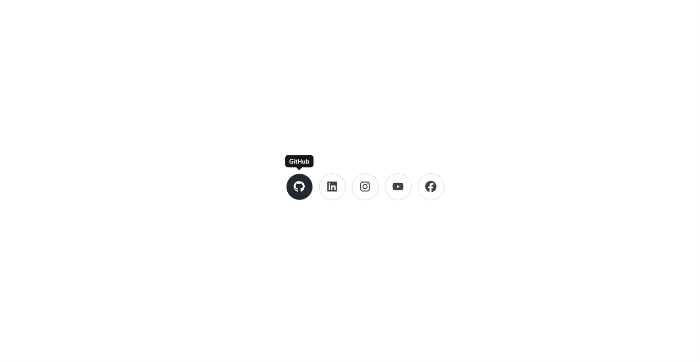
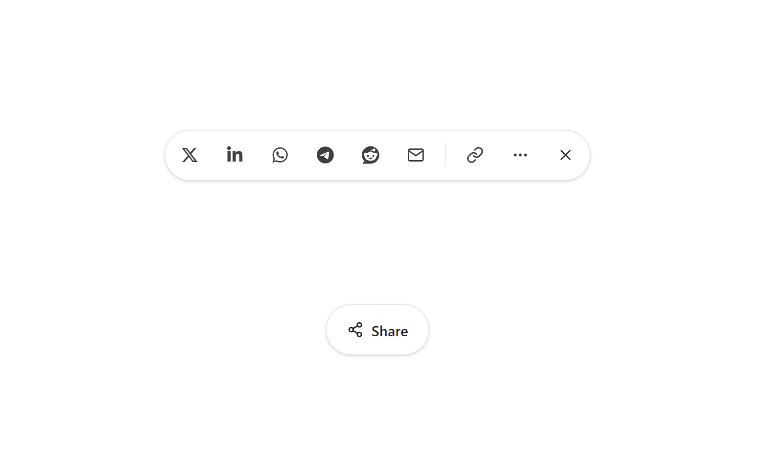
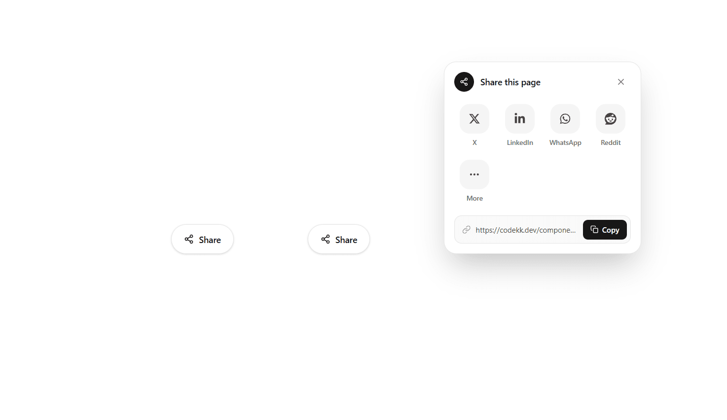
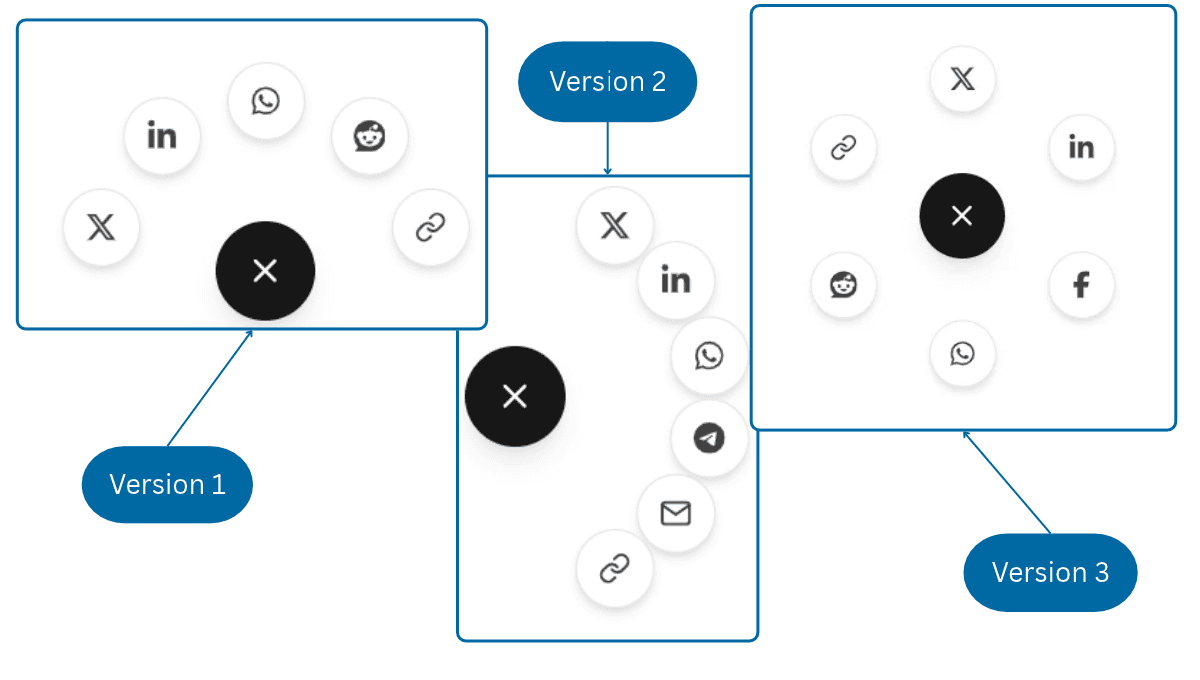
A sticky vertical share rail for React, built with TypeScript, Motion, React Icons, and Tailwind CSS v4. It's made for blog posts, articles, and documentation pages. The dock stays hidden at first and slides in from the screen edge with a spring animation once the reader scrolls past a set point. It slides back out when they scroll back up. The top button is a reading progress ring that fills as the reader moves through the page and shows a live percentage in the center. On hover, the percentage fades into a link icon, and clicking it copies the page URL. The icon then turns into a green check mark and the ring turns green. Pass a target ref to track progress through a specific article instead of the whole page, so the ring reaches 100% at the end of the content rather than at the footer. The share icons have macOS-dock-style magnification: as the cursor moves along the rail, the nearest icon grows and its neighbors grow a little less, all driven by smooth springs. Each icon fills with its brand color on hover or focus, and a label pill slides out beside it. It supports X, LinkedIn, Facebook, WhatsApp, Telegram, Reddit, and email. The networks prop sets which icons appear and in what order, and the side prop places the dock on the left or right edge. The label pills automatically open toward the content. The page URL and title are read when the dock first appears rather than on render, so it is safe to server-render in Next.js. Copying falls back to a hidden textarea on non-secure http:// pages. The rail is a labeled nav landmark, every button has an accessible label, and a polite live region announces "Link copied" to screen readers. Dark mode styles and a frosted glass background are included. When prefers-reduced-motion is enabled, magnification is turned off and the dock fades in instead of sliding. The dock is hidden below the md breakpoint by default to keep mobile reading clean. It works in Vite, Create React App, and Next.js.
Install
npm install motion react-iconsDependencies
Discussion
Feedback, implementation tips, and usage notes.
Comments
Sign in to join the conversation
Similar Components
More from the same category