<!doctype html>
<html lang="en">
<head>
<meta charset="UTF-8" />
<meta name="viewport" content="width=device-width, initial-scale=1" />
<title>Service Company Navbar — Bootstrap 5</title>
<!-- Bootstrap 5.3 + Bootstrap Icons -->
<link
href="https://cdn.jsdelivr.net/npm/bootstrap@5.3.3/dist/css/bootstrap.min.css"
rel="stylesheet"
/>
<link
href="https://cdn.jsdelivr.net/npm/bootstrap-icons@1.11.3/font/bootstrap-icons.min.css"
rel="stylesheet"
/>
<!-- Font -->
<link rel="preconnect" href="https://fonts.googleapis.com" />
<link rel="preconnect" href="https://fonts.gstatic.com" crossorigin />
<link
href="https://fonts.googleapis.com/css2?family=Instrument+Sans:wght@400;500;600;700&display=swap"
rel="stylesheet"
/>
<!-- Custom styles -->
<link rel="stylesheet" href="css/style.css" />
</head>
<body>
<!-- ═══════════════ TOP UTILITY BAR (md+) ═══════════════ -->
<div class="topbar d-none d-md-block">
<div
class="container-xl d-flex align-items-center justify-content-between py-2 gap-3"
>
<div class="d-flex align-items-center gap-3 flex-wrap">
<a href="tel:+15550142290"
><i class="bi bi-telephone"></i>+1 (555) 014-2290</a
>
<span class="topbar-sep" aria-hidden="true"></span>
<a href="mailto:hello@arcline.co"
><i class="bi bi-envelope"></i>hello@arcline.co</a
>
<span class="topbar-sep d-none d-lg-block" aria-hidden="true"></span>
<span class="d-none d-lg-inline"
><i class="bi bi-clock"></i>Mon–Fri, 9:00–18:00</span
>
</div>
<div class="d-flex align-items-center gap-3">
<a href="#careers">Careers<span class="pill-hiring">Hiring</span></a>
<span class="topbar-sep" aria-hidden="true"></span>
<a href="#portal"><i class="bi bi-person-circle"></i>Client portal</a>
</div>
</div>
</div>
<!-- ═══════════════ MAIN NAVBAR ═══════════════ -->
<nav
class="navbar navbar-expand-lg site-nav sticky-top"
id="siteNav"
aria-label="Main navigation"
>
<div class="container-xl">
<!-- Brand -->
<a class="brand me-lg-4" href="#">
<svg width="36" height="36" viewBox="0 0 36 36" aria-hidden="true">
<rect width="36" height="36" rx="10" fill="#0e5e6f" />
<path
d="M9.5 24a8.5 8.5 0 0 1 17 0"
fill="none"
stroke="#fff"
stroke-width="3"
stroke-linecap="round"
/>
<circle cx="18" cy="24" r="2.4" fill="#e8a33d" />
</svg>
<span>
<span class="brand-name">Arcline</span>
<span class="brand-tag d-none d-sm-block"
>IT & digital services</span
>
</span>
</a>
<!-- Mobile quick actions -->
<div class="d-flex align-items-center gap-2 d-lg-none">
<a class="icon-btn" href="tel:+15550142290" aria-label="Call us">
<i class="bi bi-telephone"></i>
</a>
<button
class="icon-btn nav-toggler"
type="button"
data-bs-toggle="offcanvas"
data-bs-target="#navOffcanvas"
aria-controls="navOffcanvas"
aria-label="Open menu"
>
<span></span>
</button>
</div>
<!-- Offcanvas on mobile, inline on desktop -->
<div
class="offcanvas offcanvas-end"
tabindex="-1"
id="navOffcanvas"
aria-labelledby="navOffcanvasLabel"
>
<div class="offcanvas-header border-bottom">
<a class="brand" href="#" id="navOffcanvasLabel">
<svg
width="32"
height="32"
viewBox="0 0 36 36"
aria-hidden="true"
>
<rect width="36" height="36" rx="10" fill="#0e5e6f" />
<path
d="M9.5 24a8.5 8.5 0 0 1 17 0"
fill="none"
stroke="#fff"
stroke-width="3"
stroke-linecap="round"
/>
<circle cx="18" cy="24" r="2.4" fill="#e8a33d" />
</svg>
<span class="brand-name">Arcline</span>
</a>
<button
type="button"
class="btn-close"
data-bs-dismiss="offcanvas"
aria-label="Close menu"
></button>
</div>
<div class="offcanvas-body align-items-lg-center">
<ul class="navbar-nav mx-lg-auto gap-lg-1">
<!-- Services: full-width mega menu -->
<li class="nav-item dropdown dropdown-mega">
<a
class="nav-link dropdown-toggle"
href="#"
role="button"
data-bs-toggle="dropdown"
data-bs-display="static"
data-bs-auto-close="outside"
aria-expanded="false"
>Services</a
>
<div class="dropdown-menu">
<div class="container-xl">
<div class="row g-4">
<div class="col-lg-8">
<p class="mega-heading">What we do</p>
<div class="mega-grid">
<a
class="dropdown-item item-row"
href="#web-development"
>
<span class="item-icon"
><i class="bi bi-window-stack"></i
></span>
<span
><span class="item-title">Web development</span>
<span class="item-desc"
>Fast, accessible websites and web apps</span
></span
>
</a>
<a class="dropdown-item item-row" href="#mobile-apps">
<span class="item-icon"
><i class="bi bi-phone"></i
></span>
<span
><span class="item-title">Mobile apps</span>
<span class="item-desc"
>Native and cross-platform for iOS and
Android</span
></span
>
</a>
<a
class="dropdown-item item-row"
href="#cloud-devops"
>
<span class="item-icon"
><i class="bi bi-cloud-check"></i
></span>
<span
><span class="item-title"
>Cloud & DevOps</span
>
<span class="item-desc"
>Migration, CI/CD and cost control on AWS and
Azure</span
></span
>
</a>
<a class="dropdown-item item-row" href="#ux-design">
<span class="item-icon"
><i class="bi bi-vector-pen"></i
></span>
<span
><span class="item-title">UI/UX design</span>
<span class="item-desc"
>Research, prototypes and design systems</span
></span
>
</a>
<a
class="dropdown-item item-row"
href="#digital-marketing"
>
<span class="item-icon"
><i class="bi bi-graph-up-arrow"></i
></span>
<span
><span class="item-title">Digital marketing</span>
<span class="item-desc"
>SEO, paid campaigns and analytics</span
></span
>
</a>
<a class="dropdown-item item-row" href="#it-support">
<span class="item-icon"
><i class="bi bi-headset"></i
></span>
<span
><span class="item-title">IT support</span>
<span class="item-desc"
>Monitoring, maintenance and a help desk</span
></span
>
</a>
</div>
<a class="mega-all" href="#services"
>View all services <i class="bi bi-arrow-right"></i
></a>
</div>
<div class="col-lg-4 d-none d-lg-block">
<div class="mega-feature">
<h3>Not sure where to start?</h3>
<p>
Tell us what you're trying to fix. We'll recommend a
plan, a timeline and a budget, free of charge.
</p>
<a
class="btn btn-light mt-auto align-self-start"
href="#consultation"
>Book a free consultation</a
>
<small
><span class="dot-live" aria-hidden="true"></span>We
reply within one business day</small
>
</div>
</div>
</div>
</div>
</div>
</li>
<!-- Industries -->
<li class="nav-item dropdown">
<a
class="nav-link dropdown-toggle"
href="#"
role="button"
data-bs-toggle="dropdown"
data-bs-display="static"
aria-expanded="false"
>Industries</a
>
<div class="dropdown-menu">
<a class="dropdown-item item-row" href="#healthcare">
<span class="item-icon"
><i class="bi bi-heart-pulse"></i
></span>
<span
><span class="item-title">Healthcare</span>
<span class="item-desc"
>Patient portals and compliant systems</span
></span
>
</a>
<a class="dropdown-item item-row" href="#finance">
<span class="item-icon"><i class="bi bi-bank"></i></span>
<span
><span class="item-title">Finance</span>
<span class="item-desc"
>Secure platforms for banks and fintech</span
></span
>
</a>
<a class="dropdown-item item-row" href="#retail">
<span class="item-icon"><i class="bi bi-bag"></i></span>
<span
><span class="item-title">Retail & e-commerce</span>
<span class="item-desc"
>Stores, checkout and inventory tools</span
></span
>
</a>
<a class="dropdown-item item-row" href="#logistics">
<span class="item-icon"><i class="bi bi-truck"></i></span>
<span
><span class="item-title">Logistics</span>
<span class="item-desc"
>Tracking, routing and fleet dashboards</span
></span
>
</a>
</div>
</li>
<li class="nav-item">
<a class="nav-link" href="#case-studies">Case studies</a>
</li>
<!-- Company -->
<li class="nav-item dropdown">
<a
class="nav-link dropdown-toggle"
href="#"
role="button"
data-bs-toggle="dropdown"
data-bs-display="static"
aria-expanded="false"
>Company</a
>
<div class="dropdown-menu">
<a class="dropdown-item" href="#about">About us</a>
<a class="dropdown-item" href="#team">Leadership</a>
<a
class="dropdown-item d-flex align-items-center justify-content-between"
href="#careers"
>
Careers <span class="pill-hiring">Hiring</span>
</a>
<a class="dropdown-item" href="#partners">Partners</a>
</div>
</li>
<li class="nav-item">
<a class="nav-link" href="#insights">Insights</a>
</li>
</ul>
<!-- Desktop actions -->
<div class="d-none d-lg-flex align-items-center gap-4">
<a class="nav-phone d-none d-xl-flex" href="tel:+15550142290">
<i class="bi bi-telephone"></i>
<span
><small>Talk to an expert</small
><strong>+1 (555) 014-2290</strong></span
>
</a>
<a class="btn btn-cta" href="#quote">Get a quote</a>
</div>
<!-- Mobile contact card -->
<div class="d-lg-none mt-auto">
<div class="mobile-contact mb-3">
<p class="fw-semibold mb-2">Talk to an expert</p>
<a class="contact-line" href="tel:+15550142290"
><i class="bi bi-telephone"></i>+1 (555) 014-2290</a
>
<a class="contact-line" href="mailto:hello@arcline.co"
><i class="bi bi-envelope"></i>hello@arcline.co</a
>
<a class="contact-line" href="#portal"
><i class="bi bi-person-circle"></i>Client portal</a
>
</div>
<a class="btn btn-cta w-100" href="#quote">Get a quote</a>
</div>
</div>
</div>
</div>
</nav>
<!-- ═══════════════ DEMO CONTENT (remove) ═══════════════ -->
<main class="container-xl">
<section class="demo-hero">
<h1 class="display-5 mb-3">
Software and IT support for growing teams
</h1>
<p class="lead text-secondary mb-0" style="max-width: 58ch">
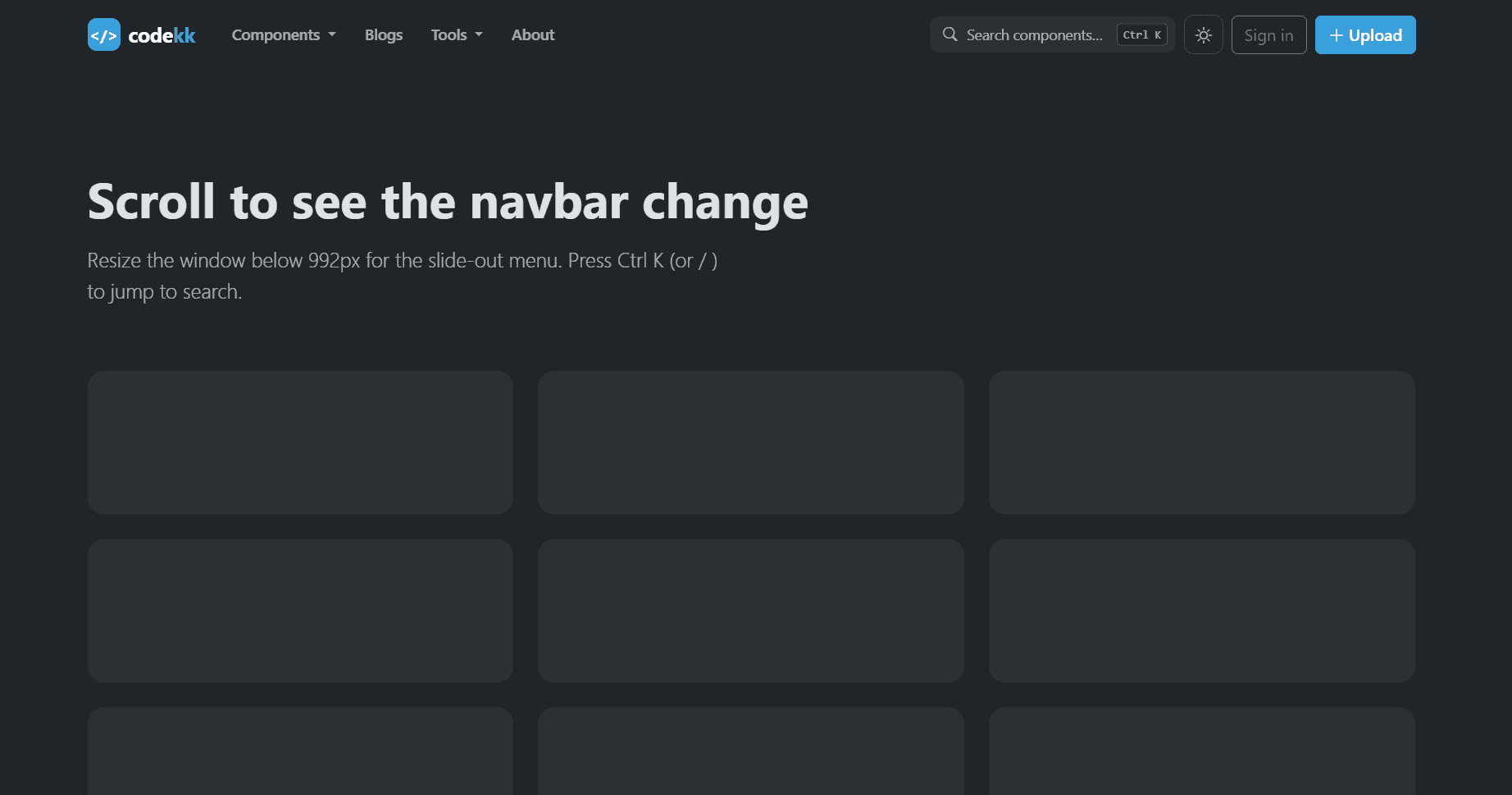
Scroll to see the navbar settle into a compact bar. Resize below 992px
for the slide-out menu.
</p>
</section>
<div class="row g-4 pb-5">
<div class="col-md-6 col-lg-4"><div class="demo-block"></div></div>
<div class="col-md-6 col-lg-4"><div class="demo-block"></div></div>
<div class="col-md-6 col-lg-4"><div class="demo-block"></div></div>
<div class="col-md-6 col-lg-4"><div class="demo-block"></div></div>
<div class="col-md-6 col-lg-4"><div class="demo-block"></div></div>
<div class="col-md-6 col-lg-4"><div class="demo-block"></div></div>
</div>
</main>
<script src="https://cdn.jsdelivr.net/npm/bootstrap@5.3.3/dist/js/bootstrap.bundle.min.js"></script>
<script src="js/app.js"></script>
<!-- Component Source: https://codekk.dev -->
</body>
</html>Component details
Overview, install command, dependencies, and project links.
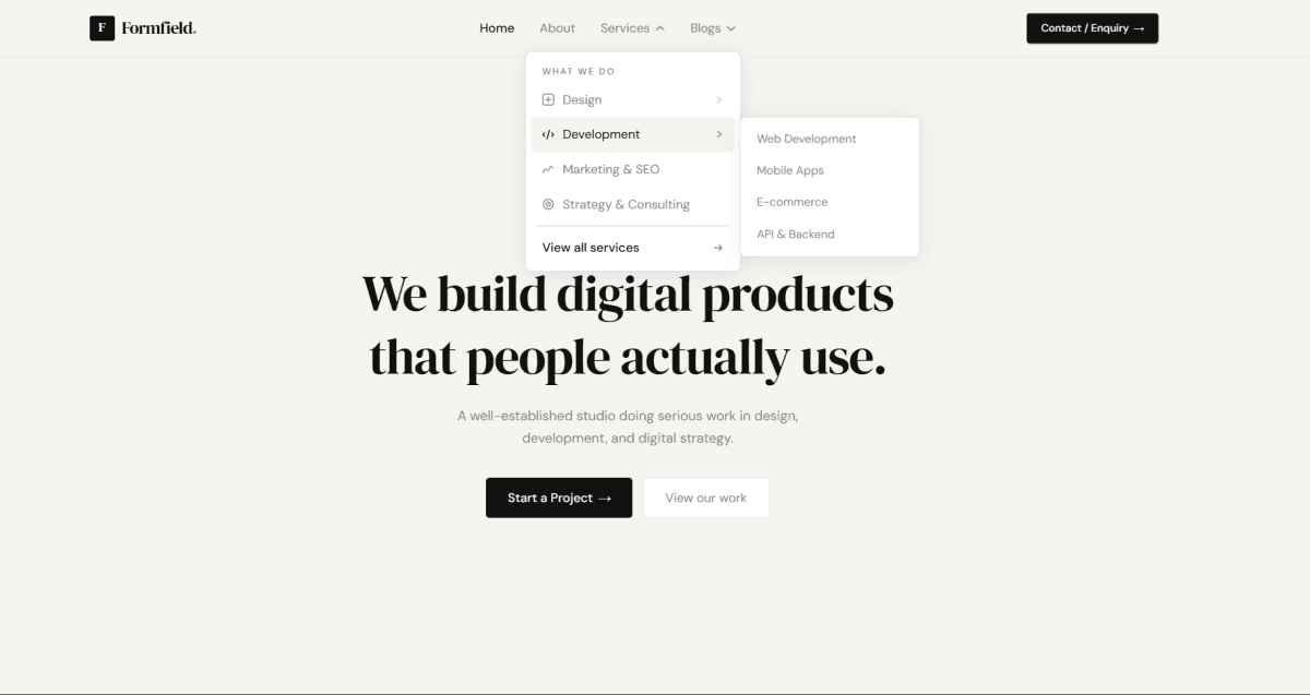
A professional, conversion-focused navbar for service-based businesses, built with Bootstrap 5.3, Bootstrap Icons, HTML, CSS, and vanilla JavaScript, with no build step. It fits IT agencies, consultancies, marketing agencies, law and accounting firms, clinics, and any company that wants visitors to call or request a quote. A dark top bar shows the phone, email, and office hours, plus Careers (with a "Hiring" tag) and a Client portal link. It scrolls away while the main navbar stays pinned. The Services link opens a full-width mega menu with six services in two columns, each with an icon, title, and short description, next to a highlighted panel for booking a free consultation. Industries and Company dropdowns, plus Case studies and Insights links, complete the menu. On the right, a "Talk to an expert" phone number sits beside a "Get a quote" button. Only one dropdown stays open at a time, and the navbar becomes compact with a soft shadow once it reaches the top of the screen. Below 992px, the navbar shows the logo, a tap-to-call button, and a menu button. The menu slides out from the right with every section, a contact card, and a full-width "Get a quote" button. It closes when a link is chosen or the window is resized to desktop. All colors are CSS variables, so the navbar can be rebranded in seconds. Accessibility includes arrow-key dropdown navigation, ARIA labels, aria-current on the active link, visible focus rings, and reduced-motion support. It works in plain HTML sites, WordPress themes, PHP templates, and any backend that renders HTML.
Discussion
Feedback, implementation tips, and usage notes.
Comments
Sign in to join the conversation