// app/components/SpotlightCardsGrid/SpotlightCardsGrid.tsx
"use client";

import React, { useCallback, useRef } from "react";
import Link from "next/link";

export type SpotlightCardItem = {
  id: string | number;
  title: string;
  description: string;
  href?: string;
  meta?: string;
  icon?: React.ReactNode;
};

type SpotlightCardsGridProps = {
  items: SpotlightCardItem[];
  /** Radius of the spotlight in pixels */
  spotlightSize?: number;
  /** Any valid CSS color for the border highlight */
  accent?: string;
  className?: string;
};

export default function SpotlightCardsGrid({
  items,
  spotlightSize = 260,
  accent = "rgba(167, 139, 250, 0.9)",
  className = "",
}: SpotlightCardsGridProps) {
  return (
    <div
      className={`overflow-hidden rounded-[1.25rem] border border-white/10 bg-[#08080b] ${className}`}
      style={
        {
          "--spotlight-size": `${spotlightSize}px`,
          "--spotlight-accent": accent,
        } as React.CSSProperties
      }
    >
      <div className="grid grid-cols-1 sm:grid-cols-2 lg:grid-cols-4">
        {items.map((item, index) => (
          <SpotlightCard key={item.id} item={item} index={index} />
        ))}
      </div>
    </div>
  );
}

function SpotlightCard({
  item,
  index,
}: {
  item: SpotlightCardItem;
  index: number;
}) {
  const cardRef = useRef<HTMLDivElement | null>(null);
  const frameRef = useRef<number | null>(null);

  const handlePointerMove = useCallback(
    (event: React.PointerEvent<HTMLDivElement>) => {
      const card = cardRef.current;
      if (!card) return;

      if (frameRef.current !== null) return;

      const { clientX, clientY } = event;

      frameRef.current = requestAnimationFrame(() => {
        frameRef.current = null;

        const rect = card.getBoundingClientRect();
        card.style.setProperty("--x", `${clientX - rect.left}px`);
        card.style.setProperty("--y", `${clientY - rect.top}px`);
      });
    },
    [],
  );

  const content = (
    <div
      ref={cardRef}
      onPointerMove={handlePointerMove}
      className="
        group relative -ml-px -mt-px h-full min-h-[15rem]
        border border-white/[0.08] bg-white/[0.015]
        transition-colors duration-300
        hover:bg-white/[0.035]
      "
    >
      {/* Spotlight border — masked so only the 1px edge lights up */}
      <div
        aria-hidden="true"
        className="
          pointer-events-none absolute inset-0 p-px opacity-0
          transition-opacity duration-300
          group-hover:opacity-100 group-focus-within:opacity-100
        "
        style={{
          background:
            "radial-gradient(var(--spotlight-size) circle at var(--x, 50%) var(--y, 50%), var(--spotlight-accent), transparent 65%)",
          WebkitMask:
            "linear-gradient(#000 0 0) content-box, linear-gradient(#000 0 0)",
          WebkitMaskComposite: "xor",
          mask: "linear-gradient(#000 0 0) content-box, linear-gradient(#000 0 0)",
          maskComposite: "exclude",
        }}
      />

      {/* Spotlight surface wash — very low opacity, keeps it restrained */}
      <div
        aria-hidden="true"
        className="
          pointer-events-none absolute inset-0 opacity-0
          transition-opacity duration-500
          group-hover:opacity-100
        "
        style={{
          background:
            "radial-gradient(var(--spotlight-size) circle at var(--x, 50%) var(--y, 50%), rgba(255,255,255,0.055), transparent 70%)",
        }}
      />

      <div className="relative z-10 flex h-full flex-col p-6 sm:p-7">
        <div className="flex items-center justify-between gap-4">
          <span className="font-mono text-xs tracking-[0.12em] text-white/30">
            {(index + 1).toString().padStart(2, "0")}
          </span>

          {item.meta && (
            <span className="rounded-full border border-white/10 px-2.5 py-1 text-[0.6875rem] font-medium uppercase tracking-[0.1em] text-white/45 transition-colors duration-300 group-hover:border-white/20 group-hover:text-white/65">
              {item.meta}
            </span>
          )}
        </div>

        <div className="mt-8 flex items-start gap-3">
          {item.icon && (
            <span className="mt-0.5 text-white/55 transition-colors duration-300 group-hover:text-white/90">
              {item.icon}
            </span>
          )}

          <h3 className="text-lg font-medium leading-snug text-white/90 transition-colors duration-300 group-hover:text-white">
            {item.title}
          </h3>
        </div>

        <p className="mt-3 text-sm leading-6 text-white/50 transition-colors duration-300 group-hover:text-white/70">
          {item.description}
        </p>

        {/* Bottom rule that draws in on hover */}
        {/* <div className="mt-auto pt-6">
          <div className="relative h-px w-full bg-white/[0.07]">
            <span className="absolute inset-y-0 left-0 w-0 bg-gradient-to-r from-violet-400/70 to-transparent transition-[width] duration-500 ease-out group-hover:w-full" />
          </div>
        </div> */}
      </div>
    </div>
  );

  if (!item.href) {
    return content;
  }

  return (
    <Link
      href={item.href}
      aria-label={item.title}
      className="block h-full focus:outline-none focus-visible:ring-1 focus-visible:ring-inset focus-visible:ring-violet-300/50"
    >
      {content}
    </Link>
  );
}

// Component Source: https://codekk.dev/
Component details
Overview, install command, dependencies, and project links.
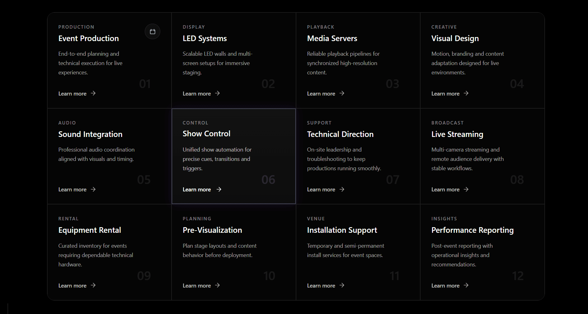
A dark-themed spotlight cards grid built with Next.js and Tailwind CSS. Each card tracks the mouse cursor position using onPointerMove and requestAnimationFrame - the pointer coordinates are written as CSS custom properties --x and --y directly on the card element, then consumed by a radial-gradient on the border highlight layer and the surface wash layer. The border spotlight uses CSS mask compositing to isolate only the 1px border edge so the glow appears on the border only - not the card fill. A second very low opacity radial gradient creates a subtle surface wash that follows the same cursor position. Both effects are throttled to one requestAnimationFrame per pointer event so performance stays smooth even on fast mouse movement. Cards support an optional href that wraps the card in a Next.js Link with a visible focus-visible ring for keyboard users. Spotlight size and accent color are configurable via props and passed as CSS custom properties so every card inherits them from the grid wrapper. Works as a "use client" component in the Next.js App Router.
Discussion
Feedback, implementation tips, and usage notes.
Comments
Sign in to join the conversation