<!doctype html>
<html lang="en">
<head>
<meta charset="UTF-8" />
<meta name="viewport" content="width=device-width, initial-scale=1.0" />
<meta http-equiv="X-UA-Compatible" content="ie=edge" />
<title>Accordion using JavaScript - CodeKK</title>
<link rel="stylesheet" href="styles.css" />
</head>
<body>
<div class="accordion-body">
<div class="accordion">
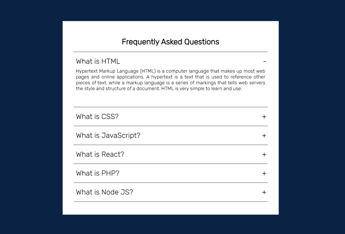
<h1>Frequently Asked Questions</h1>
<hr />
<div class="container">
<div class="label">What is HTML</div>
<div class="content">
Hypertext Markup Language (HTML) is a computer language that makes
up most web pages and online applications. A hypertext is a text
that is used to reference other pieces of text, while a markup
language is a series of markings that tells web servers the style
and structure of a document. HTML is very simple to learn and use.
</div>
</div>
<hr />
<div class="container">
<div class="label">What is CSS?</div>
<div class="content">
CSS stands for Cascading Style Sheets. It is the language for
describing the presentation of Web pages, including colours, layout,
and fonts, thus making our web pages presentable to the users. CSS
is designed to make style sheets for the web. It is independent of
HTML and can be used with any XML-based markup language. CSS is
popularly called the design language of the web.
</div>
</div>
<hr />
<div class="container">
<div class="label">What is JavaScript?</div>
<div class="content">
JavaScript is a scripting or programming language that allows you to
implement complex features on web pages — every time a web page does
more than just sit there and display static information for you to
look at — displaying timely content updates, interactive maps,
animated 2D/3D graphics, scrolling video jukeboxes, etc. — you can
bet that JavaScript is probably involved. It is the third of the web
trio.
</div>
</div>
<hr />
<div class="container">
<div class="label">What is React?</div>
<div class="content">
React is a JavaScript library created for building fast and
interactive user interfaces for web and mobile applications. It is
an open-source, component-based, front-end library responsible only
for the application’s view layer. In Model View Controller (MVC)
architecture, the view layer is responsible for how the app looks
and feels. React was created by Jordan Walke, a software engineer at
Facebook.
</div>
</div>
<hr />
<div class="container">
<div class="label">What is PHP?</div>
<div class="content">
PHP is a server-side and general-purpose scripting language that is
especially suited for web development. PHP originally stood for
Personal Home Page. However, now, it stands for Hypertext
Preprocessor. It’s a recursive acronym because the first word itself
is also an acronym.
</div>
</div>
<hr />
<div class="container">
<div class="label">What is Node JS?</div>
<div class="content">
Node.js is an open-source, cross-platform, back-end JavaScript
runtime environment that runs on the V8 engine and executes
JavaScript code outside a web browser. Node.js lets developers use
JavaScript to write command line tools and for server-side
scripting—running scripts server-side to produce dynamic web page
content before the page is sent to the user's web browser.
Consequently, Node.js represents a "JavaScript everywhere" paradigm
</div>
</div>
<hr />
</div>
</div>
<script src="app.js" type="text/javascript"></script>
</body>
</html>Component details
Overview, install command, dependencies, and project links.
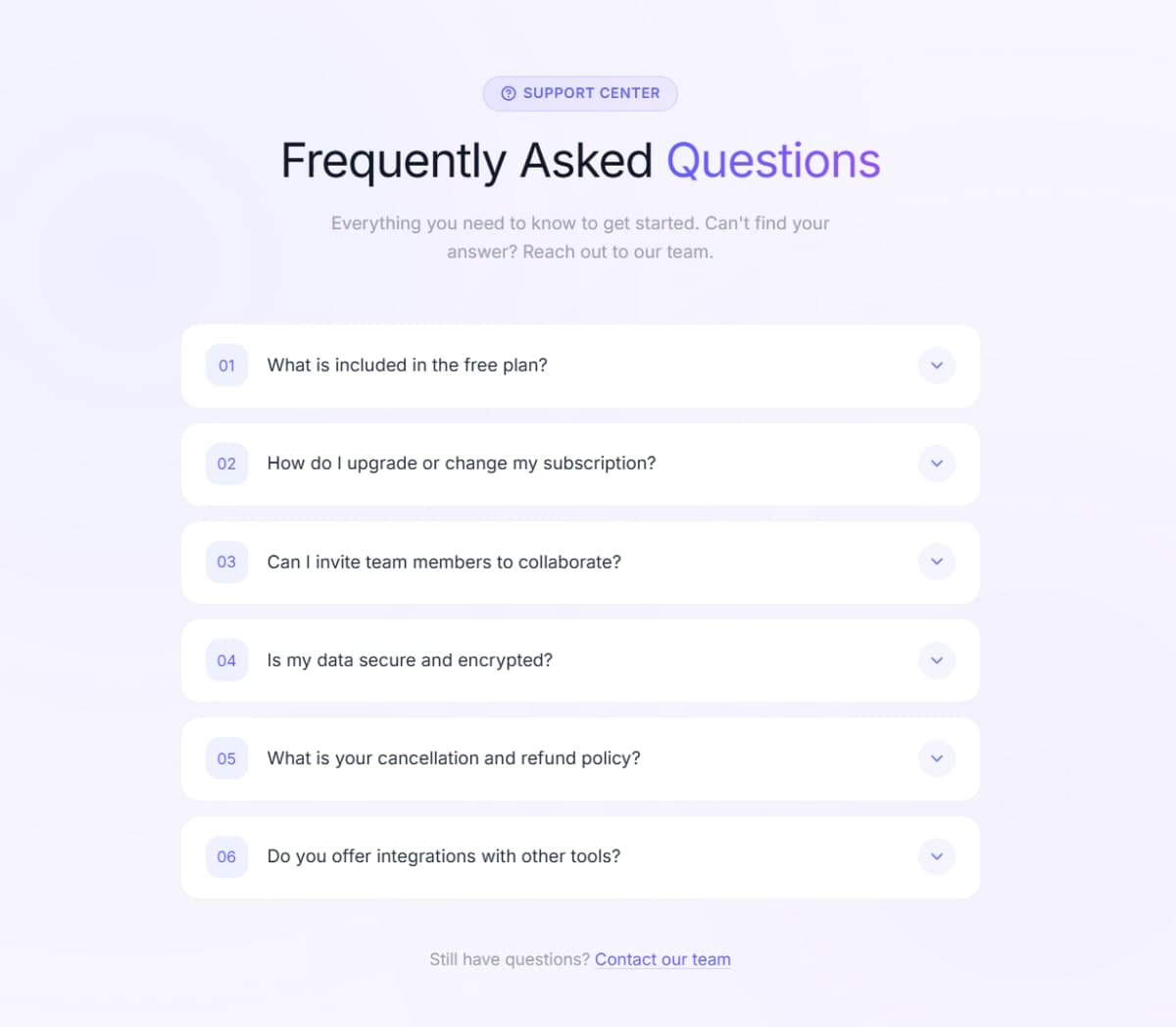
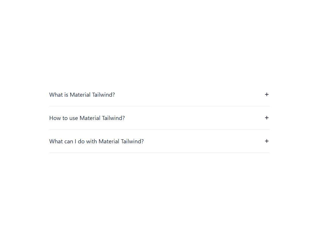
A clean FAQ accordion built with plain HTML, CSS, and vanilla JavaScript - no libraries, no dependencies. Click any question to expand the answer, click again to collapse it. Multiple items can stay open at the same time. The toggle indicator switches between + and - using a CSS ::before pseudo-element, so no extra HTML needed. The expand/collapse animation runs on a CSS height transition with overflow: hidden - smooth and lightweight. Styled with a white card on a dark navy background using the Rubik font from Google Fonts. Six questions covering HTML, CSS, JavaScript, React, PHP, and Node.js - easy to swap out for your own content by just editing the .container divs in the HTML.
Discussion
Feedback, implementation tips, and usage notes.
Comments
Sign in to join the conversation
Similar Components
More from the same category