
How to Build Dark and Light Mode in React Vite with Tailwind CSS and TypeScript (Step by Step)
A complete step by step guide to building dark and light mode in React Vite using Tailwind CSS v4 and TypeScript, explaining the Context API, localStorage persistence, and why each part works the way it does.
How to Build Dark and Light Mode in React Vite with Tailwind CSS and TypeScript (Step by Step)
I searched a lot before writing this. Almost every tutorial out there either skips the reasoning and just hands you a code dump, or explains the theory without showing you a working result. You end up copying code that works, but you still don't actually understand why it works.
So this blog is built differently. Every step explains what we're doing and why we're doing it that way, not just what to type. By the end, you won't just have a dark mode toggle - you'll understand exactly how it works under the hood, and you'll be able to build it again from memory without copying anything.
Let's go.
What We're Actually Building
A simple product card component that switches between light and dark themes, with a toggle button that remembers your choice even after you refresh the page. We'll use React with Vite, TypeScript, and Tailwind CSS v4.
Before writing a single line of code, it helps to understand what "dark mode" actually means technically. It's not magic - it's just CSS classes changing based on a condition, and that condition being remembered somewhere. That's the entire concept. Everything else is just implementation detail.
Step 1: Setting Up the Project
Start by creating a new Vite project. We're using TypeScript here, but if you prefer plain JavaScript, the same logic applies - just remove the type annotations.
npm create vite@latest
Choose React as the framework and TypeScript as the variant. Once it's created, move into the folder and install dependencies as usual.
Why Vite instead of Create React App? Vite is significantly faster during development because it doesn't bundle your entire app every time you save a file. It uses native ES modules in the browser during development, so changes show up almost instantly. For a small project like this, you'll notice the speed difference immediately.
Step 2: Installing Tailwind CSS
This part trips a lot of people up because Tailwind changed how it integrates with Vite in version 4. If you've used Tailwind before through tailwind.config.js and PostCSS, this is different.
npm install tailwindcss @tailwindcss/vite
This installs Tailwind itself, along with a dedicated Vite plugin built specifically for Tailwind v4. This plugin handles the CSS processing directly inside Vite's build pipeline instead of going through a separate PostCSS configuration step like before.
Why does this matter? In older Tailwind setups, you needed a tailwind.config.js file, a postcss.config.js file, and content paths configured manually so Tailwind knew which files to scan for class names. With the Vite plugin approach in v4, a lot of that configuration overhead goes away. Vite and Tailwind talk to each other directly.
Step 3: Connecting Tailwind to Vite
Open vite.config.ts and add the Tailwind plugin alongside the React plugin.
import { defineConfig } from "vite";
import react from "@vitejs/plugin-react";
import tailwindcss from "@tailwindcss/vite"; // add this line

// https://vite.dev/config/
export default defineConfig({
  plugins: [
    tailwindcss(), // this too
    react()
  ],
});
Why does the order or presence of these plugins matter? Vite plugins process your code in a pipeline. The Tailwind plugin needs to be registered so Vite knows to process Tailwind's CSS directives during build and development. Without this, Tailwind classes in your components simply won't generate any actual CSS - your className="text-lg" would just be a string with no styling behind it.
Step 4: Importing Tailwind in Your CSS
Open src/index.css, delete whatever default styles Vite generated, and replace it with just this one line:
@import "tailwindcss";
That's it. In older Tailwind versions you'd write three separate @tailwind directives for base, components, and utilities. Version 4 simplified this into a single import.
Why does this single line matter so much? This import is what actually pulls in Tailwind's entire utility class system into your project. Without it, none of your bg-white, dark:bg-gray-800, or any other Tailwind class will do anything - they'll just be unrecognized strings sitting in your JSX.
Run your dev server now to confirm everything is wired correctly:
npm run dev
If Tailwind classes are working in a quick test component, you're ready to move to the actual dark mode logic.
Step 5: Understanding How Dark Mode Actually Works in Tailwind
Before writing the toggle logic, you need to understand the mechanism Tailwind uses for dark mode. This is the part most tutorials skip past too quickly.
Tailwind's dark mode works through a special class prefix: dark:. When you write something like:
<div className="bg-white dark:bg-gray-800">
This tells Tailwind: "use bg-white normally, but if dark mode is active, use bg-gray-800 instead."
But here's the important part - how does Tailwind know if dark mode is active? By default, Tailwind checks if the <html> element has a class called dark on it. If that class exists, every dark: variant in your app activates. If it doesn't exist, your app shows the light mode styles.
So the entire dark mode system comes down to one simple question: is there a class called dark on the html tag or not?
That's the whole mechanism. Everything we build from here is just about adding and removing that one class, and remembering the user's choice.
Step 6: Building the Theme Context
This is the core logic of the whole tutorial. We need a way to:
Store the current theme (light or dark) somewhere accessible to the whole app
Provide a function to toggle between them
Apply the actual
darkclass to the html element when the theme changesRemember the user's choice even after they close and reopen the browser
Why use Context API instead of just useState in the App component? If you only used useState in your top-level App component, you'd have to pass theme and toggleTheme down as props to every component that needs them. If your ToggleTheme button is three components deep, you'd be passing props through every layer in between just to reach it. This is called prop drilling, and it gets messy fast.
Context API solves this by letting any component in your app access the theme value directly, no matter how deeply nested it is, without passing props through every layer.
Create a file at src/context/ThemeContext.tsx:
import { createContext, useContext, useEffect, useState } from "react";

type Theme = "light" | "dark";

type ThemeContextType = {
  theme: Theme;
  toggleTheme: () => void;
};

const ThemeContext = createContext<ThemeContextType | null>(null);

export function ThemeProvider({ children }: { children: React.ReactNode }) {
  const [theme, setTheme] = useState<Theme>(() => {
    const storedTheme = localStorage.getItem("theme");

    return storedTheme === "dark" ? "dark" : "light";
  });

  useEffect(() => {
    const html = document.documentElement;

    if (theme === "dark") {
      html.classList.add("dark");
    } else {
      html.classList.remove("dark");
    }

    localStorage.setItem("theme", theme);
  }, [theme]);

  const toggleTheme = () => {
    setTheme((prev) => (prev === "dark" ? "light" : "dark"));
  };

  return (
    <ThemeContext.Provider
      value={{
        theme,
        toggleTheme,
      }}
    >
      {children}
    </ThemeContext.Provider>
  );
}

export function useTheme() {
  const context = useContext(ThemeContext);

  if (!context) {
    throw new Error("useTheme must be used inside ThemeProvider");
  }

  return context;
}
Let's go through this piece by piece because every part here is doing something specific.
The type definitions at the top:
type Theme = "light" | "dark";
This is a TypeScript union type. It says theme can only ever be exactly one of these two string values, nothing else. If you accidentally typed "Dark" with a capital D somewhere later in your code, TypeScript would catch that mistake immediately because it doesn't match either allowed value.
The initial state with a function:
const [theme, setTheme] = useState<Theme>(() => {
  const storedTheme = localStorage.getItem("theme");
  return storedTheme === "dark" ? "dark" : "light";
});
Notice that we're passing a function into useState, not a direct value. This matters. If we wrote useState(localStorage.getItem("theme")) directly, that localStorage.getItem call would run on every single re-render of this component, even though we only need it once when the component first mounts. By wrapping it in a function, React only runs this logic once, during the initial render. This is called lazy initial state, and it's a small but meaningful performance habit.
The logic itself checks if anything was previously saved in localStorage. If the user had picked dark mode before, that string "dark" is still sitting there from their last visit, and we restore it. If nothing is saved, we default to light mode.
The useEffect that does the actual work:
useEffect(() => {
  const html = document.documentElement;

  if (theme === "dark") {
    html.classList.add("dark");
  } else {
    html.classList.remove("dark");
  }

  localStorage.setItem("theme", theme);
}, [theme]);
This effect runs every time theme changes. Remember what we learned in step 5 - Tailwind's entire dark mode system depends on whether the html element has a class called dark. This is exactly what's happening here. document.documentElement refers to the actual <html> tag in your page. When theme becomes "dark", we add the dark class to it. When it becomes "light", we remove that class.
The moment that class gets added or removed, every single dark: variant across your entire app instantly responds, because Tailwind is constantly watching for that class to exist or not exist on the html tag.
The last line, localStorage.setItem("theme", theme), saves the current choice to the browser's local storage. This is what makes the theme persist - so if the user refreshes the page or comes back tomorrow, their preference is still there waiting to be read back in step one.
The toggle function:
const toggleTheme = () => {
  setTheme((prev) => (prev === "dark" ? "light" : "dark"));
};
This simply flips the current value. If it was dark, make it light. If it was light, make it dark. We're using the functional form of setTheme here (passing a function instead of a direct value) because it guarantees we're always working with the most current state value, rather than a potentially stale one from a previous render.
The custom hook at the bottom:
export function useTheme() {
  const context = useContext(ThemeContext);

  if (!context) {
    throw new Error("useTheme must be used inside ThemeProvider");
  }

  return context;
}
This wraps useContext in a custom hook. Why bother with this extra step instead of just calling useContext(ThemeContext) directly wherever needed? Two reasons. First, it's shorter to write useTheme() everywhere instead of repeating useContext(ThemeContext). Second, and more importantly, it adds a safety check. If somehow a component tries to use this hook outside of where ThemeProvider actually wraps the app, it throws a clear error immediately telling you exactly what went wrong, instead of silently failing or giving you a confusing undefined error somewhere else.
Step 7: Wrapping the App With the Provider
Context only works for components that are nested inside the Provider component. So we need to wrap our whole app with ThemeProvider. Open src/main.tsx and wrap your App component:
import { StrictMode } from "react";
import { createRoot } from "react-dom/client";
import App from "./App.tsx";
import { ThemeProvider } from "./context/ThemeContext.tsx";
import "./index.css";

createRoot(document.getElementById("root")!).render(
  <StrictMode>
    <ThemeProvider>
      <App />
    </ThemeProvider>
  </StrictMode>,
);
Why wrap it here at the very top level? Because now every single component anywhere inside App - no matter how deeply nested - can call useTheme() and get access to the current theme and the toggle function. This is the entire point of using Context in the first place.
Step 8: Building the Toggle Button
Now we build the actual UI piece the user interacts with. Create src/components/ui/ToggleTheme.tsx:
import { Moon, SunDim } from "lucide-react";
import { useTheme } from "../../context/ThemeContext";
import { motion, AnimatePresence } from "framer-motion";

export default function ToggleTheme() {
  const { theme, toggleTheme } = useTheme();

  return (
    <button
      onClick={toggleTheme}
      className={`
        flex items-center gap-2 px-4 py-2 rounded-lg border cursor-pointer
        transition-colors duration-200
        ${
          theme === "dark"
            ? "bg-white text-black border-gray-200"
            : "bg-black/80 text-white border-black/90"
        }
      `}
    >
      <AnimatePresence mode="wait" initial={false}>
        <motion.div
          key={theme}
          className="flex items-center gap-2"
          initial={{ opacity: 0, scale: 0.9 }}
          animate={{ opacity: 1, scale: 1 }}
          exit={{ opacity: 0, scale: 0.9 }}
          transition={{ duration: 0.15 }}
        >
          {theme === "dark" ? (
            <SunDim className="w-4 h-4" />
          ) : (
            <Moon className="w-4 h-4" />
          )}
          <span className="text-sm font-medium">
            {theme === "dark" ? "Light Mode" : "Dark Mode"}
          </span>
        </motion.div>
      </AnimatePresence>
    </button>
  );
}
Why is this button's own background flipped opposite to the theme? Look closely - when theme === "dark", the button itself becomes white with black text. When the theme is light, the button becomes dark. This is an intentional design choice, not a bug. It makes the button stand out clearly against the page background in both modes, since the page itself goes dark when theme is dark, and the button does the opposite to maintain contrast.
Why use lucide-react for the icons? We're showing a sun icon when in dark mode (suggesting "click to switch to light") and a moon icon when in light mode (suggesting "click to switch to dark"). This is a common UX pattern - the icon represents what will happen when clicked, not the current state.
What is the AnimatePresence and motion.div doing here? This comes from Framer Motion, an animation library. Without it, the icon and text would just instantly swap when you click, which feels abrupt. With AnimatePresence, when the theme value changes, the key={theme} on the motion div changes too, which tells Framer Motion "this is a different element now, animate the transition." The old icon and text fade and shrink out, the new ones fade and grow in. The mode="wait" ensures the exit animation finishes before the next one starts, so they don't overlap awkwardly.
This isn't required for dark mode to function - it's a polish detail. If you want to skip Framer Motion entirely, you can remove AnimatePresence and motion.div and just keep the plain conditional icon and text. The toggle will still work exactly the same, just without the smooth transition.
Step 9: Building a Component That Actually Uses the Theme
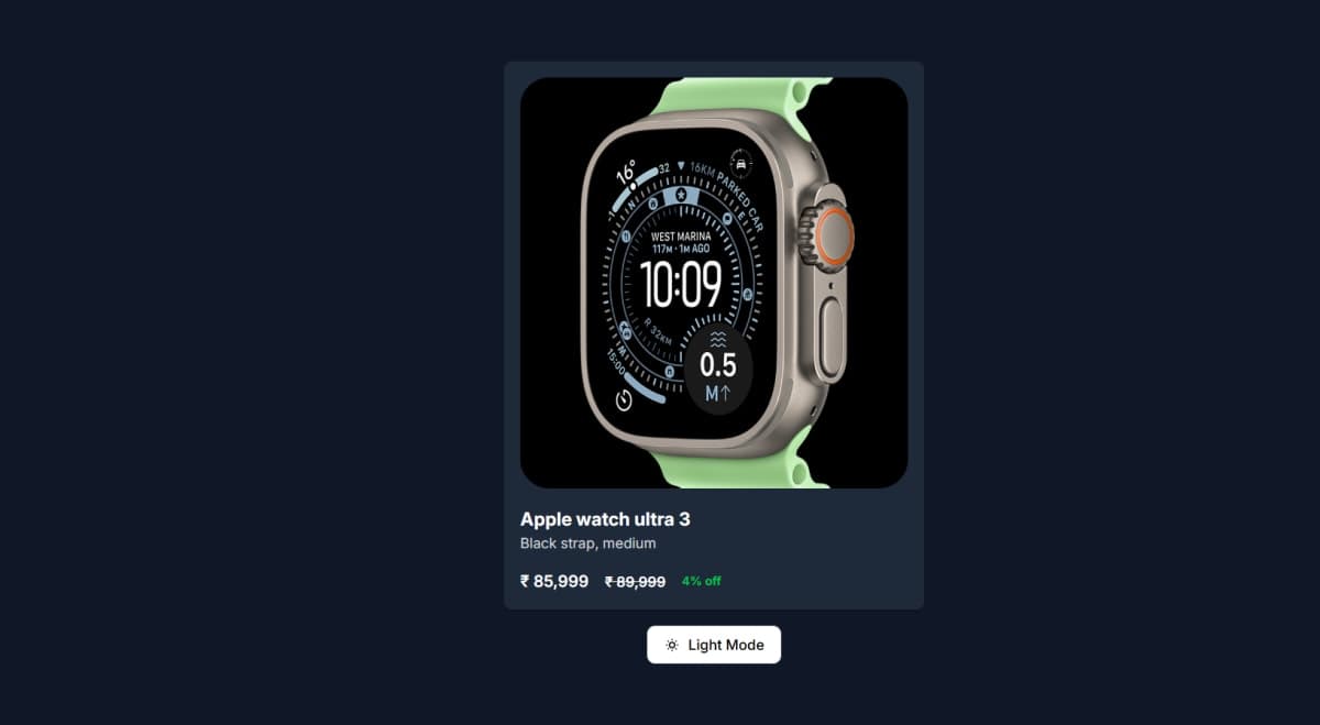
A toggle button is pointless without something on the page that visibly changes. Create src/components/card/Card.tsx:
export default function Card() {
  return (
    <>
      <div className="max-w-md p-4 bg-white dark:bg-gray-800 shadow-md rounded-lg">
        <figure className="max-w-sm">
          <img
            src="https://www.apple.com/assets-www/en_IN/watch/product_tile/large/u3_6b7e98fe2_2x.png"
            alt="Apple Watch Ultra 3"
            className="w-full h-auto object-cover rounded-lg"
          />
        </figure>
        <div className="mt-4">
          <h2 className="text-lg font-bold text-gray-800 dark:text-white">
            Apple watch ultra 3
          </h2>
          <p className="text-sm text-gray-600 dark:text-gray-300">
            Black strap, medium
          </p>

          <div className="mt-4 flex items-center space-x-4">
            <p className="text-base font-semibold text-gray-800 dark:text-white">
              ₹ 85,999
            </p>
            <p className="text-sm font-semibold text-gray-800 dark:text-white line-through">
              ₹ 89,999
            </p>
            <p className="text-xs font-semibold text-green-500">4% off</p>
          </div>
        </div>
      </div>
    </>
  );
}
Notice something important here. This component does not import useTheme at all. It doesn't know or care whether the theme is light or dark. It just has Tailwind classes like bg-white dark:bg-gray-800 written directly in the JSX.
This is the actual payoff of everything we set up earlier. Because the dark mode mechanism works purely through the dark class on the html tag, any component anywhere in your app can simply write dark: variants in its className and it will automatically respond to theme changes - without ever needing to know about Context, state, or any toggle logic at all. The component just declares "here's what I look like in light mode, here's what I look like in dark mode," and the rest is handled globally.
This is a powerful separation. Your UI components stay simple and focused only on appearance. The theme logic lives in one place - the Context - and everything else just reacts to it through CSS classes.
Step 10: Putting It All Together
Now bring everything into App.tsx:
import "./App.css";
import Card from "./components/card/Card";
import ToggleTheme from "./components/ui/ToggleTheme";

function App() {
  return (
    <main className="flex flex-col items-center justify-center min-h-screen gap-4">
      <Card />
      <ToggleTheme />
    </main>
  );
}

export default App;
At this point, run your dev server and test it:
npm run dev
Click the toggle button. You should see the card background switch between white and dark gray, the text colors invert, and the button itself swap appearance with a smooth animation. Refresh the page after toggling - the theme you picked should still be there. That's the localStorage persistence working correctly.
What's Actually Happening When You Click the Button
Let's trace through the entire flow one more time, now that every piece is built, so the full picture is clear.
You click the button. This calls toggleTheme(), which flips the theme state from "light" to "dark" (or vice versa) inside ThemeContext. Because state changed, React re-renders any component using useTheme().
At the same time, the useEffect inside ThemeProvider detects that theme changed, and runs its logic - it either adds or removes the dark class on document.documentElement, and saves the new theme value into localStorage.
The moment that dark class appears or disappears on the html tag, every dark: prefixed Tailwind class across your entire app responds instantly, because that's literally how Tailwind's dark mode variant works under the hood. No component needs to manually re-check anything - it's pure CSS responding to a class change.
Next time the page loads, the useState initializer reads back whatever was saved in localStorage, and the correct theme is restored before the user even sees anything.
That's the complete system. Five moving parts, all of them simple on their own, working together.
Why This Approach and Not Just CSS Media Queries
You might be wondering - CSS already has a prefers-color-scheme media query that detects if the user's operating system is set to dark mode. Why not just use that instead of building all this?
The honest answer is that media queries only detect the system preference - they don't let the user manually override it inside your app. If someone's OS is set to dark mode but they want your specific website in light mode, a pure CSS media query approach can't give them that choice. The Context and class-based approach we built here gives the user full control, independent of their system settings, and remembers their specific choice for your site.
If you wanted to be extra thorough, you could combine both - default to the system preference on first visit using the media query, then let the user override it with the toggle, which is exactly what localStorage allows for after that first choice is made.
A Quick Note on Folder Structure
Notice how the project separates concerns into folders - context for state logic, components/ui for reusable interface pieces like buttons, and components/card for feature-specific pieces. This isn't required for a small project like this one to work, but it's a habit worth building early. As your app grows, having theme logic, UI primitives, and feature components clearly separated makes it much easier to find things and avoid one giant messy file holding everything.
The Bottom Line
Dark mode isn't complicated once you see what's actually happening underneath. It's one class on the html tag, a place to store and read that choice, and Tailwind's dark: variants reacting to whether that class exists. Everything else - Context API, the toggle button, the animation - is just making that one simple mechanism convenient and pleasant to use.
If you understood every step here, you didn't just copy a dark mode toggle. You understand exactly how to build theme switching into any future project, with or without Tailwind, because you know the actual mechanism instead of just the code that happened to work.
Related Articles
More insights you might enjoy
SSR, CSR, SSG, and ISR in Next.js - What They Are and When to Use Each One
Next.js gives you four ways to render pages and each solves a different problem. This guide explains all four with real code examples and a practical decision guide.

React vs Next.js: What's Actually Different and When to Use Which
React and Next.js are often confused - one is a UI library, the other is a full framework built on top of it. This post breaks down the real differences: rendering strategies, routing, API routes, and when to pick one over the other.

HTTP Status Codes Explained - What They Actually Mean and Why Developers Should Know Them
Most developers know 200 and 404. But understanding the full range - and when to use them in your own APIs - makes you a noticeably better backend developer.

How React's useEffect Actually Works - And Why Developers Misuse It
useEffect is one of the most used hooks in React and also one of the most misunderstood. This guide covers the dependency array, cleanup functions, the double render, and common mistakes that cause bugs.

TypeScript vs JavaScript - What Is Actually Different and Should You Learn TypeScript
TypeScript and JavaScript are more related than most people think. This guide covers the real difference, core TypeScript features you need to know, and helps you decide whether to make the switch.

Node.js and Express.js - What They Are, How They Differ, and How They Work Together
Node.js and Express.js are not the same thing. This guide explains what each does, how they work together, and covers routing, middleware, and error handling with real code.
Comments
Sign in to join the conversation